RSS Feed

‘feature book of the week’ Category

  1. Bookbinder of the Month: Sonya Sheats

    June 30, 2013 by Erin Fletcher

    MadrigalTranstromer

    When Harold Pinter was award the Nobel Prize for Literature in 2005, the Nobel Museum (located in Stockholm) began a collaboration with the Swedish Bookbinders Guild to offer an annual Nobel Museum Bookbinding Exhibition. Their goal has been and continues to be to give bookbinders an opportunity to work together with contemporary writers. An archive of past exhibitions are also available on their site. 

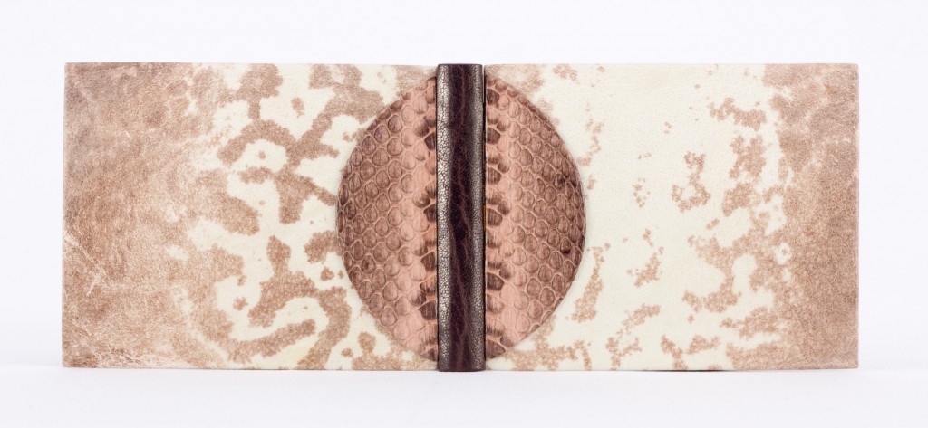
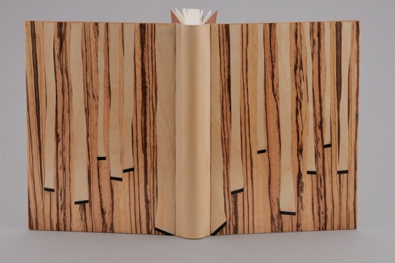
    In 2012, Sonya Sheats bound Madrigal by poet Tomas Tranströmer, who was awarded the Nobel Prize in Literature. Published in 2010, the text includes linoleum prints by Birgit Alm-Pons and was printed in a numbered edition of 50 (Sonya bound copy 13). Her binding was awarded honorable mention in the exhibition and was on display at the Nobel Museum alongside a biographical exhibit about Tomas Tranströmer from February to June of 2013. 

    Sonya’s binding is a true quarter binding structure. I’ll let her words describe the rest: 
    The spine is quite interesting. It is made of natural goatskin. The width of the leather spine piece is equal to two times the width of the spine. The hollow extends onto each board by approximately 0.5mm (one quarter the thickness of the true spine) and is attached to the boards by 0.5mm turn-ins on each side. Add all that leather up and you will get two times the width of the spine. The boards are a mosaic of zebra wood with inlays in birch wood. End sheets are tan Silsuede, and the book is encased in a shaped birch slipcase lined in Silsuede.
  2. Bookbinder of the Month: Sonya Sheats

    June 23, 2013 by Erin Fletcher

    pictorialwebster-sonyasheats

    Photo by Brandon Constant.

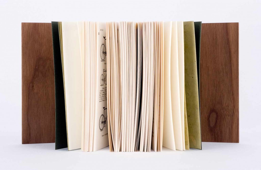
    In 2010, the New England Chapter of the Guild of Book Workers exhibited a series of juried design bindings for Johnny Carrera’s Pictorial Webster’s: A Visual Dictionary of Curiosities. As a project that began in 1996, Carrera patiently sifted through a collection of around 12,000 engravings from the Merriam-Webster Company that are now housed in Yale’s Arts of the Book Press room in hopes to create a visual dictionary inspired by the Illustrated Webster’s. Carrera’s Pictorial Webster became available to the public as a trade edition in 2010. Original letterpress copies were bound in several different styles from full leather to oak boards to full cloth. Additional copies were left unbound and made available to bookbinders.

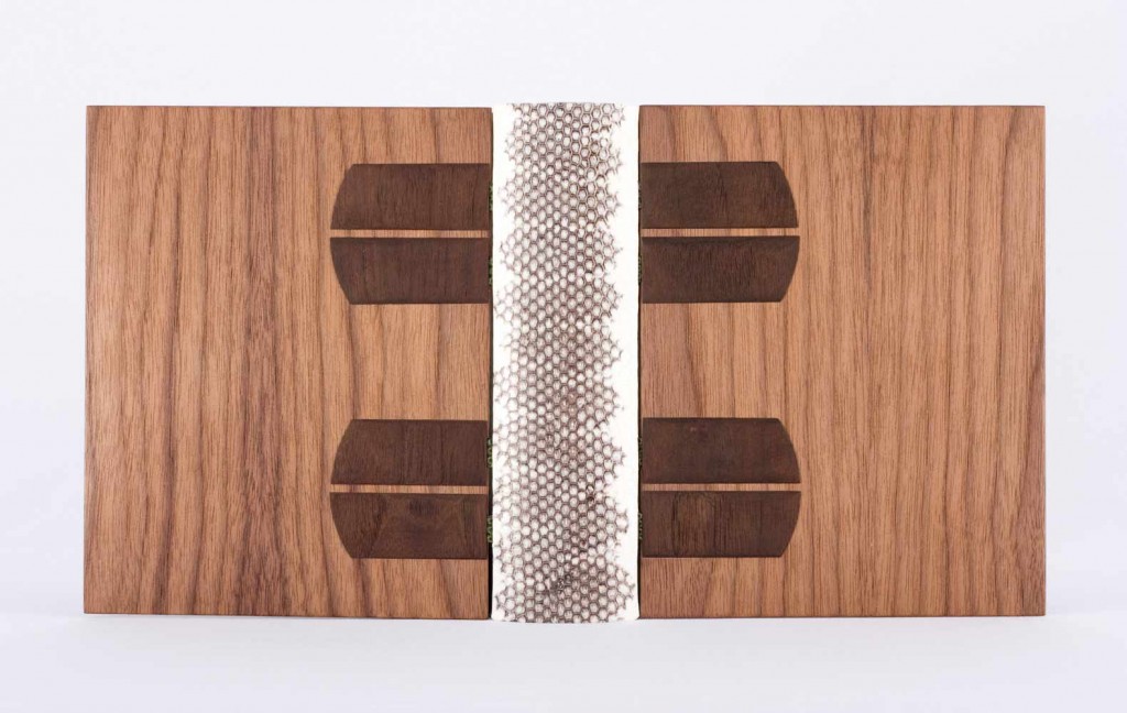
    Sonya Sheats was amongst the binders selected for the NEGBW exhibit deFINEd BINDINGS hosted at the Bromfield Gallery in Boston, MA. Bound as an open joint binding and sewn on water snakeskin and vellum tapes. The spine is white and black snakeskin and the covers are MDF and walnut veneer with dyed walnut onlays. The binding fits snuggly inside a shaped walnut slipcase. Sonya’s binding was awarded “Best Binding Structure” by North Bennet Street School

    A comment from Sonya regarding the structure of the binding: 
    Looking back, I do not think I would use an open joint structure on a book this thick. The covers essentially hang off of the book by the sewing tapes, which are hidden in a sort of de Gonet style with the dyed wooden onlays. Because of the hefty appearance of the walnut, I think it works here, but in general, I think of this structure as quite delicate and lanky. 

    pictorialwebster2-sonyasheats

    Photo by Brandon Constant.


  3. Bookbinder of the Month: Sonya Sheats

    June 16, 2013 by Erin Fletcher

    5Conjugations

    Photo by Brandon Constant

    5 Nouvelles Conjurations by Pierre Mrejen was bound by Sonya Sheats in 2010 and is the smallest book she’s ever bound at 8.5cm x 7cm (3.3″ x 2.7″). Bound as an open joint binding sewn onto eel skin and vellum tapes. The spine is brown goatskin with polycarbonate boards covered in frog skin and décor in snakeskin. Each cover uses one full frog skin.

    Sonya’s use of exotic skins has become a signature in her work and one of the reasons why I love her bindings. 

    BovaryRose

    Photo by Brandon Constant

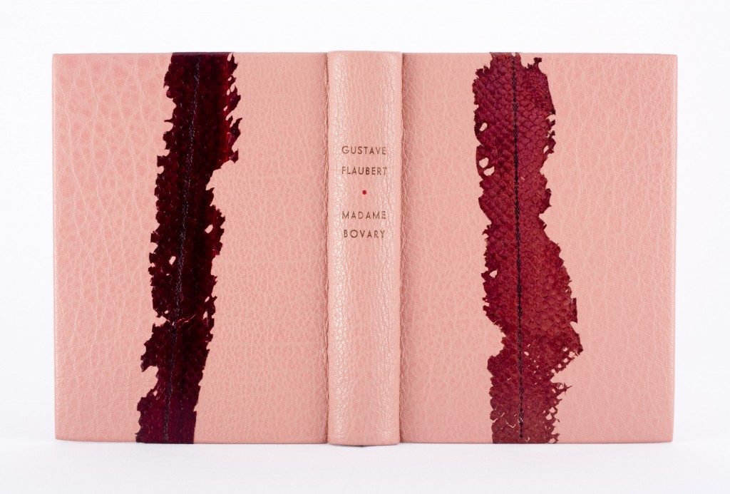
    Sonya originally bound this copy of Madame Bovary by Gustave Flaubert in preparation for a décor class taught by Florent Rousseau. However, Sonya was displeased with the work she did and immediately reworked the binding once the class was over. Sonya cut off half of the buffalo on each cover and replaced it with new leather of a noticeably different grain. To hide the seam between the new and old leather, Sonya pared salmon skin to a lace-like thinness and place them over the seam as an onlay. The seam was still quite noticeable, so Sonya blind tooled a decorative fillet over the salmon.

    A comment from Sonya: 
    This book is the one that I receive the most inquiries about on my website and in my studio. It draws the most attention for some reason, though it was made from a series of impulsive decisions. All of the shades of pink and bordeaux come straight from the illustrations inside.


  4. Bookbinder of the Month: Sonya Sheats

    June 9, 2013 by Erin Fletcher

    bienaimeraymond-sonyasheats

    Photo by Brandon Constant.

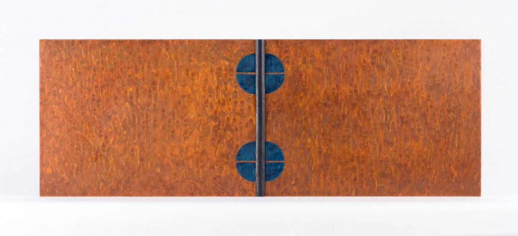
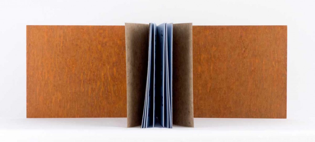
    Bien Aimé Raymond by Max Jacob with illustrations by Jean-Marie Queneau was bound by Sonya Sheats in 2007. This was Sonya’s first open joint binding using MDF and wood veneer. Sonya refers to this binding as an open joint because the covers are attached by the snakeskin and vellum sewing tapes, leaving an open (or empty) joint between the text block and the boards. It is a cased-in binding that is based on a structure that was used by Otto Dorfner in Germany in the early 1900’s.

    The covers are a dyed birch veneer with a dark blue Oasis goatskin spine. The endpapers are brown Silsuede and a brown Nepalese paper.

    bienaimeraymond2-sonyasheats bienaimeraymond3-sonyasheats


  5. Bookbinder of the Month: Sonya Sheats

    June 2, 2013 by Erin Fletcher

    paperradpoly-sonyasheats

    Photo by Brandon Constant.

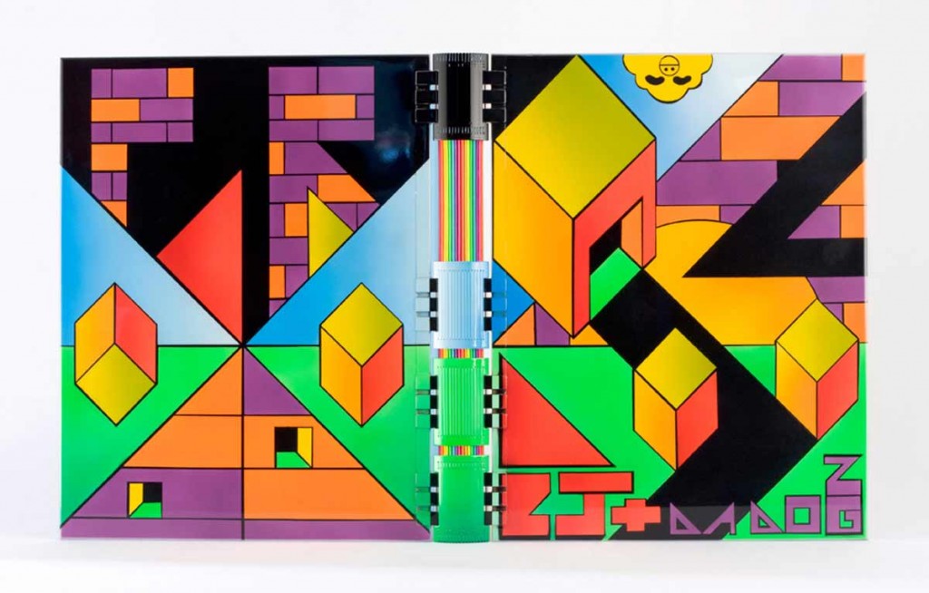
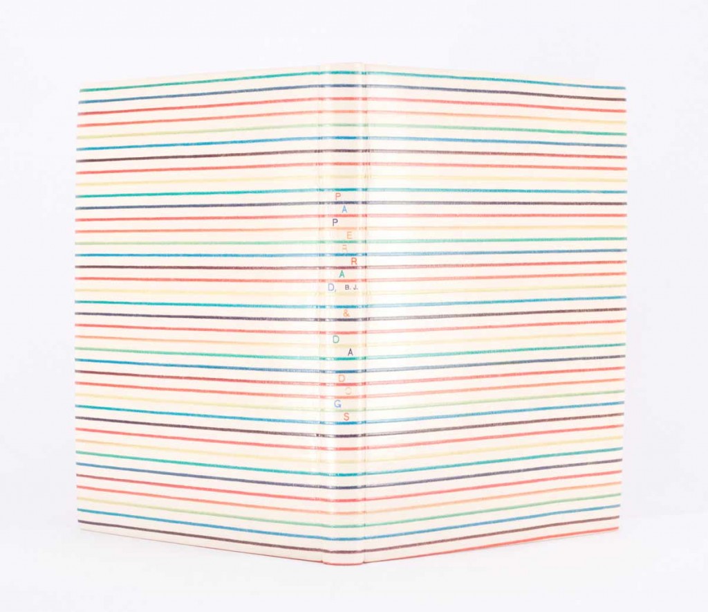
    Paperrad was an artist collective based in Boston and comprised of Jacob Ciocci, Jessica Ciocci, and Ben Jones (all fantastic friends of Sonya Sheats). Their multimedia projects use “lo-fi” visual aesthetics, bold fluorescent colors, and images from popular culture.

    In 2006, Jacob visited Sonya in France. Paperrad’s first book, BJ and Da Dogs, had just been published and he brought her a couple copies. Sonya had just finished her first apprenticeship with Edgard Claes and was about to return to Belgium to continue her studies. Jacob and Sonya thought it would be a good idea to bind Paperrad’s book, so he designed the cover while in France, and Sonya brought it with her to Belgium.

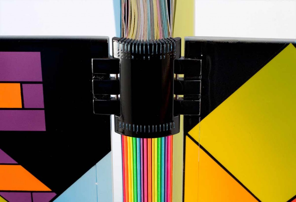
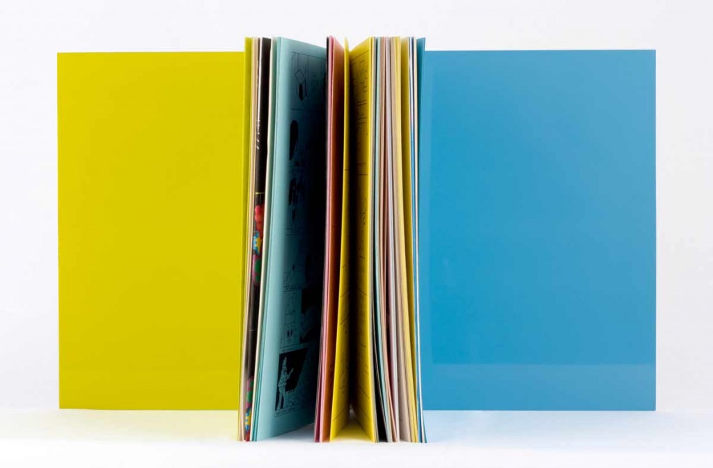
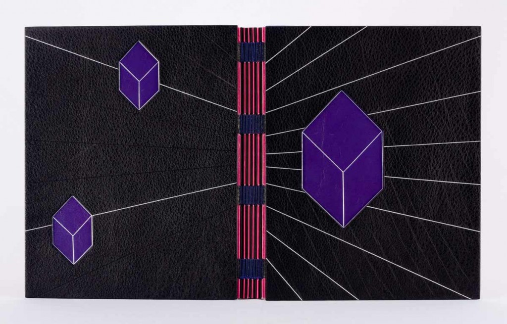
    This edition had been previously bound after publication, so Sonya dismantled the text block. To hide some wear left on the outer folds of the signatures, Sonya glued strips of fluorescent papers onto the folds. The structure for the binding is referred to as “À Creneaux” with an open spine in polycarbonate assembled in sections and PVC. The signatures were sewn with monofilament and exposed along the spine.

    A comment from Sonya:
    It will forever be a running joke between Edgard and me because he was quite shocked and unsettled by the colors in the Paperrad design. I hung up prints, templates, and color samples around my workspace, and Edgard joked that he had a hard time looking in my direction during that time. It took me about 22 hours to make 7 templates for the color blocks and to airbrush the design [with automotive paint]. 

    paperradpoly2-sonyasheats paperradpoly3-sonyasheats

    The interior of the boards were also airbrushed, one in lime and the other in a soft blue.

    paperradjourdan-sonyasheats

    Bound in 2005 for Paperrad, BJ and Da Dogs is this full embossed leather binding with colored foil tooling for the title. Below is another edition bound as an open joint binding with buffalo skin.

    paperraddiamonds-sonyasheats


  6. Bookbinder of the Month: Derek Hood

    April 28, 2013 by Erin Fletcher

    ulysses-derekhood

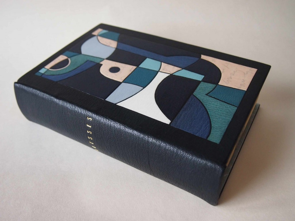
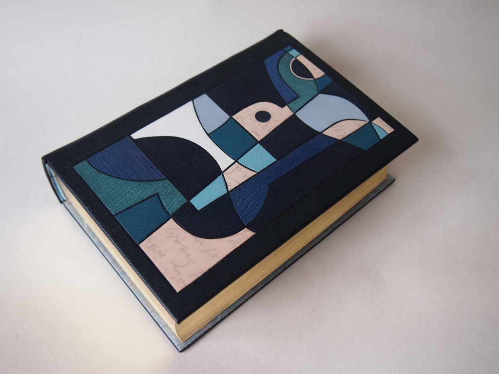
    In 2012, Derek Hood bound a copy of James Joyce’s Ulysses in full dark blue goatskin with onlays and inlays in various leathers. Printed on natural calfskin (and used as onlays) are excerpts from Joyce’s recently released handwritten manuscript of Ulysses. The book was sewn on hemp cords, which were laced into the boards. The book edges are gilt in 24kt leaf, as is the title on the spine. Endpapers are leather jointed, with Japanese Kozo doublures.

    A hand drawn map of Leopold Bloom’s Dublin by Vladimir Nabokov inspired the design. It follows Bloom’s heady journey, starting from Dublin Bay and meandering across the Liffe. The simple map is intertwined with two fractured Greek masks.

    This first edition copy of Ulysses was published by Random House of New York in 1934. 

    ulysses2-derekhood


  7. Bookbinder of the Month: Derek Hood

    April 21, 2013 by Erin Fletcher

    lookslikenothing-derekhood

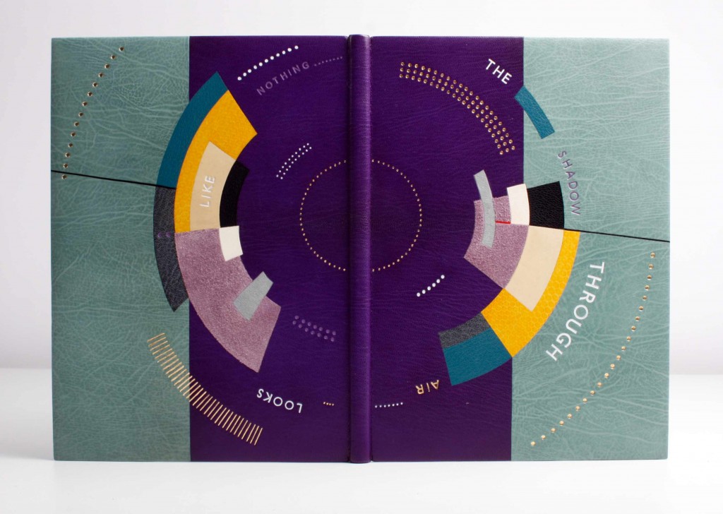
    Looks Like Nothing The Shadow Through Air was published by Circle Press in 1972 in a limited edition of 175. Letterpress printed in Times Roman on T.H. Saunders mould-made paper, the content is previously unpublished poems written by Larry Eigner between 1960-1969. The edition includes illustrated relief prints by Ronald King. 

    Derek Hood covered the binding in multiple inlaid leathers including suede, calf and snakeskin. The top edge is hand gilt in 24kt gold leaf. Lettering is tooled in white, purple and 24kt leaf. Endpapers are leather jointed with Japanese Kozo paper doublures, which are tooled with purple arcs.

    The cover artwork is a direct response to the poetry of Larry Eigner. The space between the lines, that Eigner creates, say as much to the reader as the words upon them. The circular movement reflects Eigner’s constant referral to the moon, the sun and the interplay of light between the two. The gold dots are used to emulate the keys of Eigner’s 1940s Royal manual typewriter, which he used to type all of his poetry on. The title is lettered around the book to reflect the informal style in which Eigner laid out his poetry on the page.


  8. Bookbinder of the Month: Derek Hood

    April 14, 2013 by Erin Fletcher

    phaedoofplato-derekhood


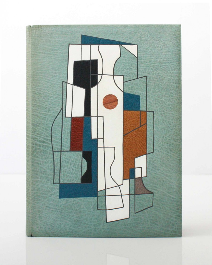
    Published by Golden Cockerel Press in 1930 in an edition of 500, this copy of The Phaedo of Plato is number 392. Written by Plato and translated into English by Benjamen Jowett, this edition also includes ornaments and initial letters by Eric Gill.

    In 2012, Derek Hood bound this copy for the Flow Gallery Exhibition. The binding is covered in light-blue goatskin with inlays of goatskin and alum-tawed calfskin. The outlines are recess onlayed with strips of grey goatskin. The book has Japanese Kozo paper doublures, which are leather jointed. The top-edge is hand gilt with the other two sides left deckled. Titling with Gill Sans hand letters are used in gold on the spine. The binding is housed in a cloth chemise and contrasting slipcase.

    The front cover shows a central abstract figure representing Socrates. The fractured image contains elements of his impending poisoning and transition from this world to the next. The muted palette and use of a wooden sphere are used to echo Socrates’ philosophical obsession with natural order. 


  9. Bookbinder of the Month: Derek Hood

    April 7, 2013 by Erin Fletcher

    revolutioninmind-derekhood

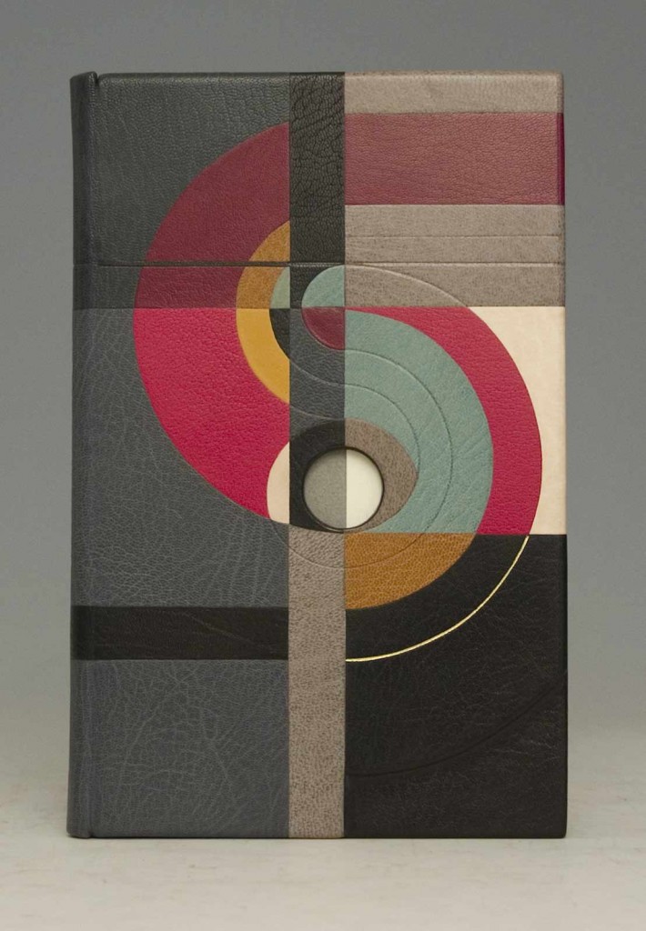
    Revolution in Mind and Practice written by Robert Owen and was published by Effingham Wilson of London in 1849. Derek Hood created this fine binding as a commission for Lord Tom Sawyer as part of an exhibition of 12 books to celebrate 200 years of Socialism. A private viewing of the books was held at the House of Lords.

    Covered in multiple inlays over sculpted boards. The design follows a fluid path based around the letter ‘S’ which represents the word Society and Owen’s revolutionary view of what it could become. The circular movement around the central hole – the minds eye – simulates the flow of his cognitive thought process.


  10. Bookbinder of the Month: Lori Sauer

    March 31, 2013 by Erin Fletcher

    topiary-lorisauer

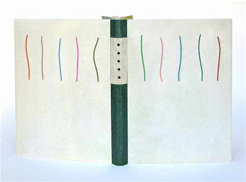
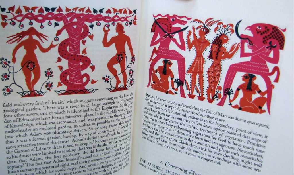
    Topiary by Cecil Stewart is about the art of clipping and sculpting foliage to maintain a clearly defined shape, like a geometric design or animal. In 1936, Topiary was published by Golden Cockerel Press in a limited letterpress edition on handmade paper with whimsical illustrations by Peter Baker Mill.

    topiary illustration

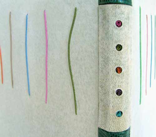
    In 2011, Lori Sauer completed a binding of Topiary in the dos rapporté structure. The binding is covered in reverse vellum dyed with leather dye. The spine is made up of 3 pieces covered in lizard skin and reverse goat. The boards have inlays of wire wrapped in silk and the spine has colured wire coils placed in cutout holes. The doublures and flyleaves are Japanese paper; the flyleaves have cutouts and ink decoration.

    The design is based around the layout of the text and the colours used in the illustrations.

    topiarydetail-lorisauer


  • My name is Erin Fletcher, owner and bookbinder of Herringbone Bindery in Boston. Flash of the Hand is a space where I share my process and inspirations.
    The StudioNewsletterInstagramEmail me
  • Archives