RSS Feed

‘feature book of the week’ Category

  1. Bookbinder of the Month: Karen Hanmer

    December 8, 2013 by Erin Fletcher

    bluestem2-karenhanmer

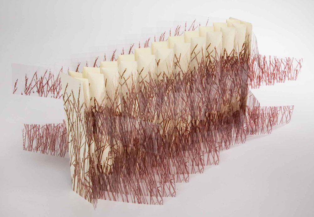
    The flag book structure has become a reoccurring model in Karen Hanmer’s work. She has quite an eye for transforming flat imagery into interesting movable objects. Bluestem was created in 2006 in a small edition of 25, the work is inspired by Willa Cather’s My Antonia and includes a quote printed on the rear panel.
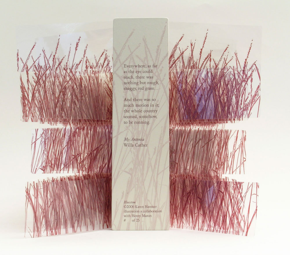
    bluestem-karenhanmerThe grass imagery is inkjet printed on polyester film and bound on either side of the panels creating a double-sided variation on the flag book structure. As you open and close this book a nice rustle is created by the movement of the pages. It’s quite simple and beautiful. 

    Inspired by the work of Hedi Kyle, you have, on several pieces used the flag book structure. How does this structure best represent your concept?
    Women and Cars by Susan King was among the first artists’ books I saw, and it has remained an inspiration. King’s use of the flag book structure gave me a model for everything I wanted to accomplish when making a non-codex book. It pairs multiple narratives with photographs, can be held in the hand and read like a traditional codex, opens fully enough to look commanding and compelling on exhibit, and gives viewers enough to enjoy that they will not focus on the book being printed digitally if that is an issue for them.

    The Bonefolder chose flag books as the theme for our 2008 online Bind-O-Rama exhibit. Although my previously editioned flag books were quite elaborate with multiple texts and imagery on inside and outside of the spine and boards, Bluestem appeals to my minimalist side. There’s almost nothing there: just a few words of text from Willa Cather’s My Antonia on the rear board and lines representing grass printed on clear polyester film and paper, yet the piece also effectively represents the boundlessness of the prairie.
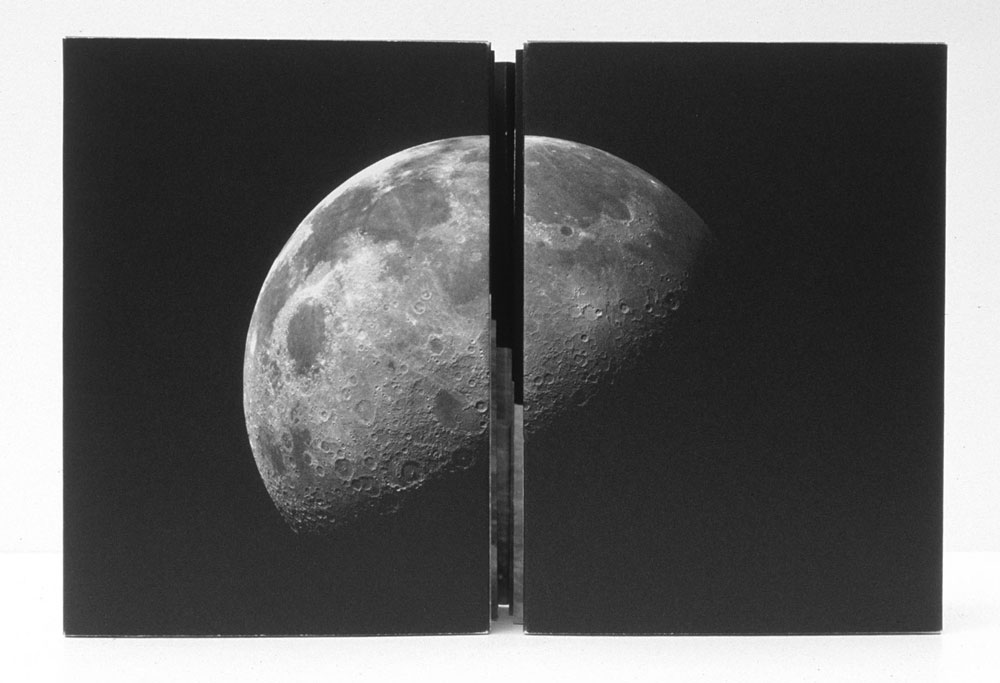
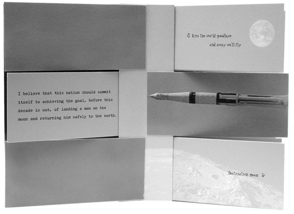
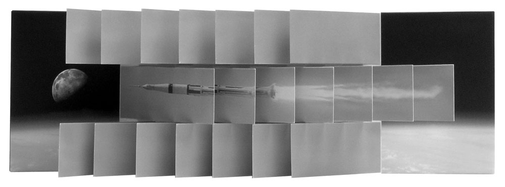
    destinationmoon-karenhanmerCreated in 2003, Destination Moon, is another simple flag book structure that involves a complex layering of material related to the moon. Archival images pertaining to the Apollo Manned Space Program are on the reverse of John F. Kennedy’s “Man on the Moon” speech in addition to the song lyrics for Roy Alfred and Marvin Fisher’s Destination Moon, about a romantic journey to the moon. 

    destinationmoon2-karenhanmer

    But when the book is fully opened, all the viewer sees is an image of the space shuttle on its way toward the moon.

    destinationmoon3-karenhanmer

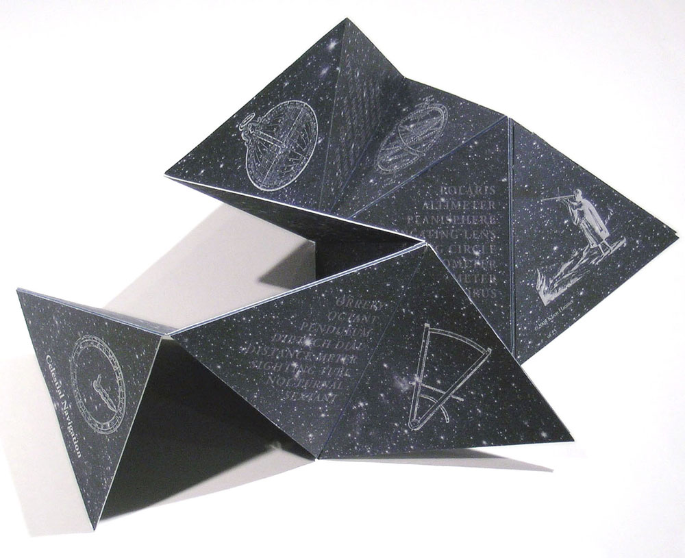
    Besides the flag book, Karen has played around in a variety of movable and folded structures. In her work Celestial Navigation, the triangular pages can be held in the hand and read like a traditional book or unfolded to reveal star charts. The structure is quite playful and can be folded into fantastic sculpted shapes. 

    celestialnavigation-karenhanmer

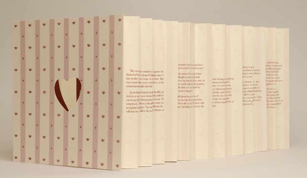
    In Pride Prejudice Passion: Tunnel of Love, Karen appropriately uses the tunnel book structure. This works combines text from the classic romance novel by Jane Austen with images cut from covers of the modern romance novel. As the term suggests, the content can be viewed through the length of the structure, similar to peering down a tunnel. 
    tunneloflove-karenhanmer


  2. Bookbinder of the Month: Annette Friedrich

    August 25, 2013 by Erin Fletcher

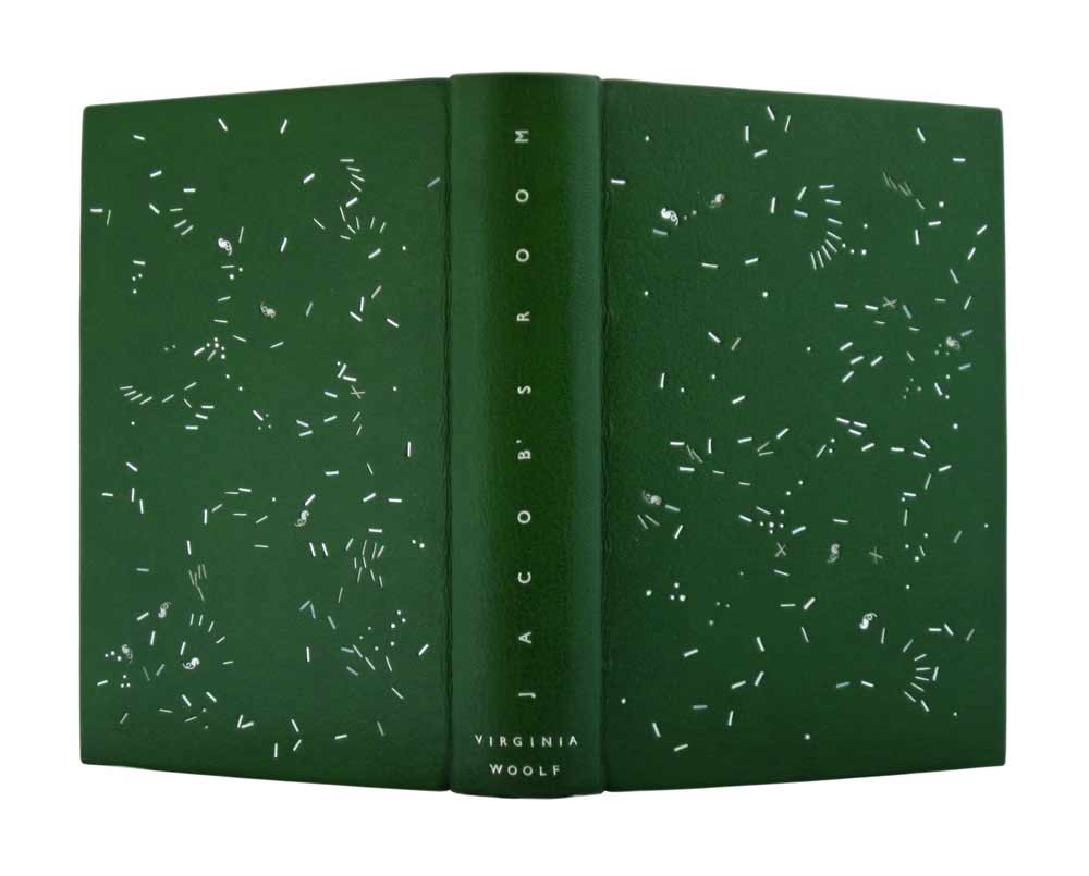
    jacobsroom-annettefriedrich

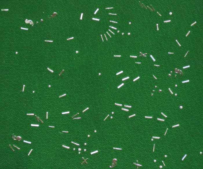
    As Annette Friedrich continues with her ongoing Virginia Woolf series, in 2012 she bound Woolf’s third novel Jacob’s RoomThis 1920’s Hogarth Press edition of Jacob’s Room was bound in full leather green goatskin. The decorative tooling on the front and back covers are done in three shades of silver, white and grey, which offer wonderful subtleties to the design. The title is tooled in matte silver along the length of the spine with the author’s name tooled in silver at the tail.

    jacobsroom2-annettefriedrich

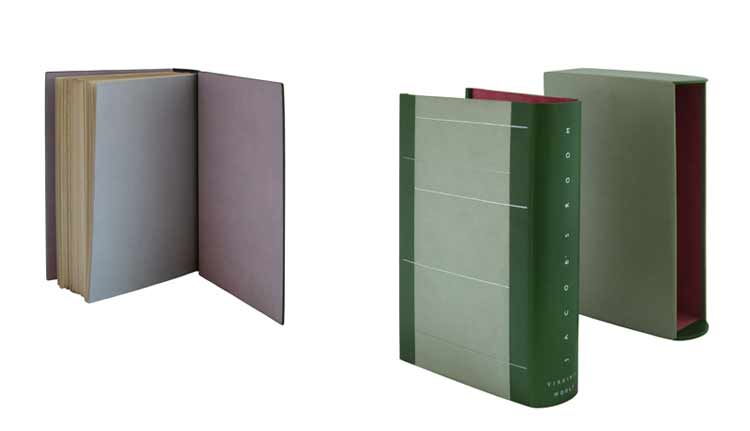
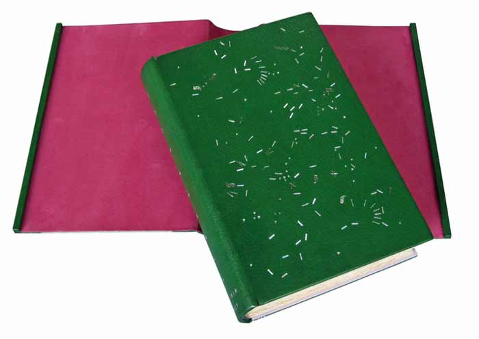
    jacobsroom5-annettefriedrichThe interior of the covers is lined with paper bord-a-bord doublures in silver rose and the fly leaves are in silver. All papers used are hand dyed. The binding is housed in a silver and green chemise with linear tooling across the sides in three shades of silver. The interior of the chemise is lined with a shockingly, vibrant pink. The spine of the chemise is tooled to mimic the spine of the binding.

    jacobsroom4-annettefriedrich


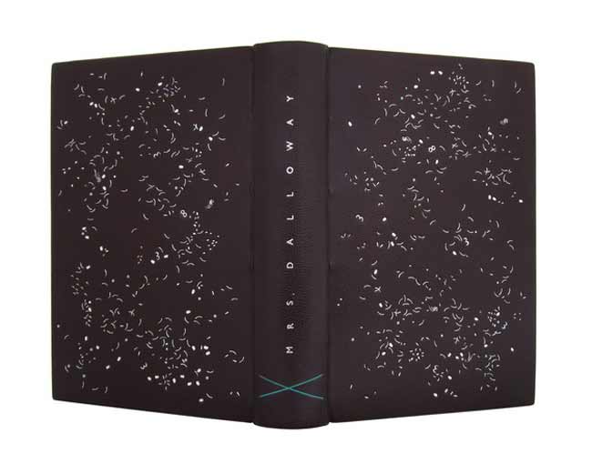
    Annette has recently added Mrs. Dalloway to her website, the fourth book in the ‘on a stroll with Mrs. Woolf’ series. It was quite a wonderful surprise to see as I’ve been frequenting her site this month. The design is similar to Jacob’s Room, with the random tooling appearing more dense and chaotic. I look forward to seeing the last five of the series! Keep up the inspiring work, Annette!mrsdalloway-annettefriedrich


  3. Bookbinder of the Month: Annette Friedrich

    August 18, 2013 by Erin Fletcher

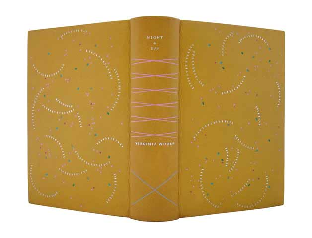
    nightandday-annettefriedrichNight and Day is Virginia Woolf’s second novel and the second book Annette Friedrich has bound for her series ‘on a stroll with Mrs. Woolf’.

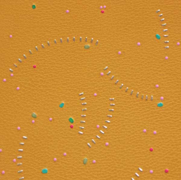
    In 2011, Annette bound this 1920 George H. Doran Company edition in full yellow goatskin. The design on the covers is tooled with platinum leaf, rose, pink and three shades of green. The spine includes the title and author tooled in platinum in addition to crosses in pink and silver. So far, this binding is my most favorite from the Virginia Woolf series. I love the whirling platinum curves and the scattered bits of color throughout the cover.

    nightandday2-annettefriedrich

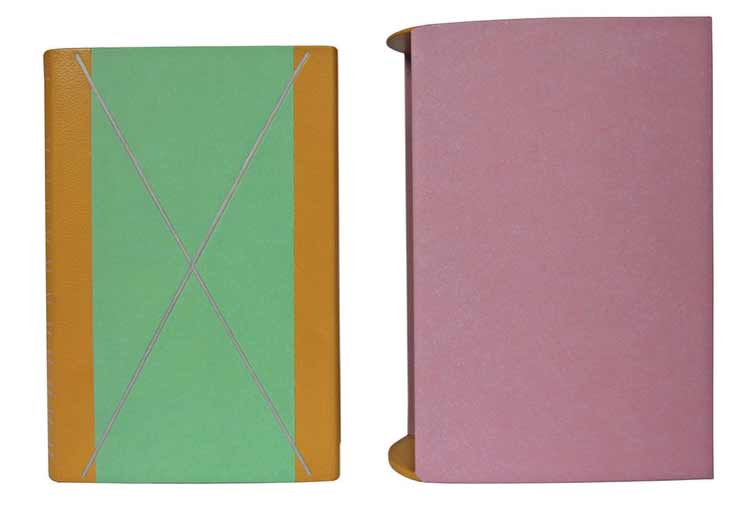
    The book is housed in a green chemise with matching yellow goatskin. A silver paper cross inlay appears on the chemise, this paper matches the endpapers. The slipcase is covered in rose paper. All papers used are hand-dyed. nightandday3-annettefriedrich


  4. Bookbinder of the Month: Annette Friedrich

    August 11, 2013 by Erin Fletcher

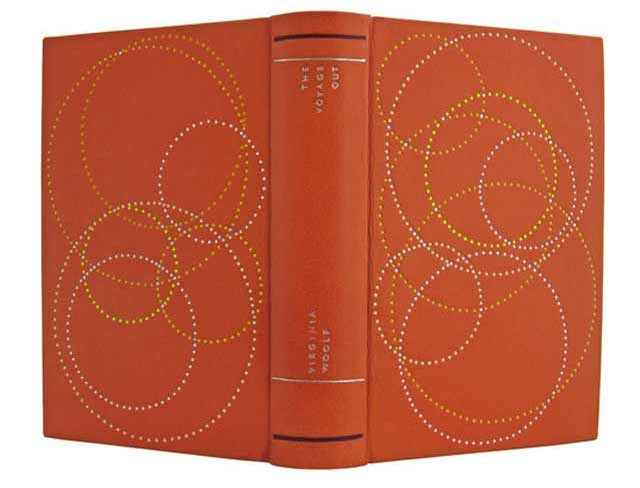
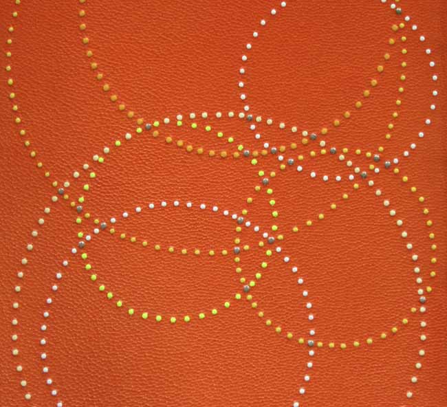
    voyageout5-annettefriedrichIn 2011, Annette Friedrich embarked on her goal of binding all nine of Virginia Woolf’s novel starting with her first book, The Voyage Out. Annette bound a 1929 Hogarth Press edition (first imprint of the unified edition) in full orange goatskin. Tooling on the covers is done with platinum leaf and four shades of yellow. The author’s name and title are tooled on the spine in platinum, in addition to two horizontal lines at the head and tail in platinum and purple.

    voyageout2-annettefriedrich

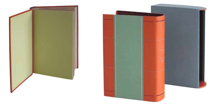
    The book is housed in a chemise covered with hand-dyed green paper and matching orange goatskin. The slipcase is covered in a hand-dyed blue paper. voyageout6-annettefriedrich


  5. Bookbinder of the Month: Annette Friedrich

    August 4, 2013 by Erin Fletcher

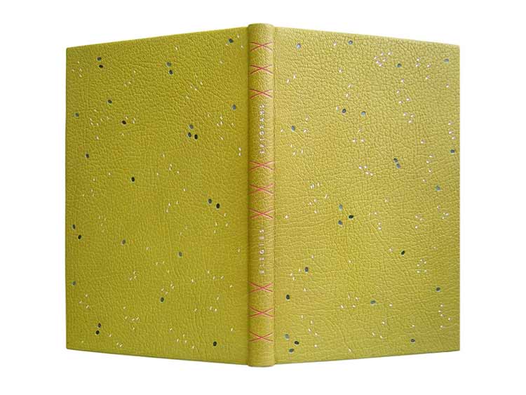
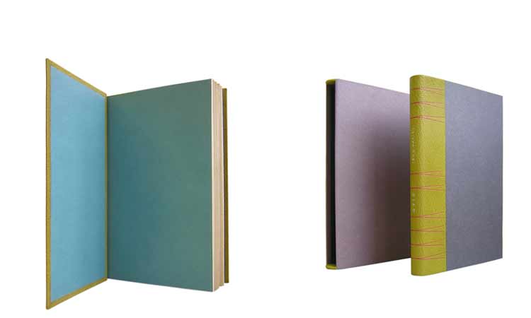
    ovidselegies-annettefriedrichIn 2010, Annette Friedrich bound Ovid’s Elegies and Epigrams of Sir John Davies by Ovid and Sir John Davies with woodcut illustrations by John Nash. This is one of my favorite bindings of Annette’s due to the rich, vibrant colors and the contrast between the smooth tooled lines and the textural grain of the leather.

    Bound as a full leather binding in yellow levent goatskin. Tooling on the covers is done in three shades of grey and silver. The spine is divided into three segments by crosses tooled in pink; the title is centered in between the crosses in silver. Matching leather joints and endpapers are light blue. The fine binding is housed by a chemise and slipcase covered in the same yellow goatskin and blue-grey and purple hand-dyed papers. 

    This binding is held in a private collection in Southall, United Kingdom.

    ovidselegies2-annettefriedrich

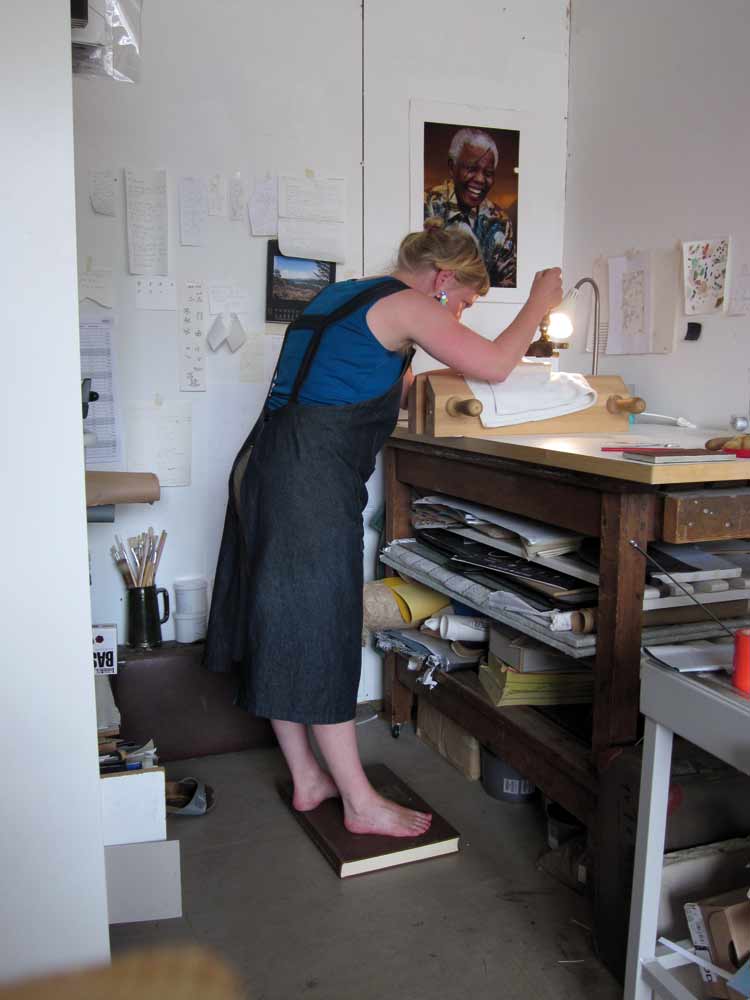
    In addition, Annette sent along this image of herself tooling the spine of Ovid’s Elegies during the sweltering heat. 

    toolingovid-annettefriedrich


  6. Bookbinder of the Month: Coleen Curry

    July 28, 2013 by Erin Fletcher

    tamalpaiswalking-coleencurry

    Every three years, the Guild of Book Workers offers a national traveling exhibition based on a general theme. In June 2012, Horizon, the most recent GBW exhibition began it’s journey across the nation starting at the University of Kentucky. The exhibition is currently on it’s way to the University of Denver for display from August 1st – October 31st. You can check out the rest of the schedule here

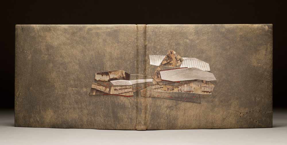
    Every day, Coleen Curry runs the trails of Mt. Tamalpais. This landscape is her backyard, her horizon; she can catch a glimpse of the mountain from her bindery windows. The text of Mt. Tamalpais echoes Coleen’s feelings about the mountain-scape and therefore, she chose to represent this horizon through texture.

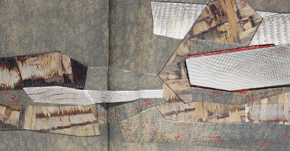
    Bound as a French-style fine binding, sewn on cords with laced-in boards. Covered in full goatskin leather that has been sanded, distressed and dyed with matching edge to edge doublures. The slopes of Mt. Tamalpais are represented with collaged horsetails, that Coleen collected from the watershed, dried and pressed. To celebrate the fog that wraps around the ridges and the California poppies and Indian paintbrush which smatter the slopes, Coleen painted and blind tooled lizard inlays and onlays.

    When I toured this exhibition at the Utah Museum of Fine Arts, I was in awe of Coleen’s binding. Because her work is so textural, her bindings appear even more vibrant and animated in person. 

    tamalpaiswalkingdetail-coleencurry


  7. Bookbinder of the Month: Coleen Curry

    July 21, 2013 by Erin Fletcher

    fantasynonsense-coleencurry

    In 2012, the Rocky Mountain Chapter of the Guild of Book Workers put on a juried set-book exhibition which was held in conjunction with the Standards of Excellence conference at the J. Willard Marriott Library at the University of Utah in Salt Lake City. The set-book, Fantasy and Nonsense, is a collection of poems from 19th century American poet James Whitcomb Riley with peculiar wood engravings by Berrot Hubrecht. The text was letterpress printed on handmade paper in an edition of 230 from Tryst Press.

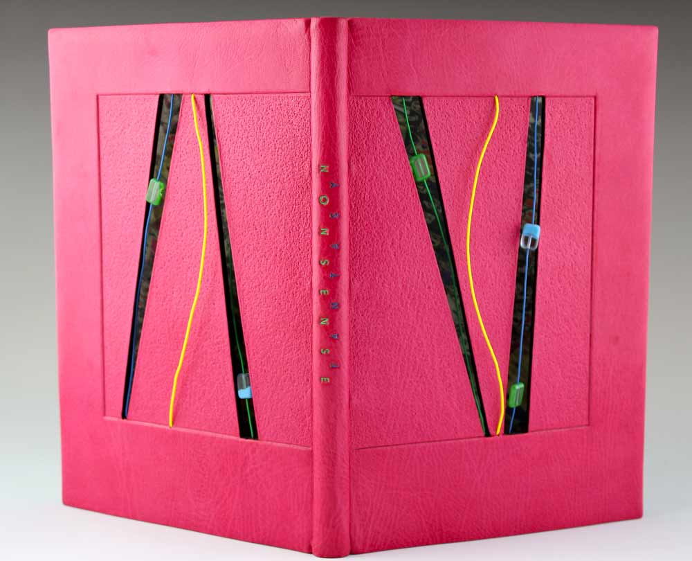
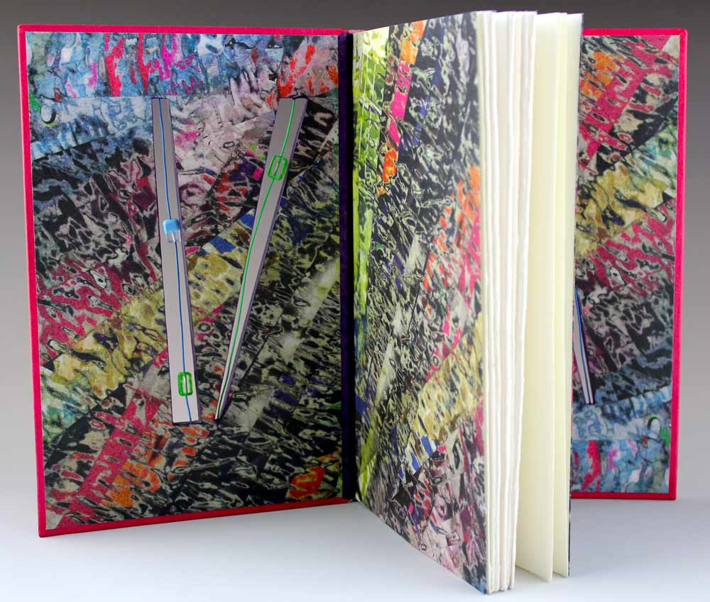
    The first prize went to Coleen Curry’s traditional French-style fine binding covered in a custom-dye pink Harmatan goatskin. Sewn on 4 cords with laced-in boards. The front and back cover cutouts have embedded electrical wires strung with floating glass beads. The decorative endpapers are made by Coleen; a collage made by laminating magazine strips, then sanding and painting the surface. The finished collage was then scanned and inkjet printed onto arches text wove. The bold color palette is a reflection of the whimsical nature of the poems and illustrations.

    fantasynonsense2-coleencurry


  8. Bookbinder of the Month: Coleen Curry

    July 14, 2013 by Erin Fletcher

    desertdreams-coleencurry

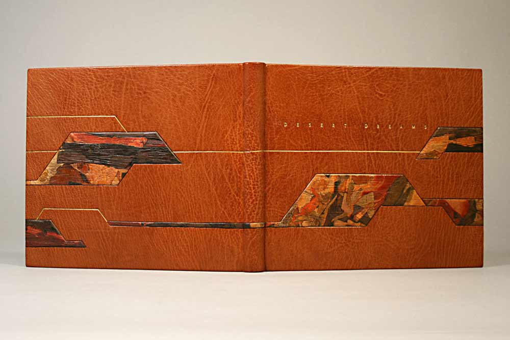
    West of the Plains was a juried exhibition put on by the Rocky Mountain Chapter of the Guild of Book Workers between 2008-09. Coleen Curry submitted two fine bindings to this exhibition, Desert Dreams by Lawrence G. Van Velzer with illustrations by Peggy Gotthold and Grand and Sublime Scenery by W.W. Elliot. 

    In 2008, Desert Dreams was bound as a traditional French-style fine binding, sewn on 5 cords with laced-in boards. Bound in Harmatan goatskin with matching doublures and suede fly leaves. Lacunose-style sanded leather raised onlays decorate the covers. Blind and gold leaf tooling, title is hand tooled with golf leaf. The head edge is gilded. The binding is housed in a clamshell box lined with ultra suede and covered in ‘Duo’ cloth using magnets for closure. A colored agate slice decorates the box cover. 

    Coleen was inspired by the vast mesa in Utah. While she drives to Telluride from California, she often travels through an area of Utah called the Paradox Valley. The colors on the binding are that very mesa. Coleen is excited about the lacunose technique because it so easily creates a feeling of landscape and motion. 

    Laura Wait acted as an exhibit juror and wrote quite the review of Coleen’s work: “Californian Coleen Curry’s binding “Desert Dreams”, is perhaps the finest example of traditional French binding in the show, with leather doublures, suede flyleaves and raised onlays. It also opens well!”


  9. Bookbinder of the Month: Coleen Curry

    July 7, 2013 by Erin Fletcher

    grandandsublimescenery-coleencurry

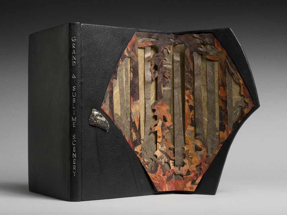
    W.W. Elliot’s Grand and Sublime Scenery was bound by Coleen Curry in 2008 as a French-style fine binding, sewn on cords with lace-in boards. Covered in black Morocco goatskin with matching edge to edge doublures; cover has an embedded Colorado agate. The head edge is decorated with graphite and title is hand-tooled in palladium. 

    The book is about the grandeur of the Sierra Nevada, which inspired Coleen to create a structure that would excite awe and showcase the timeless expanse of the landscape. The front cover panel is held in place by magnets and opens three-quarters outward to reveal elements of rock and giant redwood trees. The interior panel is designed with a layer of blind tooled lacunose (sanded leather) and two layers of Japanese paper.

    In 2009, Coleen’s binding was selected for the Guild of Book Workers traveling juried exhibition Marking Time. The exhibition traveled throughout the country until March 2011.


  10. Bonus // Bookbinder of the Month: Sonya Sheats

    June 30, 2013 by Erin Fletcher

    oiseaumendelssohn-sonyasheats

    Photo by Brandon Constant

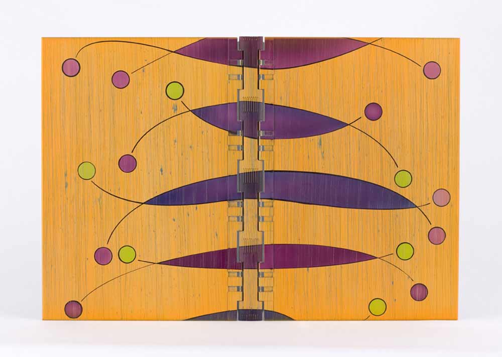
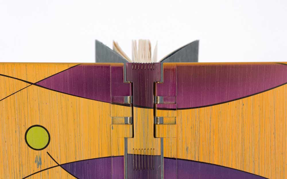
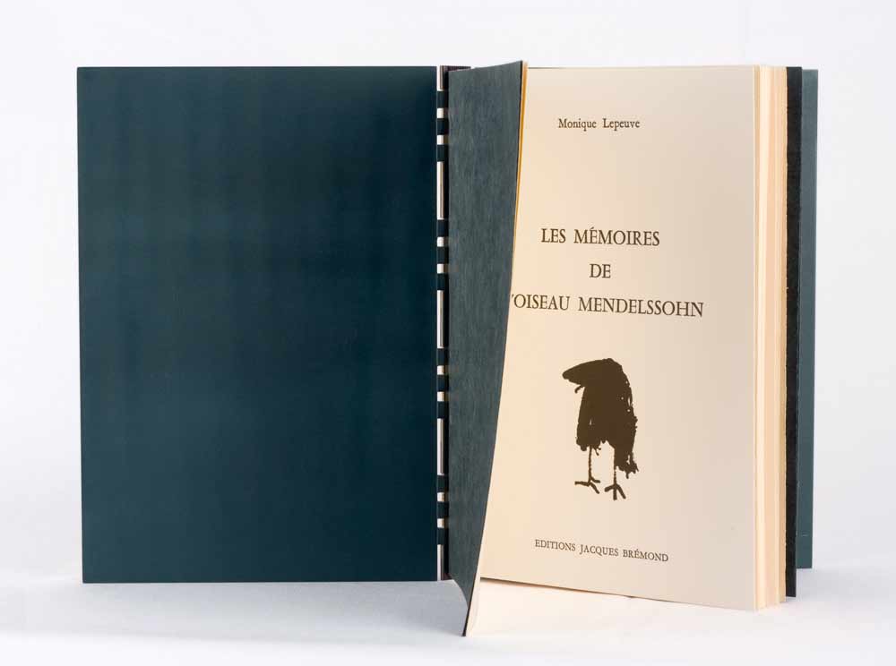
    Les Mémoires de L’Oiseau Mendelssohn by Monique Lepeuve was bound by Sonya Sheats in 2005 and was her first polycarbonate binding made during her first apprenticeship with Edgard Claes in Belguim. It tells the story of a bird by the name of Mendelssohn, who introduces the reader to the incredible characters in his family.

    This style of binding is referred to as “À Creneaux” and is archival in the sense that no glue or paste is applied to the text block. The signatures are sewn directly to the PVC spine with monofilament and could safely be removed by simply cutting the monofilament. The hinge between the polycarbonate covers and PVC spine is made from a spring-loaded watch pin.

    Sonya talks about her process for creating the airbrushed covers:
    The painted covers were done using two different processes. First, I applied four coats of paint with an airbrush (red, blue, white, and yellow ochre), and while these coats were all still wet, I took a steel brush and lightly scraped the paint. This created the fine bamboo-like grain of the design. Second, I used a series of templates to mask portions of the covers and airbrushed feather-like forms in shades of purple, circles in purple and lime, and black contour lines throughout the design.

    oiseaumendelssohn3-sonyasheats

    Photo by Brandon Constant


    oiseaumendelssohn2-sonyasheats

    Photo by Brandon Constant 


  • My name is Erin Fletcher, owner and bookbinder of Herringbone Bindery in Boston. Flash of the Hand is a space where I share my process and inspirations.
    The StudioNewsletterInstagramEmail me
  • Archives