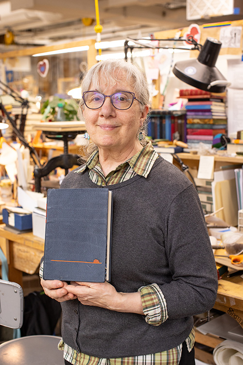
Since moving to Austin, I miss out on establishing relationships with the students at North Bennet Street School (NBSS) as they navigate through their two years in the program. Therefore, these annual set book interviews have now become even more valuable to me. Speaking with each of the graduating students on their approach to the set book project gave me a glimpse into their personalities and creative influences. We also spoke about how they found their way to North Bennet to attend the Bookbinding program and where they see themselves after graduation.
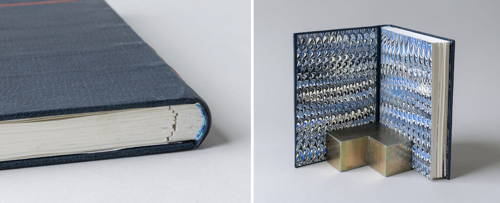
The students were presented with John Steinbeck’s Of Mice and Men this year. This American classic is simultaneously taught in most high schools while also becoming one of the most challenged books of the 21st century according to the American Library Association due to its vulgar language, racism and sexism. I found that many of the students who read this novella in high school chose not to revisit it in preparation for this project. However, many of the students could agree that Steinbeck is a great writer and found his language about the landscape of California to be the most inspiring. This particular edition from the Folio Society presented a unique challenge with it being printed on heavyweight paper. In order to create a more flexible binding, several of the students explored ways of incorporating stubs into their final binding. The text block also included a set of prints which were either incorporated into their binding or given separate housing or left out entirely.
The student’s bindings are on display in the 2024 Exhibition: Then & Now at North Bennet Street School through August 10th. To celebrate the 10 years since moving the school into its new expansive building at the entrance of the North End, this exhibit explores the personal evolution of the students and alumni by showcasing their work before and after their time at North Bennet.
As always, the students presented such thoughtful consideration to their designs, choice of materials and techniques used. The students had fresh ideas to their approach to design and it was invigorating to discuss their experiments, successes and challenges. I hope you enjoy reading these interviews and please visit the exhibition to see these wonderful bindings in person. A big thanks to Jo Sittenfeld for photographing the students with their bindings and to NBSS for photographing the bindings! If you want to learn even more and see some behind-the-scenes images, check out this article: The Journey of a Set Book.
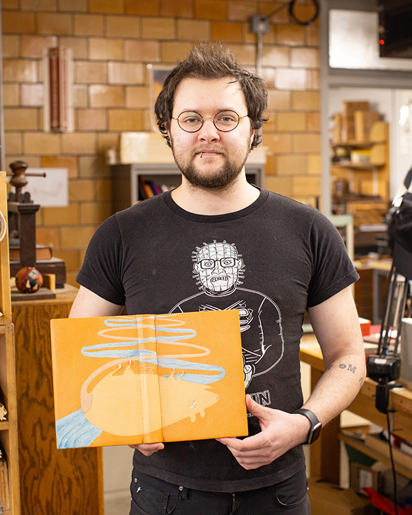
Fox Allen
Fox Allen Bindery
@foxallenbindery
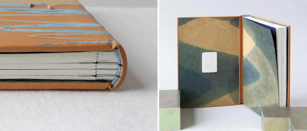
The design on Fox’s binding was spurred by his emotional connection to the text and Steinbeck’s use of color as a descriptor. The design you see below started out as a simple doodle as Fox began to play around with ideas. The dead mouse is the reader’s introduction to Lennie, a character who struggles with social cues and independence. He often strokes the soft fur of animals to help calm his nerves. However, unconscious of his own strength Lennie ends up killing each of these creatures that provide him with comfort. A habit that begins with mice and escalates throughout the book until he kills a woman.
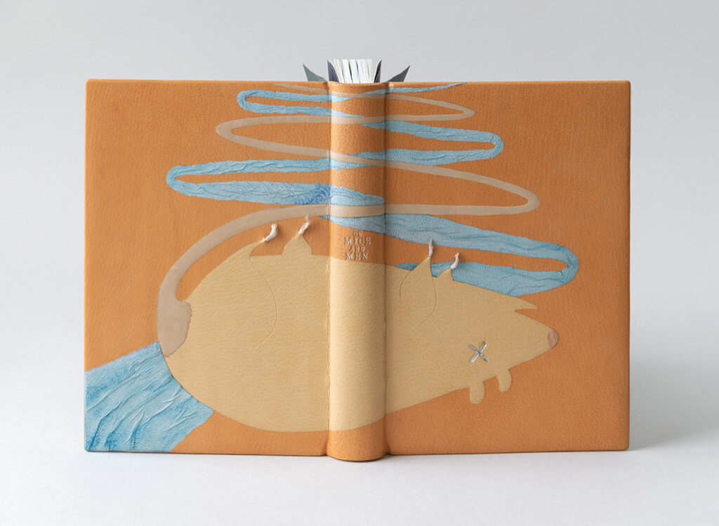
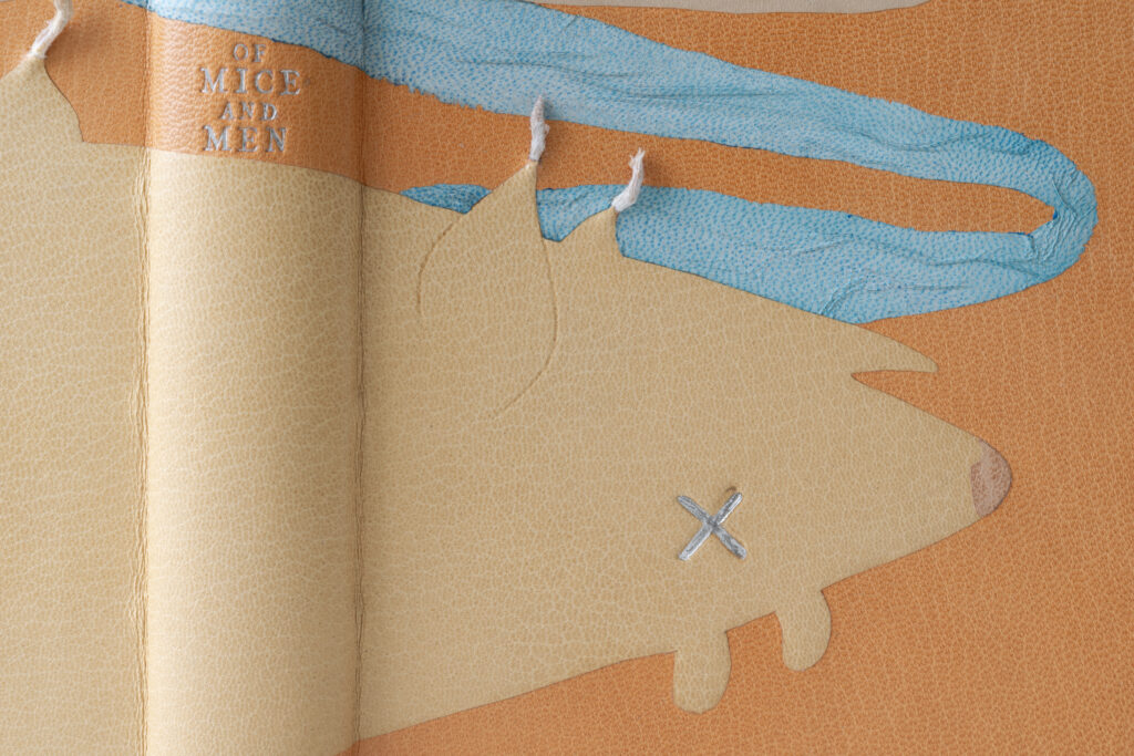
Like many of Fox’s classmates, he too was inspired by Steinbeck’s use of color and selected a color palette based on the text. The body of the mouse is a cushioned onlay cut from a beige goatskin with an undyed calfskin onlay for the tail and pinkish goatskin for the nose. The tail zigzags up towards the head edge intertwined with a blue goatskin onlay attached with the suede side up and wrinkled to show the flow of water. All elements are set on a background of tan goatskin. In lieu of an eye, Fox uses that iconic letter X indicating death. Using a handmade finishing tool, the eye is tooled in palladium. The tool’s irregular surface mimics the look of a pen scribbled deep into paper.
The most surprising element of this binding are the feet protruding from the cover. Fox collaborated with a taxidermist friend to get these little feet from feeder mice. The feet are attached in a similar fashion as an ascona onlay. A small opening is cut and the feet are fed under the leather and secured with PVA, Fox affectionately called these “skin caves”. The title is tooled between the belly of the mouse and the river in palladium.
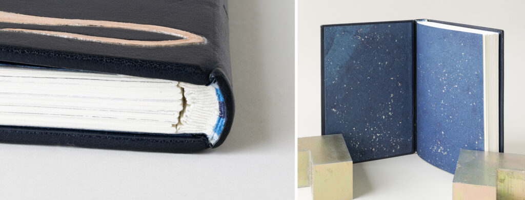
Fox and I spoke at length about his many experiments with stubs before landing on the perfect construction for this particular text block. The stubs are laminated sheets of yupo paper, which is used commonly for watercolor due to its non-porous surface. The yupo paper was laminated together with heat-set tissue. The separate illustrations were added to the text block with their own unique stub constructed using museum board sandwiched by leather. This style of stub made it near impossible to round and back in the traditional way. So Fox created shoulders with a small rectangular stub encased in a thin layer of yupo and shaped the spine with a micro-plane. Since the yupo cut so easily with the plane, Fox had to be very careful when shaping the spine, so as not to lose the shoulders or create an irregular round. The spine was lined in the traditional manner, with a hollow for the final layer to create a soft base for tooling the title later on.
The endbands are sewn through a laminate of paper and sized muslin around a rectangular core, as it was not possible to sew through the yupo stubs. Using silk threads in powder blue, navy and yellow, the design on the endbands matches the division of materials used for the stubs. The paste downs and fly leaves are Cave Paper dyed with that familiar swoosh of indigo and pomegranate rind. Inlaid on the inside of the front cover is a patch of mouse fur (also supplied by Fox’s taxidermist friend). This creates a moment for the reader to sympathize with Lennie or perhaps invites the reader to embrace the same calming technique as they read through this tragedy.
Fox seemed almost destined to attend the full-time program at North Bennet. He began making books when he was 15 with his friend who ultimately became the taxidermist mentioned above. This became a full circle moment for Fox and he wants to continue exploring unconventional materials in future work. Fox had the opportunity to intern with Chena River Marblers to conduct research and experiments on the tiger’s eye pattern. Ultimately landing on a formula to make this challenging pattern easier to create and more accurate to historical examples. Fox also had the opportunity to learn under the great Daniel Kelm. With all this experience and two years at North Bennet under his belt, Fox has a goal of finding a full-time job in the field while also maintaining a studio space where he can continue to experiment and make creative work.
Louise Capizzo
It was great to reconnect with Louise during this interview. She attended of few workshops that I had taught at North Bennet prior to entering into the full-time program. Making books for the first time in my class, she felt her whole body light up! A feeling that many book people can recognize. As we discussed the text and how it inspired her design, it became apparent that her design was also restricted by her long daily commute from Maine. In order to complete the binding on time and work in her skill-set, Louise felt that simple was better. After reading Of Mice and Men, Louise found similarities to the injustices faced by many marginalized and working class people of today to the story of Lennie and George. Both men had a dream to live a simple life on a their own farmland, but without the support of society they would never see this dream come true.
Working with such a simple design, it was important for Louise to choose a leather with a pronounced grain to cover the entire binding. A road is depicted on the front cover using an ascona onlay in a vibrant orange leather. The color is meant to evoke the heat of this era and the hardships of working outdoors. A terra cotta goatskin tooled onlay is placed on top of the road in the shape of a mouse, with its blind tooled tail sweeping below the road. Louise added the mouse to represent two things: there is the obvious connection to the mice both loved and unintentionally killed by Lennie early on in the story. The second connects back to the theme of injustice. Mice and rats are often seen as pests, creatures that are ignored until they become a nuisance to society. Unfortunately, this sentiment has also been applied to people experiencing homelessness, immigrants, marginalized communities and in regards to the book, itinerant workers. Rather than creating policies to provide safety and assistance they are often just swept away from the public’s eye.
Of Mice and Men and Steinbeck are tooled on separate labels cut from the same terra cotta leather as the mouse. The text is blind tooled and intentionally staggered to once again shine a light on our imperfect society.
Since the landscape is so crucial to the plot, Louise felt it necessary to represent it somewhere in her design. And as someone who has spent the majority of her life in Maine, Louise wanted to capture the contrast of the west coast sky in her design. The single-core hand-sewn endbands are stitched with bands of light blue and sky blue using silk threads to evoke the sky of Salinas. Upon opening the binding, you are flooded with bright blues marbled with black and white pigments to pair with the endbands. Louise made these marbled papers during a workshop with Chena River Marblers that took place earlier in the year.
During our conversation about her journey to becoming a full-time student at North Bennet, it became quite clear how impactful those Community Education classes were to Louise back in 2018. She always loved to craft and build things with her hands. Her love of books led her to get a masters degree from Simmons University in 1999 and work as a librarian before retiring to attend North Bennet. After graduation she plans to open a small bindery in order to service public libraries in rural areas of Maine, who are in desperate need of conservation services.
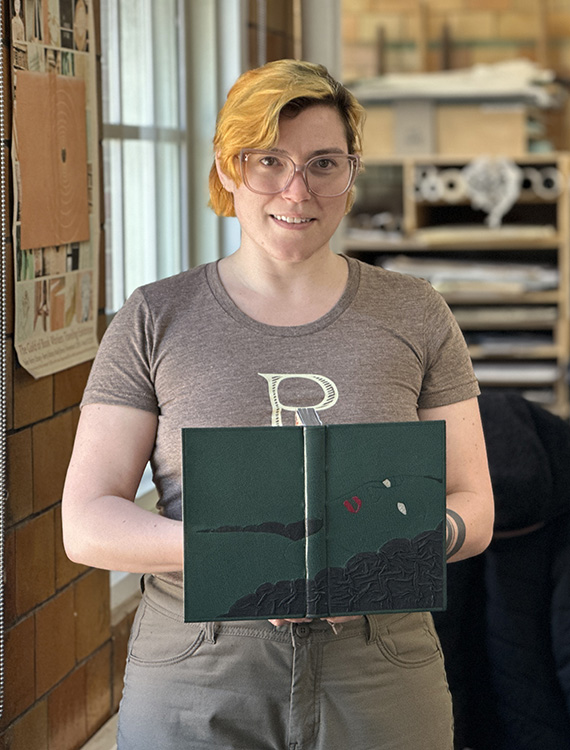
Elizabeth Grab
Rambling Rambler Press
@ramblingrambler
Even though Steinbeck is considered an American classic, Of Mice and Men is brimming with racism and sexism. Elizabeth used the latter within her design to put a spotlight on Lennie’s final victim. The character in question was never given a name and is simply referred to as Curley’s wife. In a New York Times article, Steinbeck explained that she is “not a person, but a symbol. She has no function, but to be a foil – and a danger to Lennie.” Her ambitions of becoming a star on the silver screen are vanquished and she is cursed to live a meaningless life with an abusive husband.
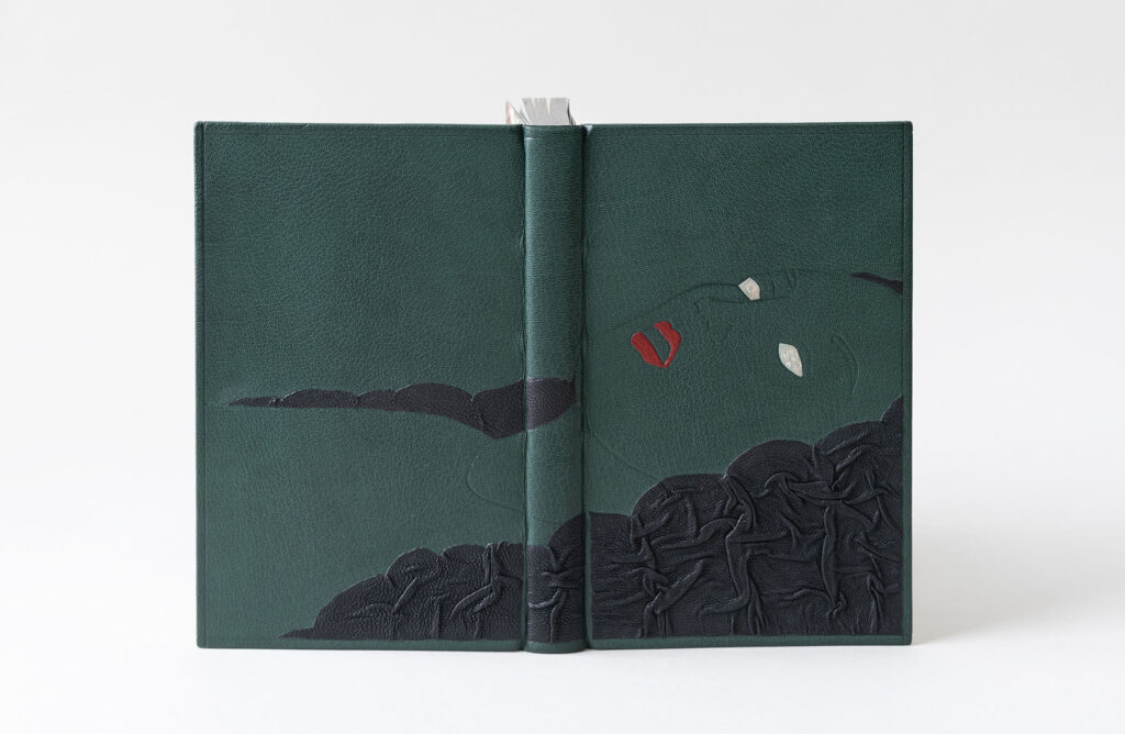
Curley’s wife falls victim to Lennie’s strength when she allows him to stroke her hair. When she becomes frightened, Lennie in turn becomes alarmed and inadvertently kills her. To highlight this part of the story, Elizabeth created a tactile experience on her binding by using a puckered leather technique inspired by the work of Tini Miura and Anthony Cains. The black goatskin is wrinkled and folded within a tooled outline and manipulated by hand in such a way to resemble the flow of hair. This part of the design was very challenging, as the black onlay leather had to start off slightly larger and fit into an abstract shape. The final results create texture and shadows and you see the effect of layering and overlapping at the edges.
Elizabeth pulled from Steinbeck’s colorful descriptions of both the landscape and Curley’s wife to help choose the palette of her binding. The verdant green goatskin that the binding is covered in represents the river basin of Salinas Valley. Her face and neckline are tooled in blind, allowing her to fade into the green leather. A crimson red goatskin that closely matches a particular lipstick shade from that era was chosen as the tooled onlays for the lips (as red was used continuously by Steinbeck to describe Curley’s wife.) The ghostly look in the eyes comes from using leather with a faint blue tint. The title is tooled in palladium in her eyes to represent the pupil and iris. Of is tooled in the eye in the background with Mice & Men tooled in the foreground. For Elizabeth, it was important to minimize the story by tooling the title in the character’s eyes and to omit Steinbeck’s name from the design entirely. The title is so subtle it allows her presence to be in the forefront of the design. In addition she is set within a frame on the binding, as if we are peering into this scene and witnessing this atrocity.

The hand-sewn endbands in cream and red linen continue the color scheme from the cover. The graphite edge showcases all that glitters is not gold to play on the character’s tarnished dream of becoming an actress. The over-marbled paper (or party paper) used for the paste downs and fly leaves were created by Elizabeth using acrylic paint to develop a real pop of color and to give a nod to a material contemporary to the setting of the book. From my discussion with Elizabeth, it became apparent that her choice of colors and materials were really rooted in the time period of the story.

Elizabeth found book arts while studying at Wellesley College in the mid 2010s, where she studied under Katherine Ruffin, Director of the Book Studies Program. Katherine offered her students a full spectrum view of the letterpress and book arts possibilities by granting access to the Special Collections and Conservation Lab. Elizabeth then obtained a Library Science degree from the University of North Carolina in 2019, where she was also a fellow for the Learning from Artists Archives program. This fellowship allowed her to work with artists and art repositories to aid in developing their archives. During the pandemic she worked at an interior design studio in New York to build up her skills with leather. For her, the next logical step was to attend the full-time program at North Bennet where she could both gain skills in addressing preservation issues with works on paper with artists and lean into design binding. After running her small business Rambling Rambler Press and assisting in the foundation of a few nonprofits, she is ready to work full-time at an institution to dive deeper into conservation.
Jacqueline “Jacky” Martin
Battle Axe Bindery
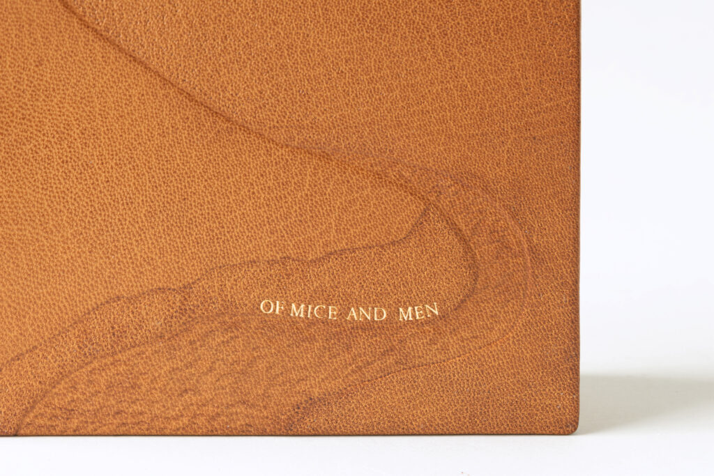
I have to admit that I have never read Of Mice and Men, but after speaking to the students I was told again and again about the immense care given to describing the landscape even over the main characters, George and Lennie. Jacky mentioned in particular that there is a starkness and simplicity to the way Steinbeck writes; that his writing is without flourishes. Relying only on texture to convey the majesty of the Salinas Valley, Jacky evokes the same strategies found within Steinbeck’s writing.
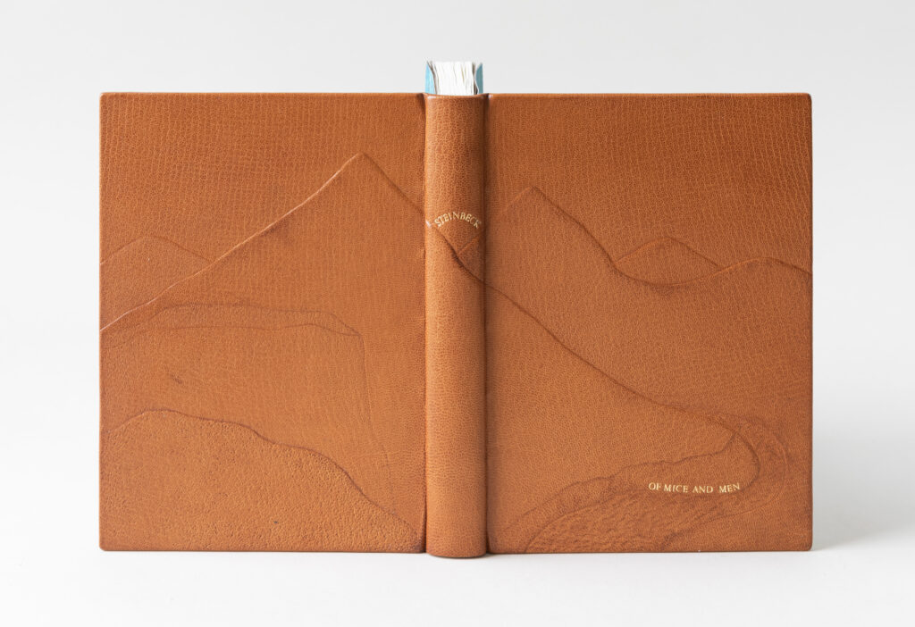
Jacky has prior experience working with tooling techniques traditionally used in saddlery, which is best achieved on calf skin. However, being restricted to using goatskin for her set book, Jacky looked to images of cuir-ciselé as well to find inspiration. This 15th century technique involved outlining the design with a pointed tool when the leather is damp. Areas of the design can be textured by stamping a succession of dots into the leather or by embossing from the backside of the leather. To create the landscape, Jacky added three layers of 10pt. museum board to the covers and 2 layers of thinly pared leather to the hollow on the spine. Then the binding was covered in a medium brown goatskin.
After covering, the leather was dampened again and pressed with various grits of coarse sandpaper to create subtle texture in specific areas of the landscape. To create movement in the river that cuts through the valley, Jacky pressed the tip of a bone folder into dampened leather and gently pushed it forward. The title is tooled along a curve at the river’s edge using red gold leaf, while Steinbeck hovers above the mountains on the spine.
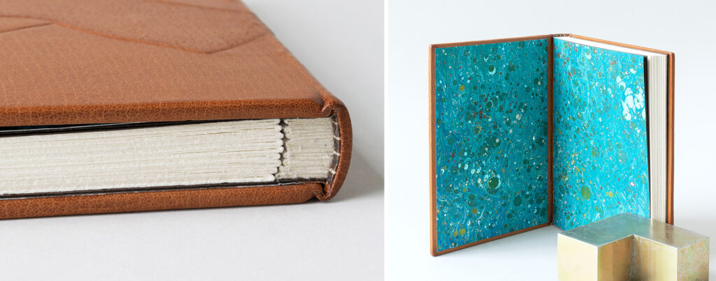
Jacky chose the route of incorporating stubs into her binding. She landed on a laminate of Gutenberg and muslin for the stub, which made it easy to shape into a rounded spine. The hand-sewn endbands are a single-core wrapped in three different shades of brown silk. The marbled papers are a splash of blues and greens, acting as a nice reprieve from the monotone cover.
Jacky spoke about her joy in creating this binding, how her training provided the necessary confidence to create success. Leaving the engineering department for literature, Jacky eventually found herself interning at the preservation lab at MIT. Afterwards, Jacky received a degree in Library Sciences at Simmons University. During this time, she had the opportunity to attend a summer course on basic conservation, which happened to be hosted at North Bennet Street School. The rest is history. After graduation Jacky hopes to stay in the New England area and work full-time in conservation.
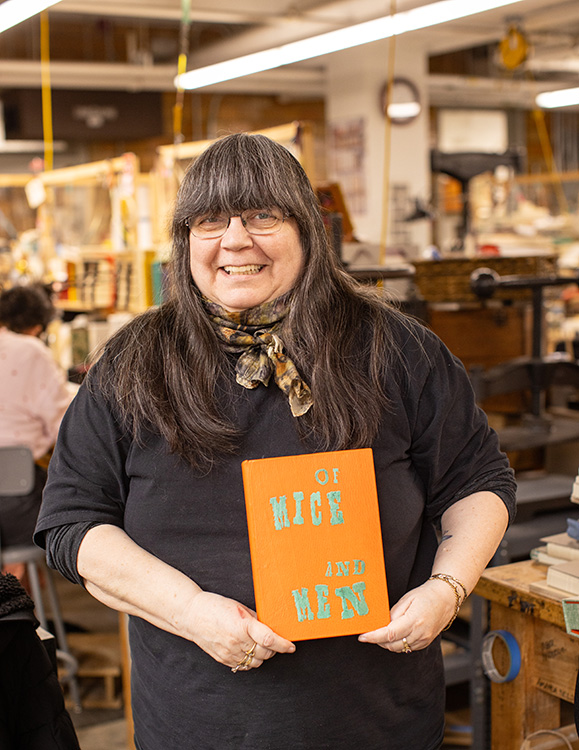
Spike Minogue
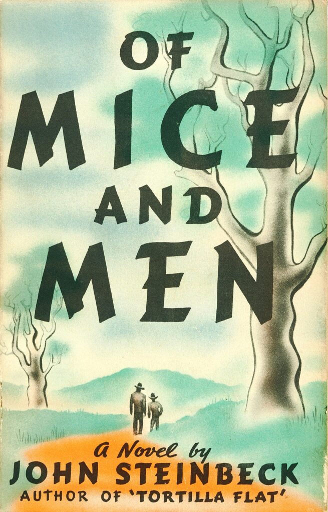
While searching for inspiration across several iterations of the novella, Spike stumbled upon the cover design for the first edition of Of Mice and Men from 1937 (pictured above). With a background in offset printing and design, the oversized and stylized typeface really stood out to Spike. To tie her design to this new edition from the Folio Society, Spike recreated the typeface from the title page with feathered onlays.
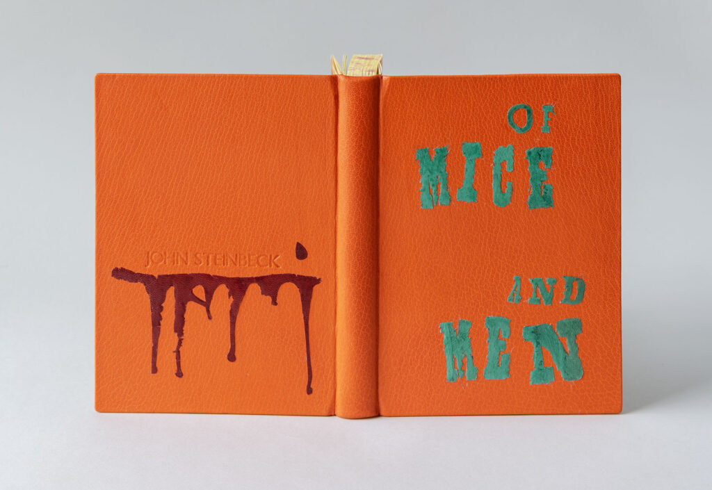
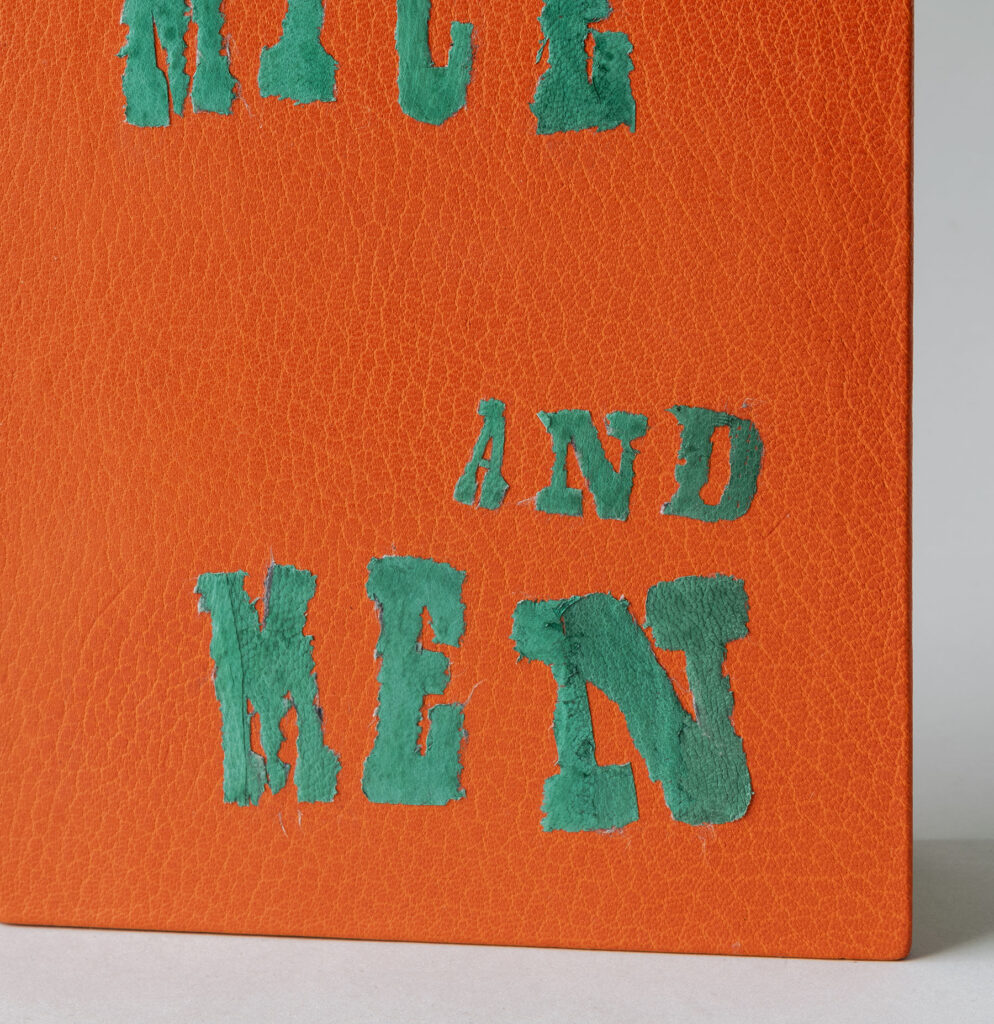
Also inspired by the bold and bright colors from the original cover design, Spike covered her binding in a vibrant orange goatskin. Teal goatskin was pared incredibly thin to be used to construct the letters for the title. A layer of Japanese tissue was attached to the goatskin to aid in cutting down the individual letters. After removing the tissue, the paste left a film to the leather and dulled the color. To combat this, Spike added two layers of shellac to bring back that vibrant teal color. Some of the larger letters are pieced together from different parts of the leather creating texture through the varied grain and saturation of pigment. The edges were finished with a paring knife to create a rough, feathered look.
Spike bravely placed her finished binding under the Kwikprint in order to blind stamp the author’s name onto the back cover. To highlight the darkness of the story, the dripping blood underlining Steinbeck’s name represents the escalation of deaths and murders. This onlay is also comprised of several smaller pieces of feathered onlays in crimson goatskin.
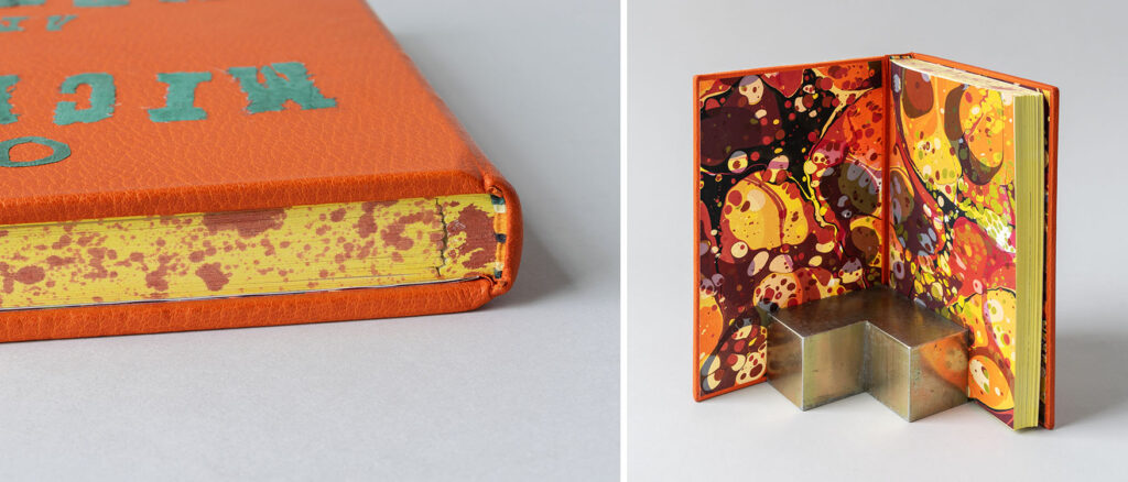
During an online workshop with Karen Hanmer, Spike learned a unique sewing technique for endbands devised by Jen Lindsay. The bead on this single-core endband is sewn over 3 strands of thread to give the effect of a double-core. For Spike’s endbands she incorporated orange, yellow, black and green linen. All three edges (including the stubs) have been painted with a yellow acrylic wash, with the head edge splattered with red to continue the blood stain motif. Spike experimented with different materials before landing on Arches text wove for the stubs. The layers of each stub are laminated together. Although Arches is a softer paper, Spike found this was the easiest material to shape at the spine.
The paste downs and fly leaves are over-marbled paste papers or party papers, which were made by Sandy (a first year student) during a workshop earlier in the year with Chena River Marblers. I wasn’t familiar with the term party paper and Spike was the second student to use it. She noted that it refers to a paper that is marbled twice: one layer having large circles of pigment and the other layer having smaller, tighter circles. The marbled paper used in Spike’s binding incorporates those bright, bold colors from the cover and endbands.
For nearly 30 years Spike worked in the commercial printing industry which led to her teaching the pre-press side of printing in the Graphic Design program at Algonquin College in Ottawa, ON. In 2012, Spike became involved with the Canadian Bookbinders and Book Arts Guild (CBBAG) after reading an article about rebinding books. She took many workshops with Betsy Palmer Eldridge, Dan Mezza and Karen Hanmer before advancing to teach many of the core classes and serving on the local CBBAG Committee for several years. Through her connections at CBBAG she found out about North Bennet. Spike chose to come to the program in order to challenge herself and really hone her skills. After graduation, Spike will be welcomed back to her home in Canada by her husband and dog. She will be teaching a course this fall at Carleton University in Ottawa and hopes to continue teaching for CBBAG.
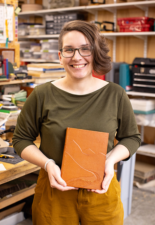
India Patel
It was such a joy to discuss India’s path of discovery and contemplation to get to the final binding you see below. After rereading the text with an intent for design, India considered imagery inspired by Steinbeck’s colorful descriptions of the California landscape, the various animals and the farmlands. Textures, softness and structure also came into play, from the gestural marks of the illustrations to Steinbeck’s structured narration which is often disrupted by its own devices.
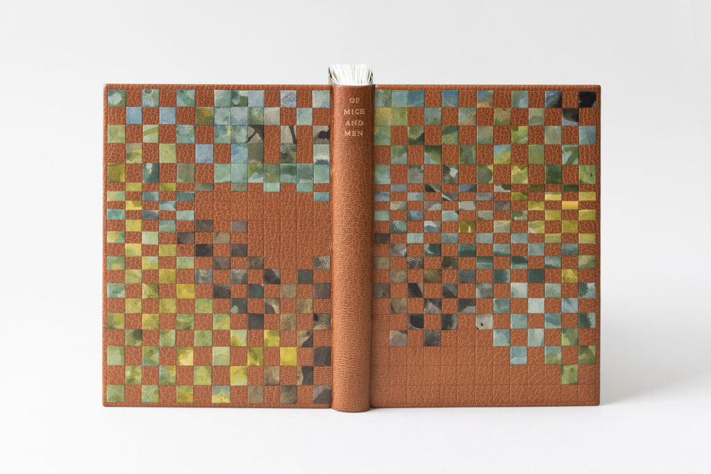
Using imagery of the Salinas Valley, India sought to create an abstract landscape dissolving while also being pulled apart into pieces arranged on a structured grid. After learning leather dyeing techniques with the intent to color match for the purposes of conservation from James Reid-Cunningham during a workshop, India set out to use these skills in a more painterly way. Working on small pieces of fair goatskin, India played with Roda dyes through different ways of applying and diluting the pigments to create a variation of scale and texture.
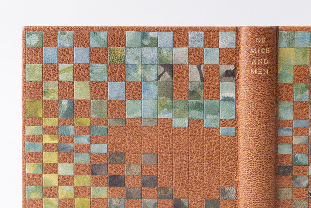
Once the book was covered with a medium brown goatskin, India blind tooled an irregular grid across the front and back cover. Instead of tooling a regimented and uniform grid, India highlights the abstract nature of the design by tooling perfect squares that collapse into thin rectangles before expanding back into squares. Even though India plotted a look for the landscape, she was ultimately under the control of the individual dyed pieces. In order to create an effective blurry landscape, she had to constantly arrange, rotate, flip and rearrange pieces before adhering them in place. The title is tooled across the spine in gold and is centered in relation to the onlays in order to create balance.
Like many of her classmates, India also chose to sew her text block on stubs. However, her choice of using a colored paper stands out from the rest. The stubs were cut and folded into a “V” shape using a light brown handmade paper from the Morgan Conservatory. The endbands are a single-core sewn with a thick silk in a similar grey to the stubs. This choice of neutral tones for the stubs and endbands is a lovely choice that adds intrigue, but doesn’t distract from the beauty of the cover. The interior is covered with a meditative paste paper simply made by sweeping two shades of brown over a sheet of dark blue Hahnemuhle Ingres. I say simply because India has become a master of paste papers during her time at North Bennet.

Initially interested in becoming a librarian, India spoke to many in the field, but while considering graduate school she worked for a private press doing bookbinding and repair as well as making paste papers. Coincidentally, her time there coincided with Ariana Rutledge’s internship. Ariana graduated from the Bookbinding program in 2022 and is the current TA. Hearing about Ariana’s experience and learning more about the program certainly became a factor once North Bennet became a contender for her next step. After graduation, India will be interning at the Northeast Document Conservation Center, which will be followed by an position at the Boston Athenaeum in the fall provided by the Von Clemm and Driscoll Family Fellowship in Book Conservation.
Jennifer Pyburn
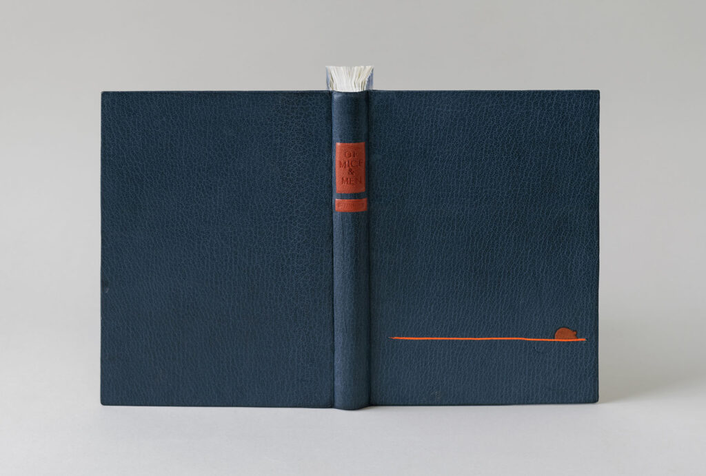
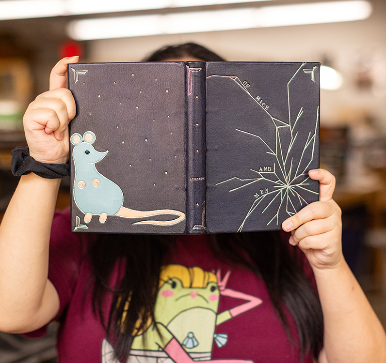
Reading Of Mice and Men in high school was enough for Jennifer and she chose not to read it again for this project. However, one part of the book that stuck with her was a scene where an aging and sickly dog had to be put down. Though this scene was troubling to Jennifer, it is meant to foreshadow the death of Lennie at the end of the book. After it is discovered that Lennie murders Curley’s wife, George kills Lennie with a gun. The design on the front cover conveys this gunshot through the use of tooling to create a shattered effect. In a way I think it may also represent Jennifer’s disdain for the book.
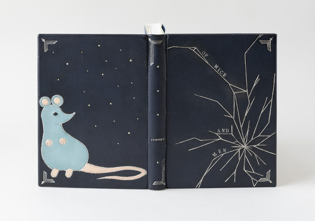
Using palladium on the front cover, Jennifer noted that she had a rough outline of the shattered design, but chose to freehand some areas directly on the cover to create the right balance. The title is also tooled in palladium and anchored to different segments of the cracked cover. The binding is covered in a navy blue goatskin to both set her binding apart from her fellow classmates and to allow the palladium to pop. Each plane of the book is framed with corner ornaments uniquely formed by combining three separate finishing tools.
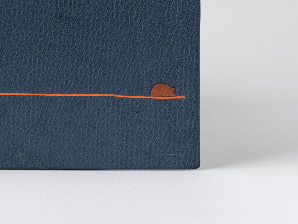
The back cover design is hinted at from the spine with the appearance of gold and palladium stars. The stars continue onto the back cover along with tooled dots. This nighttime scene evokes a dream-like atmosphere and nods at the desire of owning land that is so central to the drive of the two main characters. From the start, Jennifer wanted to include a mouse in her design and chose to place it on the back so that it wasn’t the focal point. This stylized mouse was created with tooled onlays in light blue and undyed goatskin. Before placing the light blue onlay, Jennifer adhered a small bead for the mouse’s eye. Then with the light blue onlay in place a small slit was cut into the leather and shaped around the bead to create eyelids.

Although sewing her book on stubs was noted as her least favorite part, Jennifer understood their importance and was determined to have her binding function properly. The stubs are constructed in a “V” fold using Arches wove, with the layers of each stub laminated together. The endbands are a traditional double-core French style sewn with pale blue, sky blue and navy blue. Using an indigo paper laced with mica flakes from Cave Paper, Jennifer extends that dreamy night sky to the interior of the binding for the paste downs and fly leaves.
Jennifer always enjoyed working with her hands, but never enjoyed traditional schooling. As a child she found folding origami and making books from scrap paper to be quite fulfilling. This made her a perfect candidate for North Bennet, as she was also seeking teachers that were passionate educators. So after ruling out college and taking a long gap year after high school due to the pandemic, Jennifer could justify the short commute from her parent’s home in Medford to attend the Bookbinding program. She loves making new bindings over repair work, but is still considering all avenues post graduation.
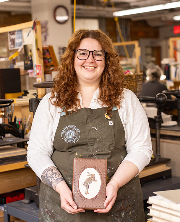
Emily Stanley
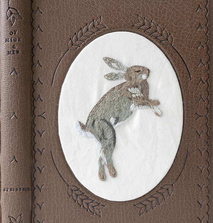
Struck by the trauma of Lennie’s interaction with animals throughout the book, Emily sought out a soothing medium for her binding. Emily began stitching during the pandemic to keep herself occupied and found a real pleasure in creating animals through embroidery. Even though Lennie never kills a rabbit in the story, Emily uses the image of a rabbit to represent the death of Lennie’s dream of owning a farm. His aspiration is used as a metaphor for the American dream and both are vanquished at the end of the book with Lennie’s death. Emily wanted her design to evoke folk art rooted in earth tones and simple materials that would be accessible to ordinary women in the early 1900s.
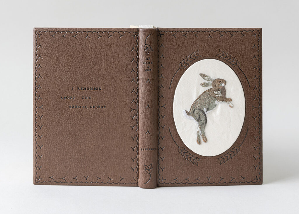
Before covering the binding in a brown goatskin, the front cover board had to be built up in layers to create the oval well. The top-most layer of matboard was cut by a framer at a bevel and the offcut was used as the support for the embroidered muslin. The rabbit is stitched using DMC cotton floss in a range of browns, greys and whites. The single-ply stitches are delicate and intricately placed to create movement in the rabbit’s fur. Once the embroidery was complete Emily wrapped the fabric around the offcut and stitched the turn-ins with a running stitch to hold the fabric taut before securing with a layer of Arches. The entire piece was then inlaid into the binding with PVA.
I appreciated that Emily seemed to embody a character in order to render a design made with care and precise imperfections. The organic quality of the carbon-tooling is a result of Emily’s tool choices. The scallop border framing each board is tooled using two different gouges, while the strands of barley are a result of a single tool modified by Emily and repeated either six times (front cover) or two times (spine). The swooping “V” shape is meant to evoke an embroidered stitch and reminds me of elements pulled from a stitched sampler. The title and author are tooled on the spine in a slight staggered effect along with a quote pulled from the book , which has been tooled on the back cover. With the layout of the quote, Emily showcases that she is once again making calculated decision to making perfection imperfectly.
The sprinkled edge and tinted decorative paper used on the inside were a way to place the binding in the early 1900s, to make it feel intentionally old. All three edges have been heavily sprinkled using a raw umber acrylic paint. The impressive double-core French endbands are sewn with the same cotton floss from the embroidery work. To create the aged look for the paste downs and fly leaves, Emily used a more diluted raw umber sponged onto Gutenberg to slightly tint the cream paper.
As an aside, Emily shared the diploma case she made during her first year for her classmate Kaylee, who graduated last year (as is tradition). At some point, Emily cared for Kaylee’s tarantula and so decided to stitch Adelaide onto the custom diploma folder. Emily also shared experiments she has conducted working embroidery onto cloth bindings as well. Prior to attending North Bennet, Emily was studying Library Science at Indiana University. She found herself working in the E. Lingle Craig Preservation Lab, first with film and then with books. Unfortunately, this experience was cut short due to the pandemic. However, Elise Calvi, Head of Preservation suggested Emily look into North Bennet. After graduation, Emily will be heading back to Indiana to be an Advanced Conservation Assistant where she will be focusing on both book and paper conservation.
– – –
Thanks to each of the students in this year’s graduating class for hanging out with me for an hour over Zoom and to Jeff Altepeter, Head of the Bookbinding Department, for once again letting me steal away his students. I still look forward to this moment every year and I can’t wait to see these bindings in person. I wish each of these students the best of luck as they embark into the field after graduation.
If you want more interviews from past classes check out the list here.

Beautiful work! So happy to see a class of 8 again :)
Beautiful work. I know how hard you had to work to reach this level of ability. Congratulations to all of you !!
What a stellar achievement by the entire class each and every one. Brava! Thank you for sharing and best wishes on your future book adventures.
These are wonderful, thank you for sharing.
[…] Erin interviews the graduating Bookbinding class about their set books and future plans. Read her interviews with the class of 2024 here.This story is from our Summer 2024 issue of Benchmarks magazine. View more […]
Wonderfully creative bookbinding from very talented young people. They have been privileged to attend North Bennet as the quality of teaching is truly outstanding.