Part of my move to Austin meant that I would not be able to conduct the annual set book interviews in person anymore. This year, I lost the ability to handle the bindings in person, to really see the incredible details of the work added with care and intention by each of the students. But the interviews, which were conducted through Zoom, were still the highlight of my week. It was such a joy to speak with each of these budding bookbinders. Their energy and excitement reminded me of how special North Bennet is as a place. We spoke about their futures, the dread over their two-year journey coming to an end, the collective pressure of creating their bindings and of, course the bindings themselves.
This year’s set book was La Vita Nuova by Dante Alighieri. Originally published towards the end of the 13th century, this collection of prose and verse is an expression of courtly love that reflects the love a man has for a woman he’s never spoken to. Viewing this story through a 21st century lens, the students all had very interesting reactions towards the protagonist’s perpetual desire and lack of action. A few students created designs that outright repelled against the text, while others chose to highlight the work by expressing the torment and passion depicted in the text with either a contemporary or historical flair. You will also find several references to the number three and nine as they were significant within the text.
Each of the student’s bindings will be on display in the 2023 Exhibition: Continual Craft at North Bennet Street School through August 12th. The exhibit includes work from several departments at North Bennet and highlights the careful considerations that go in to crafting an object that is long-lasting due to the intentional selection of technique and materials.
Year after year, the students continually astound me with their thoughtfulness to design, material and technique. Whether they have the desire to continue with this style of binding or not, each student put considerable care into their work and they should each feel immensely proud of themselves. I wish them all the very best as they leave the comfort of their North Bennet benches and start their own unique journeys in the field of bookbinding and conservation. A big thanks to Jenn Pellecchia for taking photographs of the students and their work!
![]()
Nicoline Meyer
she/her
Silver Ocean Studios
Setting aside the story within La Vita Nuova, Nicoline was captivated by the scaffolding of Dante’s writing style and his attempt at writing poetry that would be accessible to everyone. This draw is in part due to Nicoline’s background with pre-Renaissance history, but her time spent abroad in Italy also created a pull to incorporate a sense of place into her design. From the start, Nicoline surveyed historical bindings from the 13th century for inspiration. Finding it difficult to fully reinterpret these historical bindings, Nicoline moved forward in history and decided to take some cues from 18th century fine bindings as well.
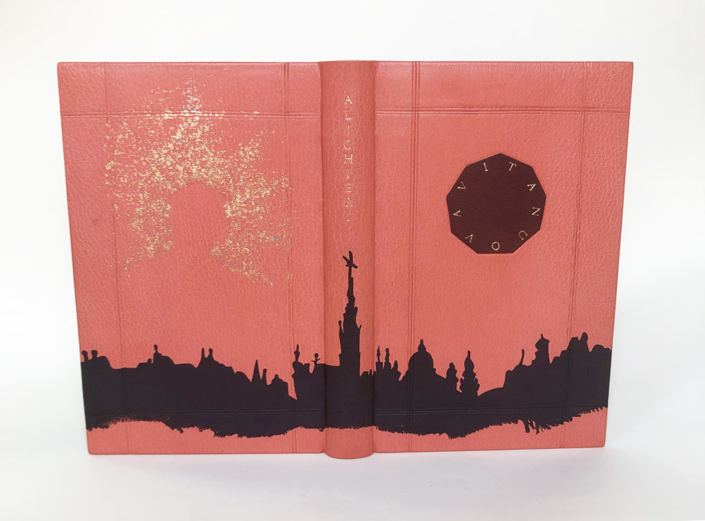
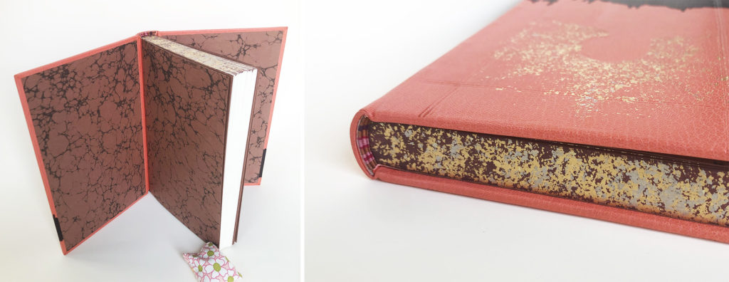
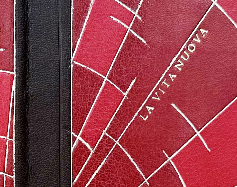
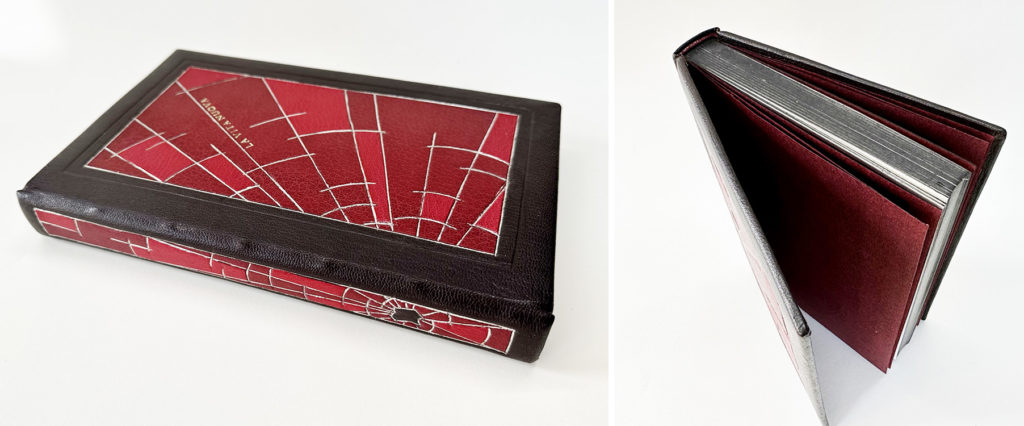
Using a color palette harmonious to the illustrations in the text, Nicoline covered her binding in pink goatskin. With a subtle nod to both medieval and 18th century bindings, the suggestion of a panel design is created through a frame of three blind tooled lines. The idea of including bosses in some way crossed her mind, but Nicoline shifted to adding a central medallion on the front cover instead. While this cherry red goatskin onlay evokes the silhouette of a stained glass window, the real significance lies in its number of sides: nine. By simplifying the title to Vita Nuova, these nine letters could be perfectly arranged to one letter per side and tooled in 23kt gold.
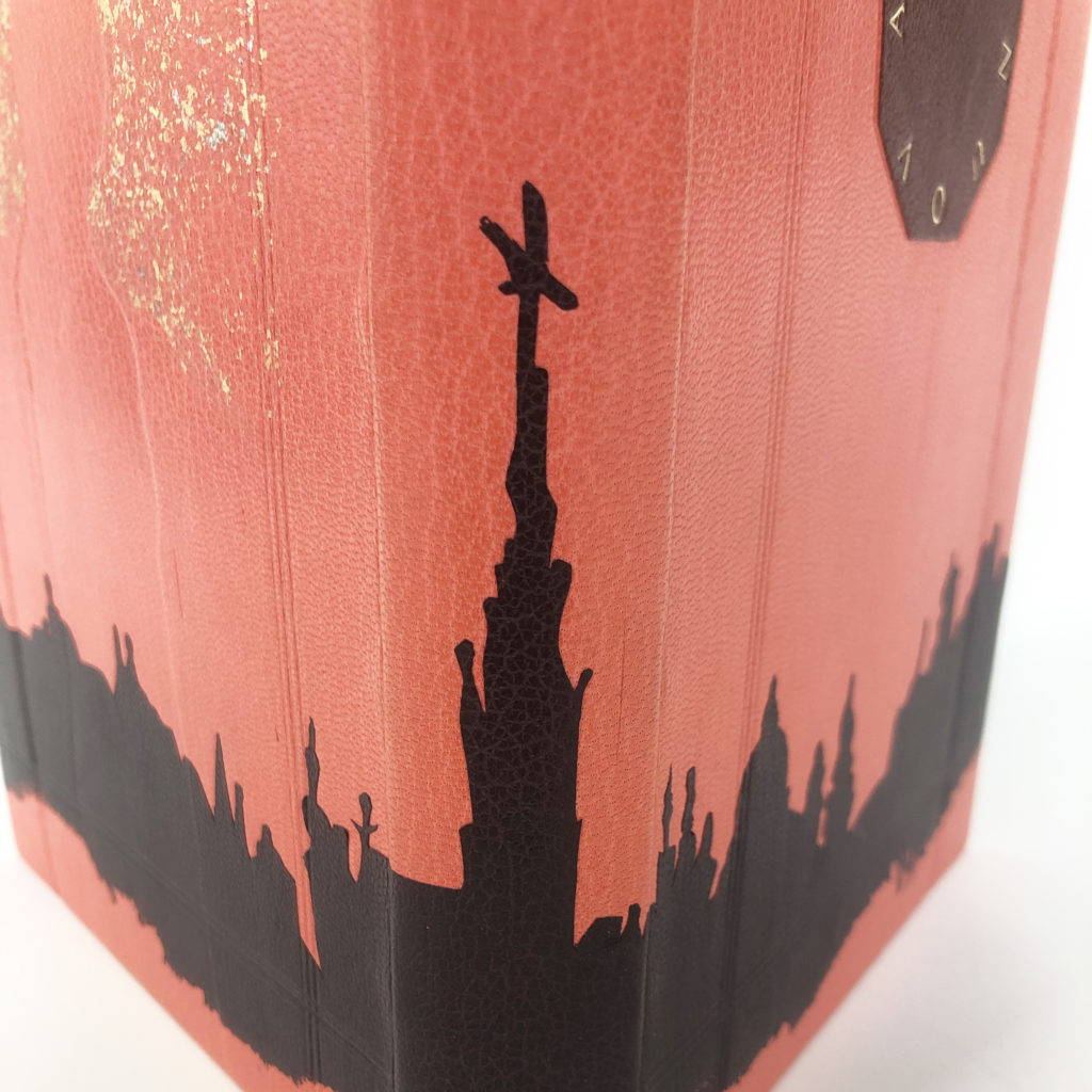
Pulling the skyline of Florence from the text, this element identifies a location for the viewer and magnifies the significance of the city to Dante and his work. At the time of publication, it was more common to write in Latin. However, Dante chose to use a Florentine dialect, which caused a shift that would help modernize the Italian language as other influential writers followed in his footsteps. Nicoline used a blackberry goatskin back-pared onlay to illustrate the city with the bottom edge feathered off.
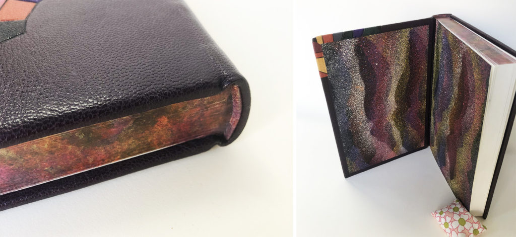
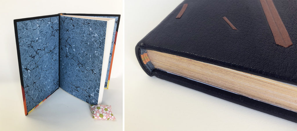
A silhouette of Beatrice is pressed into the back cover surrounded by a halo of sprinkled 23kt gold and palladium. As with the other design elements, this imagery of Beatrice is conveying two ideas. Beatrice perishes in the story and the impression we have of her is hollow as it has been crafted by Dante’s blind infatuation rather than told by Beatrice herself. Extending the color palette further, Nicoline embellished the head edge with a dark red acrylic base sprinkled with red gold and palladium. The French double-core endbands include stripes of bronze, light pink, hot pink and purple. The interior is lined with an Italian vein marbled paper made by Nicoline.
Over the course of our conversation, it became quite clear that Nicoline did not land on her ideas quickly, but only after long and careful consideration. I appreciate that within her sophisticated design, Nicoline employed a range of techniques. The three main elements of her design identify key aspects of her concept while working in harmony to create a cohesive composition. Enjoying the process that required precision and exacting technique, Nicoline hopes to continue working in this style. Her interests also lie in edition work and her plan is set up her own studio after graduation.
Kaylee Moen
she/her
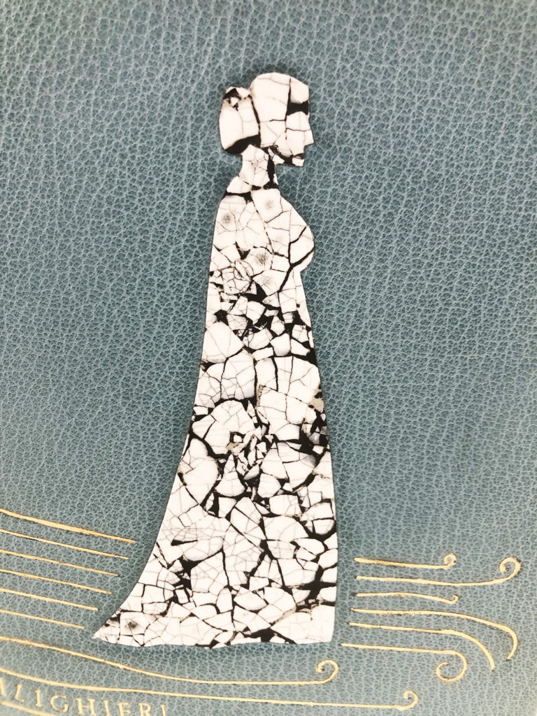
While appreciating the significance of Dante’s work, Kaylee couldn’t help but consider how his projection of Beatrice has both immortalized and erased her at the same time. Putting herself in Beatrice’s position, Kaylee expressed that she would love to travel back in time and take control of the narrative by destroying any mention of her life. Kaylee decided to let her aversion towards La Vita Nuova guide her in the designing process. In the end, she created a binding that appears to be smashed into pieces.
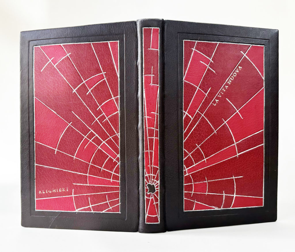
Burnt umber French Chagreen is used to cover the binding and also acts as the frame around the shattered glass. Kaylee built up the boards into three levels to accentuate the frame along with blind tooling the edges. The shattered glass is comprised of crimson and scarlet goatskin with the cracks tooled in palladium. The title and author are placed right along the edges of the cracks and tooled in gold.
The shattered effect radiates from a ‘hole’ placed at the tail of the spine. Rather than breaking up the design at the spine, this portion of the binding was given the same panel treatment. Kaylee crafted the binding as a tightback so that the spine could be given the same number of layers as the cover boards. To create the ‘hole’ in the design, Kaylee simply cut a hole in the onlay leather to expose the burnt umber below.
The edges of the text block are painted with diluted acrylic ink to match the burnt umber leather, giving it the appearance of being a solid object. The leather wrapped endbands match the red used for the onlays. Kaylee choose to stay true to the simplicity of the illustrations for the palette of her binding.
While the design was driven by emotion, Kaylee also wanted to set herself up for success and choose techniques that would both compliment her design along with simplifying the process. As we spoke candidly about her reactions to the text, I greatly appreciated the route she took with her design. While I think it’s important to create a striking design, it doesn’t necessary have to paint the text in a positive light. After graduation, Kaylee will be moving back home and begin building up her portfolio while she seeks a position in repair and conservation.
Abra Mueller
she/they
@by_the_bookish
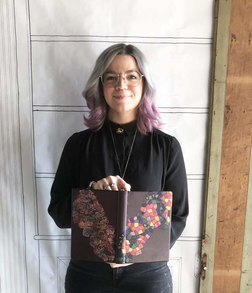
The route towards inspiration can sometimes start with the desire to work with specific techniques. This was the case when Abra, a very technique-driven individual, began to think about her design. Reading and re-reading through La Vita Nuova, Abra considered how she might explore tooled onlays and eggshell panels in her design. With an overwhelming sense of exhaustion caused by Dante’s obsession with Beatrice and his search for salvation through her virtue, it only seemed fitting that Abra create a design with nearly 200 individual pieces of leather.
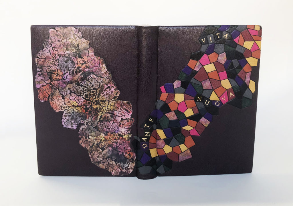
The mosaic design of the front cover is indicative of a stained glass window so characteristically found adorning medieval churches, putting the viewer in a time and place. The design, which sits on a backdrop of blackberry goatskin, is comprised of several onlays cut from various scraps of goatskin leather with carbon-tooled edges. After much trial and error, the title has been perfectly placed within this design using individual handle letters and red gold leaf. Abra searched for the right balance within the onlays large enough to hold each letter. The author’s first name is given the same treatment as it rises up the spine of the binding.
With the use of an eggshell panel, Abra shows us the stained glass window not in its pristine state, but something that is shattered and crumbling. The panel was created by first crushing, then layering and sanding turkey eggs. The pigment was added through blending alcohol inks and isopropyl alcohol to create a hazy, cloudy effect that mirrors the way the colors are arranged on the front cover. A bit of shimmer comes from flecks of gold paint dotted throughout the panel.
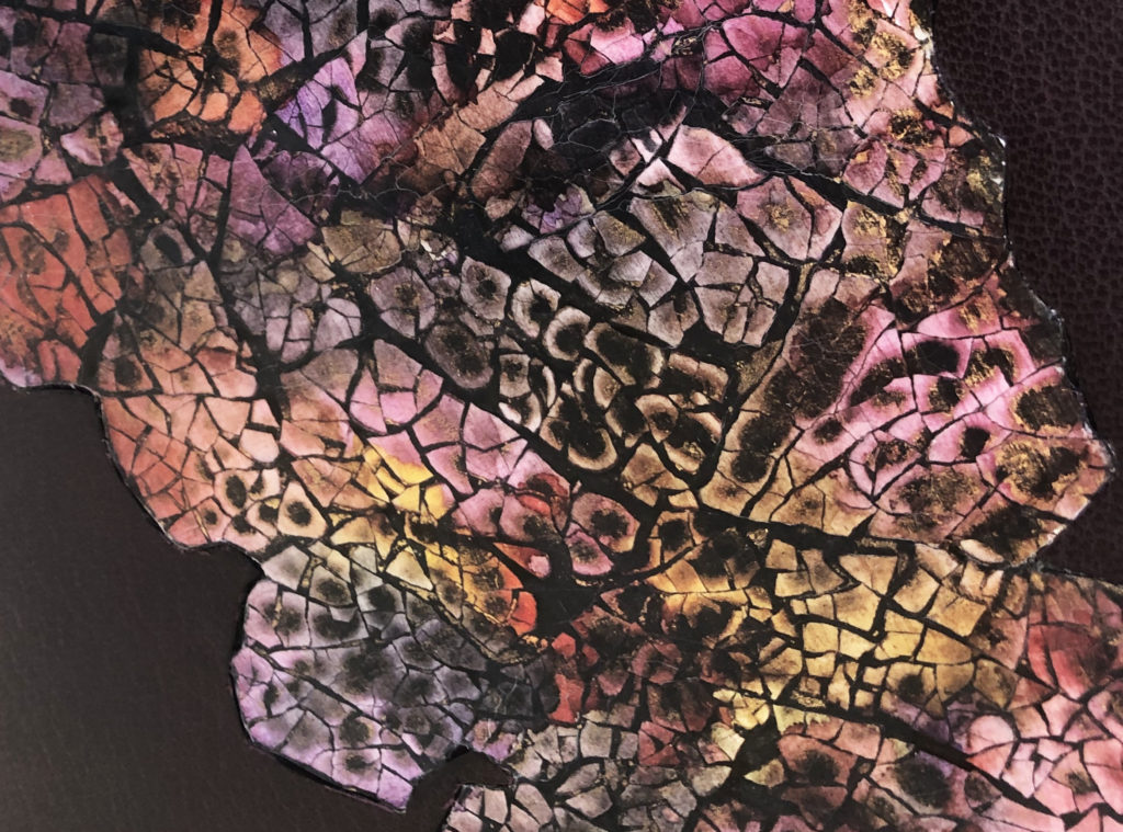
The central theme of deterioration continues onto the other decorative surfaces of the binding. Using the same range of colors, Abra dabbed acrylic paint onto the head edge and included moments of gold paint. The flat vellum-core endbands are wrapped with the same dyed leather used as part of the mosaic on the front cover. Further driven by a desire to play with technique and finding inspiration in the work of Roger Green, Abra created these fantastic decorative papers for the interior of the binding. Using a mask that resembles the silhouette of the eggshell panel, pigment was sprinkled onto the paper using a toothbrush. The placement of the mask was played with to create layers of both color and texture.
Right from the start Abra declared that she wasn’t an artist and leaned into her strengths of more left-brain thinking. Yet after our conversation and her thoughtful approach to design, I think she can reconsider this outlook. She spoke so fearlessly about approaching each technique and expressed how freeing this binding process was for her, an unexpected surprise that she hopes to recapture with the next fine binding. While she waits to hear back from applications submitted to various institutions, Abra is seeking to land a conservation position after graduation.
Rachel Payne
she/her
Saga Bookbinding
@saga_bookbinding
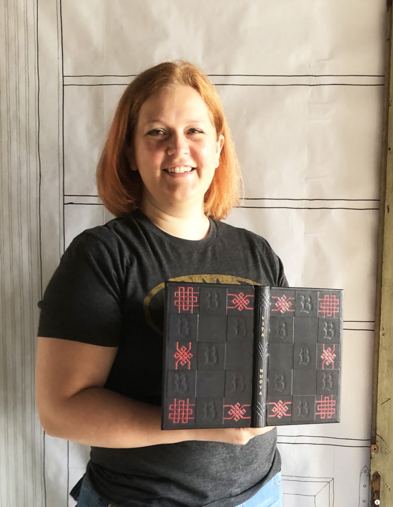
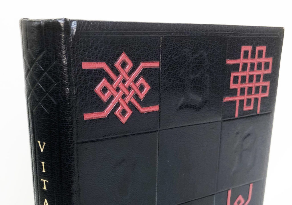
One route to designing a cover for a binding is to overlap your own interests with the text. Finding threads between two distinct sources can offer unique results. Rachel began with her love of Gothic architecture and stained glass. Using medieval architecture as a starting point, Rachel found herself steeped in historical bindings and eventually came upon the collection of Thomas Mahieu, a 16th century collector who took a special interest in decorative bindings. Taking some visual cues from these bindings, Rachel also decided to incorporate another interest of hers: Celtic knots. The intricate knots thread a connection to Dante’s tangled obsession for Beatrice.
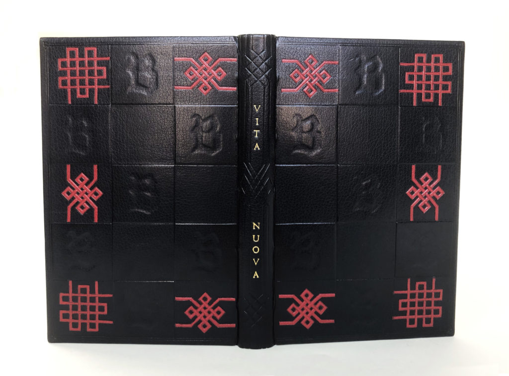
Draping her binding in a simple color palette of dark navy blue and scarlet red, Rachel can put the emphasis on the texture of her boards. While surveying older bindings, one aspect that Rachel found herself drawn to over and over again was dimension. To create the geometric boards, panels of 10pt. museum board were cut to size with the letter ‘B’ cut from the center in a stylized Blackletter script. Once affixed to the boards, these panels create both raised and debossed areas of the board that are further defined through blind tooling. The entire design is framed with a blind tooled double line and a flourish in each corner.
To create the delicate and intricate knots from scarlet goatskin, Rachel employed a Silhouette machine to insure each angle would be cut with precision. This was only after several experiments to find the correct way to support her materials and the right depth for the blade. The complexity of the knots is beautifully mimicked on the spine in blind tooled lines that frame the gold tooled title. This effect on the spine is perfectly executed, creating a balance to the design. The tooled lines extend onto the endcaps and bring your eye to the extra details Rachel has added to the text block edge.
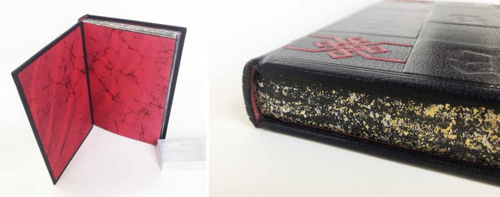
An interlacing design informed by the patterning on the spine is gauffered on the head and tail edges. The gauffering sits on top a layer of lamp black ink embellished with palladium and 23kt. gold sprinkling. The leather wrapped endbands are the same scarlet goatskin used for the knots on the covers. Adorning the inside are these incredible marbled papers made by Rachel. She used two tones of red and navy blue for an Italian vein pattern. While pulling the paper, Rachel worked the sheet back and forth to create a Spanish wave effect.
I couldn’t help but exclaim out loud at the drama of the endpapers. I wasn’t expecting such a bold, rich color to be lining the inside. I particularly love the contrast between the organic flow of the marbled paper against the static quality of the outside. Rachel found a way to express both herself and the text in her design; a harmonious outcome not always so easily achieved. After graduation, Rachel will be moving back to the Twin Cities in Minnesota where she plans to set-up a studio space and start her own bindery business that will take commissions focusing on conservation and unique bindings.
Sara Pines
he/she/they
@sosnastudios
Sara set up a few parameters when tackling what the design of their binding would look like. First, they really wanted to capture the spirit of Art Nouveau in the design. Second, they wanted the design to incorporate an eggshell panel and tooled lines constructed with gouges. Sara initially felt uninspired by the structure of La Vita Nuova and the melodrama presented by Dante’s archaic version of love. However, it was Dante’s lack of action that propelled the design forward and lead Sara to create a simple silhouette of Beatrice walking on a road that begins to disappear.
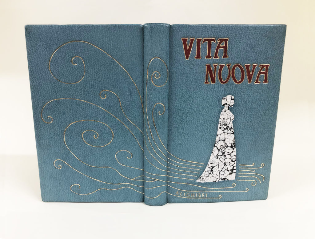
Sara’s use of peacock blue goatskin sets her binding apart from the darker palettes seen on the other bindings. It’s also the perfect choice, as it creates a heavenly, ethereal backdrop for the design. The whimsical lines that make up the road in which Beatrice is walking upon were creating by carefully charting the different gouges required to illustrate each wave and curl. Modifying the free form lines of their original design through the confinements of the tools was a task that became both challenging and rewarding for Sara. Each of the nine lines starts and finishes with a tight curl, creating the sense of movement and that at any moment they will evaporate into nothing. The author’s name is gilt between the bottom two lines.
Working with a classic Art Nouveau typeface for the title, Sara further connects to their initial inspiration. To create the gold tooled edges around the vibrant crimson red goatskin onlays, Sara once again faced the need to modify the curvatures of the letters to best fit the shapes of the gouges.
Selecting duck eggs for their thicker shells (and because they would make a delicious omelet later), Sara created the eggshell panel inlay that would be used to represent Beatrice. The space between the cracks is filled with black acrylic paint, creating a stark contrast to the white of the eggshell. Sara was attracted to this technique and how it would highlight the perception of Beatrice presented by Dante. The purity of the white eggshell along with the translucency of the material creates this angelic version of Beatrice, yet the cracked effect works to represent her misrepresented identity.
With the book still closed, the remaining details are colored red. The endbands are wrapped in the same crimson goatskin and the edges are painted with red acrylic paint. The head edge was further embellished with gold leaf. Once you open the book, you are greeted with an explosion of color from the marbled paper flyleaves. Sara greatly challenged themselves with each aspect of their design and was able to achieve a cohesive depiction of the text. Given the freedom to design a binding and work with techniques in a creative way really resonated with Sara and they hope to continue working in this style in the future. However, their main focus is in conservation and after graduation, Sara will be on the search for a position in the field.
EJ Youcha
they/them
@pashariko_bookbinding
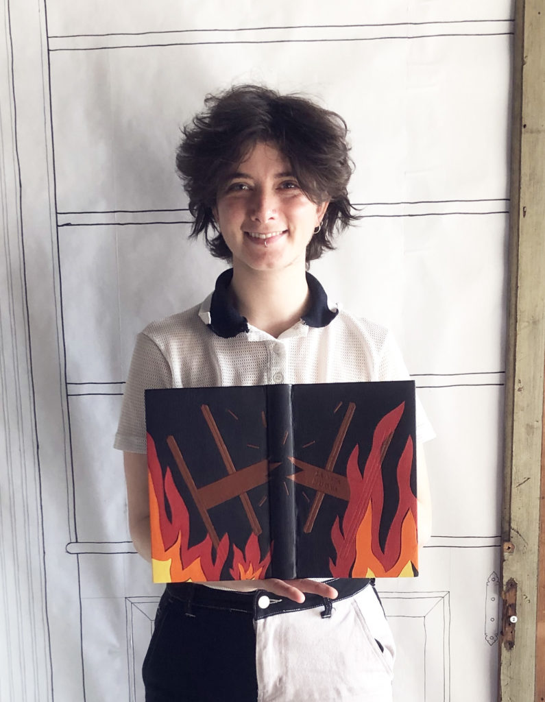
As a student, working with leather is initially used to create historical models and for rebacks, so EJ delighted in the opportunity to finally use leather in a creative way. As we discussed the inspiration behind their design, EJ acknowledged that the style of writing used by Dante is not typically what they find themselves reading. However, they found a way to connect to the passionate love felt by Dante towards Beatrice and the underlying dreariness of his reality. Each element in the design is making multiple connections to both the text and EJ’s concept, some that were intentional from the beginning and some that arose as we discussed their binding further.
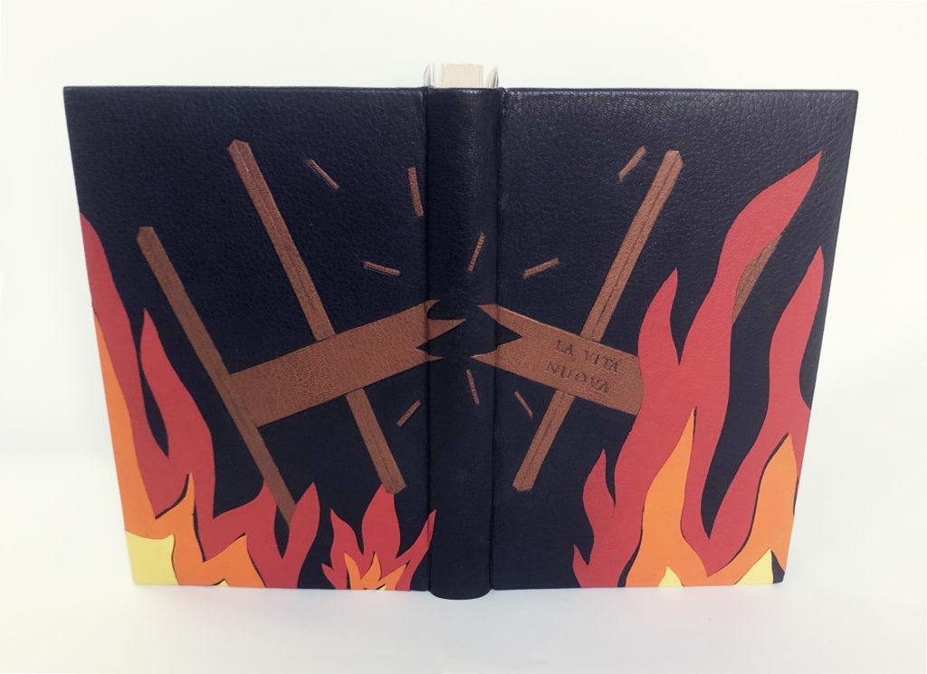
That dreary reality that I mentioned above is expressed through a bed frame splintering amongst dancing flames. The carbon tooled onlays in medium brown goatskin representing the bed frame act as a stand-in for both love and a crumbling infrastructure. Dante’s love is more of an obsession over Beatrice and their love story is one sided. His delusions begin to deteriorate with the realization that his one true love will die someday. However, this does not push Dante to act, instead he chooses to withdraw from society.
The entire scene is set against a dark navy blue goatskin with the fire created through back pared onlays in red, orange and yellow goatskin. The onlays are purposefully misaligned to create the illusion of movement, as if we are viewing this scene of destruction as it is happening. In truth, the story is about unrequited love or a dangerous love as described by EJ. The perplexing title is carbon tooled onto the bed frame. What does a new life mean in the context of Dante’s story. EJ has established the bed frame as both love and infrastructure, but could it also represent new life? EJ is simultaneously creating a visual representation of the text while also encouraging the idea that perhaps La Vita Nuova is a cautionary tale and one that promotes the idea that when things fall apart a new phase of life can begin.
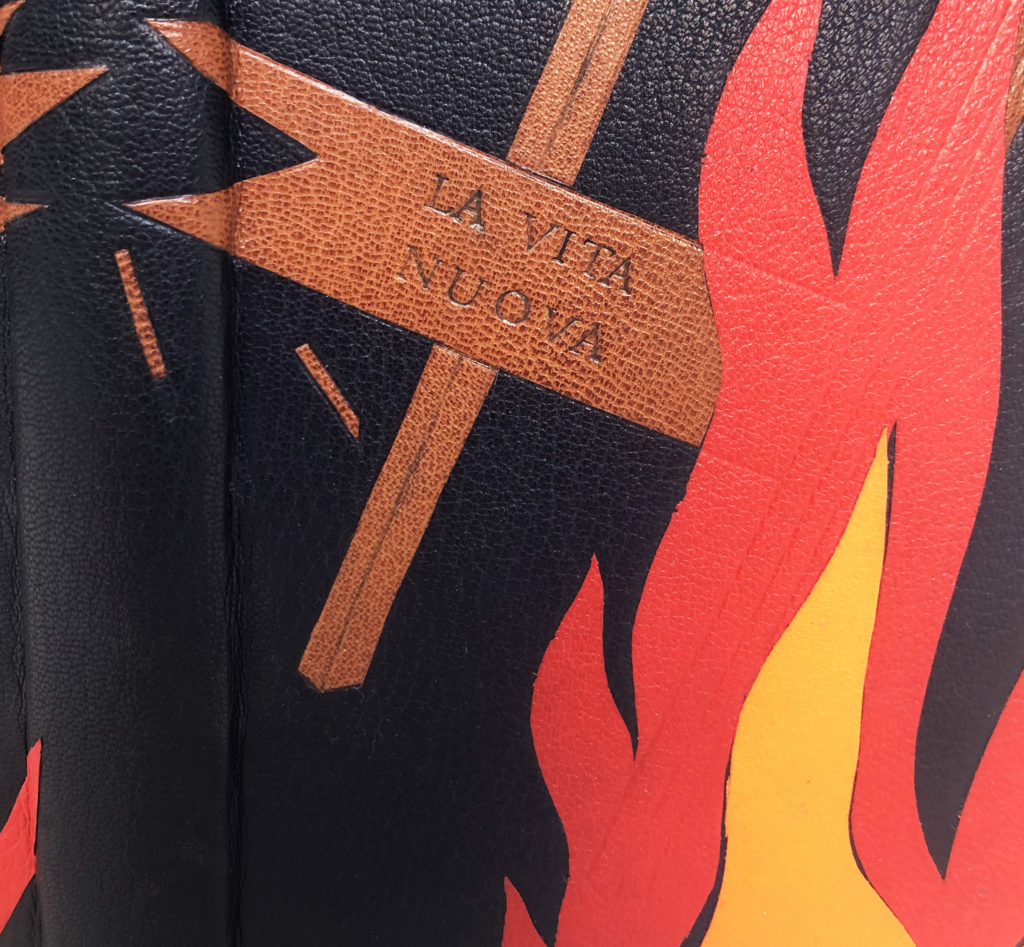
While the design originally included more splinters, EJ landed on a total of nine to create a design that is more visually impactful through its simplicity and to give a nod towards the importance of the number nine. The flames are also comprised of three groupings of three colors each. The vibrancy of the flames is cooled by the blue marbled interior. EJ made this marbled paper specifically for their binding to represent the hot interior of a flame. The head edge is rough edge gilt and the endbands are hand-sewn with colors pulled from the overall design.
EJ was the first student I interviewed and they really set the stage for me. It was a joy to speak with them about the entire process, what excited them and what created stress. In the end, I think EJ crafted a design that speaks volumes in its simplicity. For now, EJ plans to stay in the Boston area and is searching for a studio space to share with a fellow classmate. They are interested in both bookbinding and conservation and has goals of bringing both into their practice. And perhaps another fine binding or two is in their future!
![]()
Mimi Zycherman
she/her
@zycherwoman
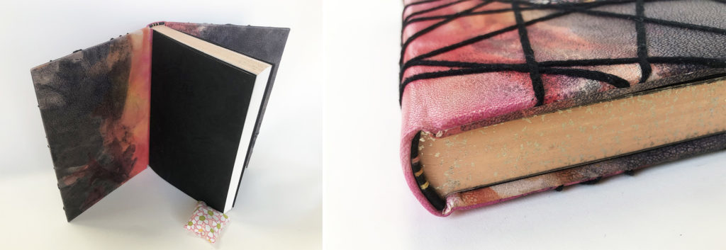
The fear of rejection is so powerful, it compelled Dante to never reveal his true feelings to Beatrice. With her design, Mimi sought to visualize the turmoil a person may experience from internalizing something so potent for a great length of time. Like many of her other classmates, Mimi was determined to work with certain techniques to achieve her design. This included leather dyeing, embroidery and doublures. As someone who uses embroidery often in my own work, Mimi sought out my expertise to find the right style of sewing to create the bold thick lines seen in her design. I greatly enjoyed working with Mimi on this task, as it encouraged me to consider adding these new stitches to my own work.
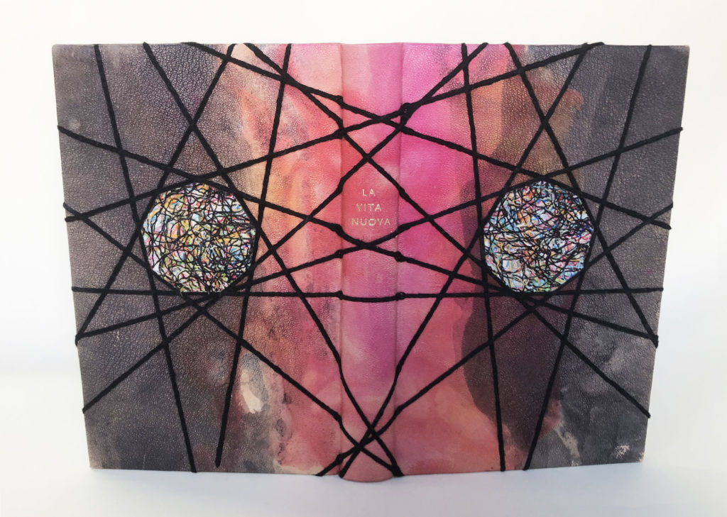
The binding is covered with hand-dyed goatskin using a technique that blends spirit dyes and diluted alcohol. Rather than applying the dye directly to the leather, Mimi placed the dye onto a plexiglass board and then spread the dye by spraying diluted alcohol. The leather was then placed grain side down and dabbed to absorb the dye. To achieve a more layered effect with the black, the skin was placed lightly, lifted and then placed again to absorb more dye. The main inspiration for this effect came from Helen Frankenthaler’s Causeway and Mimi’s style of working greatly reflects Frankenthaler’s unique technique dubbed “soak stain”.
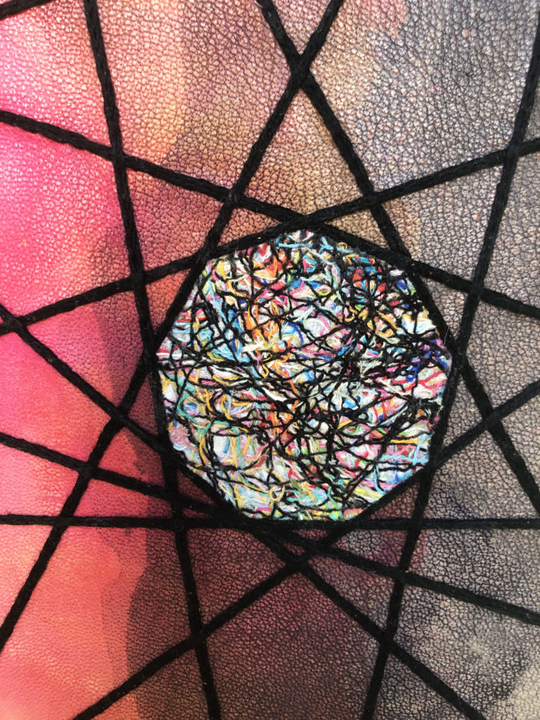
The central medallions are onlays of stitched muslin. The messiness of the thread scraps highlight the turbulence experienced from keeping something hidden and trapped inside. The threads are secured through machine stitching and a layer of paste wash. Closing in around these nine-sided medallions are thick stitched lines of heavy chain stitch in black embroidery floss. The heavy chain stitch is dense and sits prominently on the surface of the leather. The texture created with the embroidery acts as an invitation to handle the binding. This result was part of Mimi’s drive to use embroidery in the first place. Something that I can greatly appreciate and desperately wanted to do. The gold-tooled title is framed by overlapping lines running across the spine from both directions.
While dyeing the leather for the cover, Mimi dyed a second skin to use for the doublures. The same blend of color and tumult continues onto the interior, but is arrested by the black on black suminagashi flyleaves. Working within a simple color palette, the endbands are black leather with three sewn bands of color in yellow, orange and pink. The head edge is a peachy acrylic base with sprinkled moon gold.
Even though her passion lies with conservation, Mimi found freedom in being creative during the process of crafting this binding in addition to putting decorative techniques she had learned throughout the year to good use. I greatly encouraged Mimi to continue in this style of working. Through thoughtfulness to design and technique, she was able to craft a really beautiful binding. After graduation, Mimi will get the chance to pursue conservation further at the Boston Athenaeum as the Von Clemm Fellow. This position will last an entire year starting in September.

These are all examples of thoughtful work executed with technical aplomb. Just excellent. I wish that I would have a chance to study in such an obviously superior environment.
Beautiful work. Are any of them for sale?
You will need to contact the individual binder to find out. Most of the students have an Instagram where you can message them.
Beautiful work , clearly everyone has mastered the use of their materials and the tools we work with. I’m floored by how gorgeous all these pieces are. -Chloe Goff BB 22