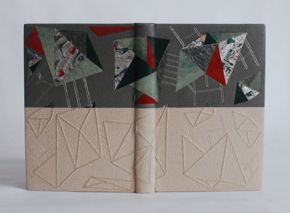
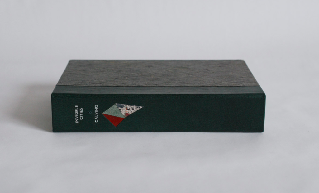
I was introduced to the work of Italo Calvino through his 1972 novel Invisible Cities. I became infatuated with his writing style and imagination. The tales within Invisible Cities project so much imagery and color and emotion. And so I set forth to create a binding worthy of Calvino’s descriptive tales of fantastical cityscapes; the binding was completed in 2017.
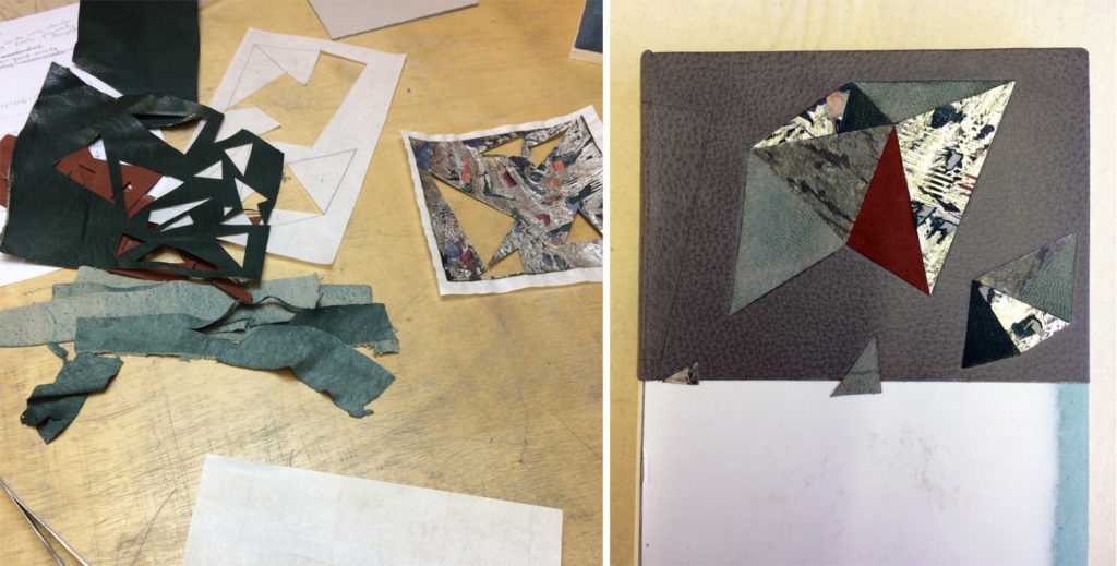
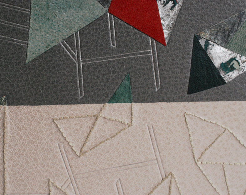
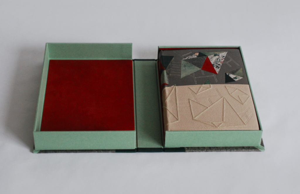
Bound as a traditional French-style fine binding, the book is covered in two separate pieces of buffalo skin which meet along the center horizon. The top half is busy and heavy; the collaged materials depict abstract images of buildings with gilt “scaffolding”. The abstract building structures were achieved through various onlays of suede, goatskin, stone veneer and palladium lacunose. The stone veneer and palladium lacunose were too textured and too stiff to back-pare, so to achieve the look I wanted I attached stand-in onlays in the full shape of the collaged structures before paring.
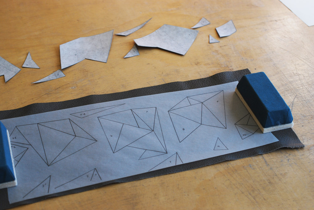
Once pared down, the top half was attached to the book and the stand-in onlays were removed to make way for the final onlay pieces. In order to cut each onlay to the correct size, I used additional pieces of tissue drawn with the same shapes used for the back-paring. The final onlay pieces were cut out through the tissue to ensure their exactness.
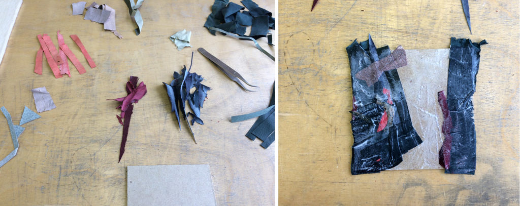
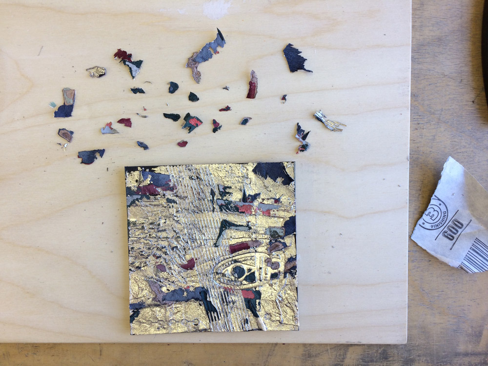
The palladium lacunose is a technique I learned during a workshop with Mark Cockram. An assemblage of goatskin and suede scraps was surface gilt with palladium. Additional texture was created through stamping, tooling, sanding and paring.
With all of the onlays placed in the top portion, I was ready to work on the bottom half. My first step was to trim both halves at a bevel to create a seamless connection at the center of the book. The design was marked in the leather and sewn with a cotton floss in a matching light grey color. Some shapes span across both halves of leather, so it was vital to have the embroidery line up with the onlay pieces.
The final aspect of the design to put in place was the “scaffolding”. After making my own thin line brass tools, the top half was tooled in palladium, while the bottom half was left blind.
Despite finding the entire book inspirational, one particular city drew me in deeper than the rest. Within chapter seven under the group “the dead” Eusapia speaks of an underground city where the dead attempt to mimic the living or vice versa. These opposing forces of truth and falsehood are represented by the two opposing panels. The lower portion of the design is meant to poorly mimic the top portion. This was achieved by removing the color, texture and glisten of the upper panel.
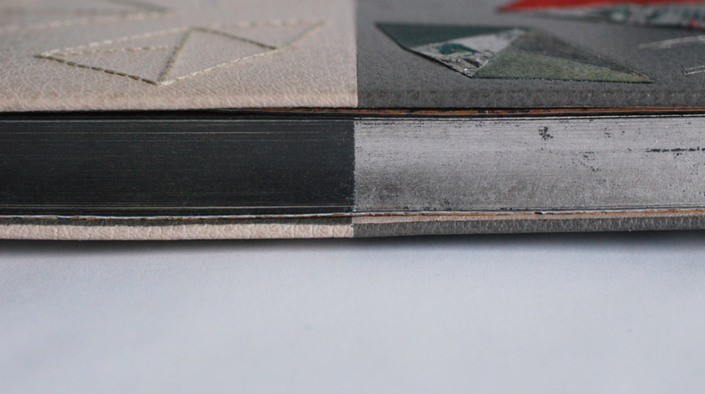
This theme of polarity and symmetry continues onto the edge of the book and the leather doublures. The entire edge was initially covered in graphite, then palladium was applied to just the head edge and half of the fore edge. The palladium was left looking distressed to compliment the broken palladium on the lacunose onlays.
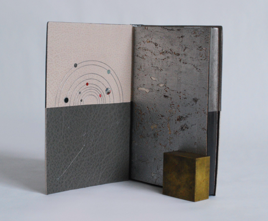
As you open to the interior side of the covers, more imagery is unearthed leading you back into the richness of the text. Pulling from Calvino’s references to building structures and the solar system, the front doublure depicts the orbits in our solar system with inlays representing the planets. The bottom half shows the constellation for Cancer. The stars are embroidered in a matching cotton floss with connecting lines tooled in blind.
The back is similarly styled with a palladium tooled dome and the constellation for Pisces. The fly leaf is a metallic cork paper. The book is housed in a quarter leather clamshell box. The spine of the box hints at the design of the binding with three small inlays collaged together. The rest of the box case is covered in stone veneer. The trays are covered in handmade Katie MacGregor paper and lined in the same faux suede used on the binding.
This binding was apart of the Student and Alumni Show at North Bennet Street School before going on display for the Society of Bookbinders International Competition 2017 in Keele, England. You can read more about my concept and see even more images here.

I find your intimate dedication to the material and design inspirational. I am so glad there are artists like you in this world.
Thanks for the wonderful compliment, I’m so glad you appreciated the post.
Hello Erin,
I love Calvino’s work as well, my introduction was through the Non-existent Knight.
It is a wonderful binding, so many things to like both on a technical level but also in your approach to represent Calvino’s spirit.
Thank you for taking the time to take pictures and explain your thought process behind your choices and the binding’s creation in general. It really helps to appreciate the result even more.
May I ask something?
How steep is the bevel between the leathers in the middle and how far in does it go? I’ve tried it a couple of times as practice but I never seem to get it right: if the angle is similar to turn-ins they always show under the leather and if it is too steep I’m afraid the “seam” won’t hold at the joints and spine.
Keep up the good work!
Dimitris K.
Hello Dimitris,
I have yet to read the Non-existent Knight. I am slowly working my way through his work. And hopefully I’ll be doing another Calvino binding in the future.
Thank you for your comments, I’m glad you enjoyed the post. The bevel was made at a 45 degree angle. I achieved this by cutting through both leather panels at the same time (the dark grey was already attached to the book, the light grey was not). I did have some issues initially with the light grey leather popping away at the joint, but was able to rectify it with more paste and PVA. I hope that helps.
– Erin