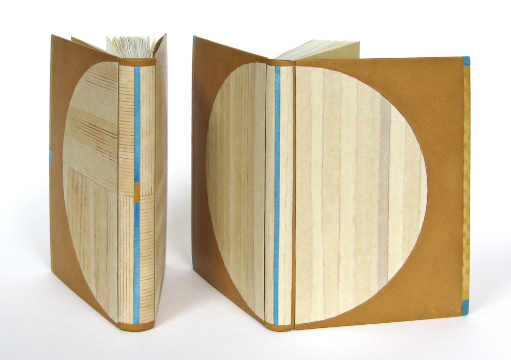
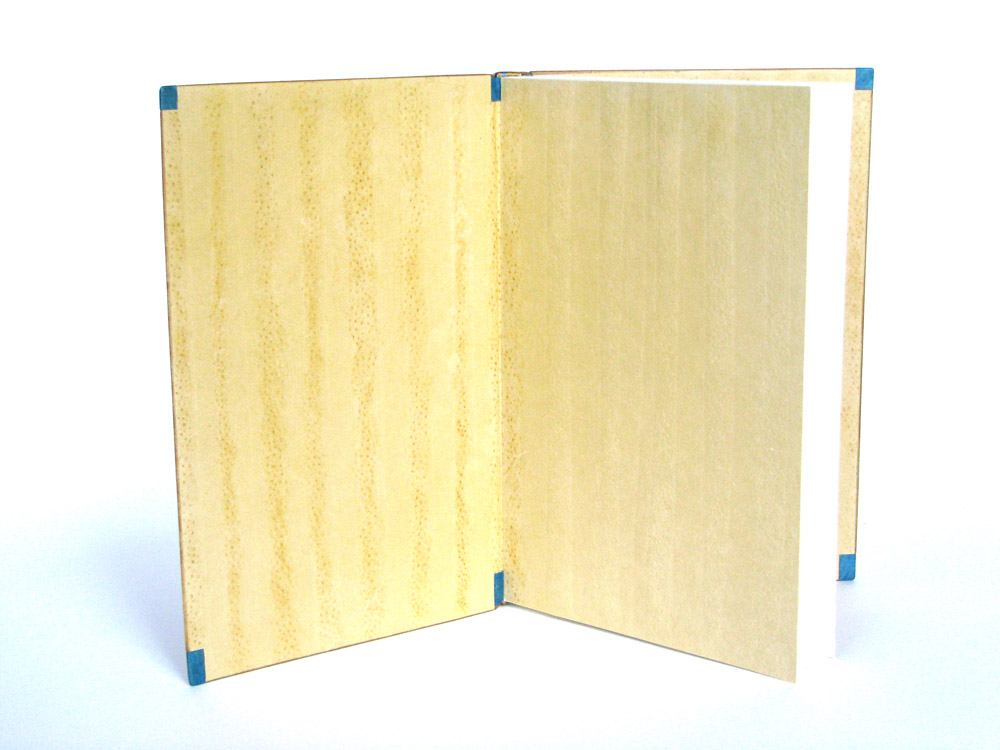
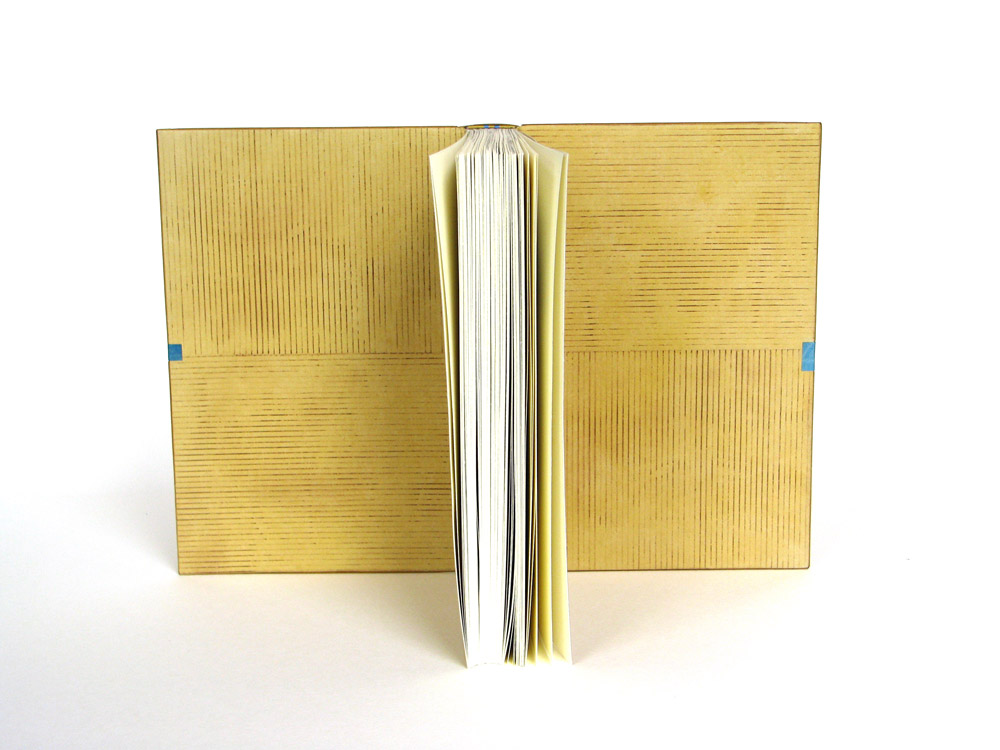
Lori Sauer bound The Moonstone by Wilkie Collins in 2015, just three years after it was published by Arion Press. This limited edition includes illustrations by Stan Washburn. As Lori mentions below, she split the text into two volumes, creating two fine bindings that compliment each other beautifully. Each binding is covered with calfskin and decorative handmade paper.
Can you talk about your use of materials and how they connect to the text? Which elements are paper and why use paper over another type of material?
Relating a material to a text is not something that I ever find myself mulling over. In rare cases one might pick wood for a book about wood, etc., but in the majority of cases leather is used, as convention. I’ve moved away from leather and now mainly bind in vellum because it’s so beautiful. Just to break out from my habit I bound this one in calfskin and paper. The calfskin because it has no grain and paper because I’ve always wanted to use it as major material for a design binding. I’ve always had the feeling (perhaps I’m wrong here) that paper is not considered appropriate for serious work. But it has a longer shelf life than leather, is open to a wide range of decorative treatments and I haven’t met a binder yet who isn’t besotted with it.
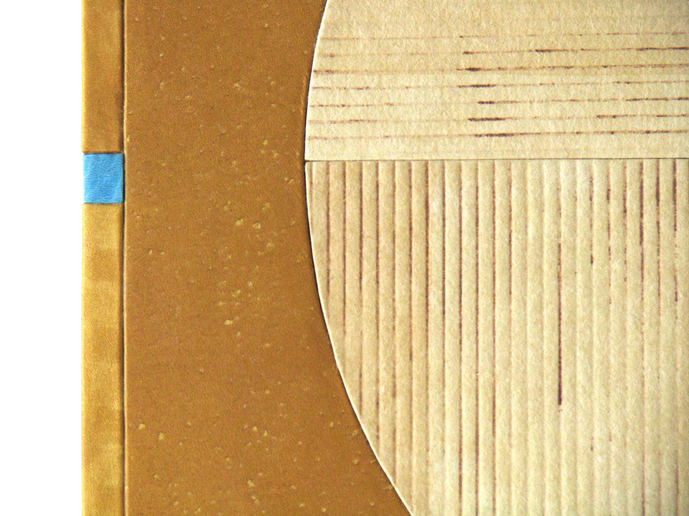
The circular shapes are paper and the area around the circles is calfskin. The paper is a heavy weight Griffen Mill, specially made for a commission I did and these are some of the off-cuts. The pieces have been tinted with watercolour to achieve a range of neutral shades. The leather has been sanded over the top of a pimply surface to create texture.
This is a very long novel with many characters and lots of narrative layers. There were a number of key scenes set on some shifting sands, a metaphor for the quasi-surreal nature of the plot. My colour choice came from this and also why I wanted to use a variety of textures/materials.
This is a single volume production (Arion Press) but I decided to split it in to two bindings because I find very thick books rather clumsy. It worked out well to divide it because of how Collins had structured the story into two sections. I liked doing a pair of complimentary bindings, as I was able to use more than just one of the many compositions I had played around with.


She’s wonderful