As I walk through the bookbinding department at North Bennet Street School, I am greeted by that familiar mixture of excitement and anxiousness as the school year comes to an end. The students are working busily to finish their projects before stepping out in the larger bookbinding community. I always look forward to this time of year, that is, the Student and Alumni Show. The exhibit opened on May 16th and will run until June 2nd (click here for opening hours). If you are around the Boston area, you must stop by to truly appreciate the craftsmanship of each binding.
The show will be highlighted in two posts, with this one focusing on the Set Book. Each graduating student is given a copy of the same book (a set book) and asked to create a design binding. I was incredibly impressed by the level of craft and creativity that each student employed in their binding. The set book for this year was 1984 by George Orwell, a literary classic and a story that many are familiar with. I had, in fact, never read the book. So in preparation for the following interviews, I read through an old 1984 edition that I had lying around. After photographing each book, I spoke with each binder about their inspiration behind their designs and how they chose to execute it. We candidly discussed the challenging and rewarding aspects of creating one’s first design binding.
Peggy Boston
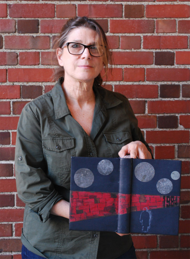
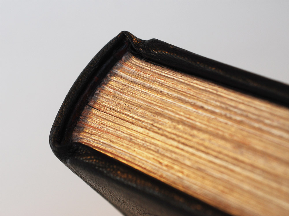
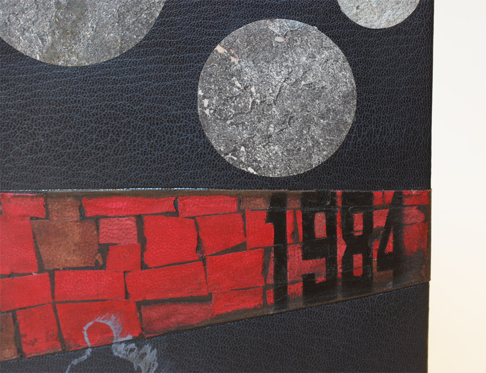
Peggy Boston used a dark blue Harmatan goatskin to cover her binding of 1984. Spanning across the binding is a large lacunose relief onlay with the title applied with airbrush. Five stone veneer inlays appear at the top half of the binding. The final element to the design is the painted outline of a man. The first thing Peggy mentioned to me in regards to her design was her craving for texture. Even in the small details, Peggy managed to apply some form of texture. Lacunose scraps were used to make leather wrapped headbands. The head edge is rough edge gilt in palladium. And stone veneer was used as the paste down and fly leaves.
For Peggy, creating her design was all about connecting the past with the present. She first read the novel back in the 9th grade and acts of oppression against individuality were as aggressive then as they are now. The most effective way to beat people down is to isolate them up against a wall.
The eye is often used as a symbol for Big Brother, yet Peggy wanted to indirectly suggest the looming gaze of a watchful government. To achieve this she shaped layers of tissue underneath each inlay to offer a subtle spherical dimension to the circular pieces of slate. Peggy employed paint in her design in two ingenious ways: first is the airbrushed title mimicking graffiti on a crumbling brick wall and the second is the painted outline of Winston, the novel’s protagonist, creating a shadow to suggest the character’s former existence.
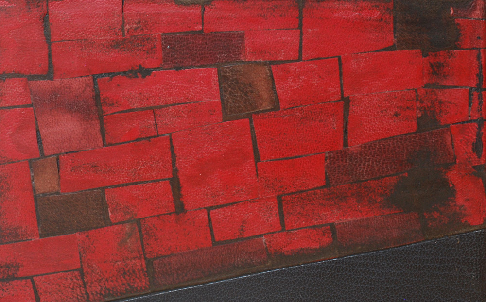
The lacunose brick wall was achieved by sanding through several layers of leather. Peggy used red and crimson colored goatskins for the bricks and covered them with a layer of brown goatskin to represent the grout. All of the sanding was done once the onlay was attached to the binding. Peggy did indeed achieve a level of depth with her design by incorporating just the right amount of variation in textures.
After graduation, Peggy will be moving back to San Francisco and looks forward to integrating into the thriving bookbinding community on the West Coast. Delighted to work in this medium, Peggy plans to continue studying bookbinding.
Nicole Campana
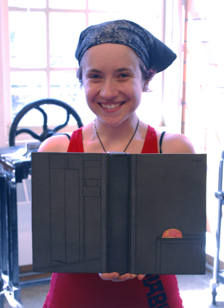
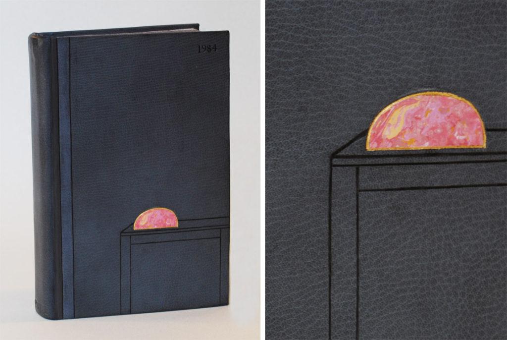
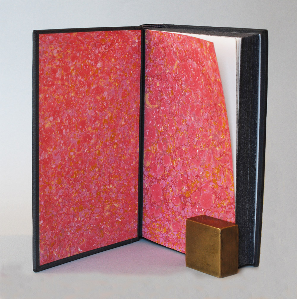
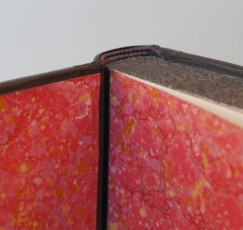
Nicole Campana used three shades of grey goatskin to capture the emotion of this bleak novel. Minimalist lines are smoke tooled on both covers to create a scene from the book. A gold-tooled onlay of marbled paper laminated to mylar sits upon the table on the front cover. The title is also smoke tooled in the upper right hand corner of the front cover. The French double-core headbands are sewn with alternating shades of grey with a stripe of pink breaking up the pattern. All three edges of the text block have been sprinkled with various shades of grey pigment; layer upon layer to build a more textured look. Nicole hand-marbled the paper used for the paste down and fly leaves.
One of the pivotal moments in 1984, is Winston’s decision to purchase the paperweight. Unlike the diary and pen he purchases earlier, the paperweight serves no real function yet unknowingly tethers him to the past. Through smoke tooling Nicole captures this scene. The back cover is a series of lines and angles, a minimalist rendering of the antique store front. As your eye moves onto the front cover, you are instantly drawn to the brightly colored paperweight sitting on the table that is tooled in a similar fashion. The smoke tooled lines are soft and hazy; the grittiness of 1984 is captured within the soot that lays in those tooled lines.
Winston is drawn to the paperweight just as our eyes are drawn to the onlay on Nicole’s binding. Encased in the glass paperweight is a single piece of coral, which Nicole represents with her own hand-marbled paper. She chose bright shades of pink and gold laid out in a traditional stone pattern.
As you open the cover, the allure of the coral is amplified. Nicole uses the same hand-marbled paper for the paste down and fly leaves and you’re senses are flooded with warm emotions. A lovely juxtaposition from the melancholic exterior.
Nicole will continue to focus on bookbinding after graduation and has been building up an inventory for her Easy shop that will be launching soon.
Todd Davis
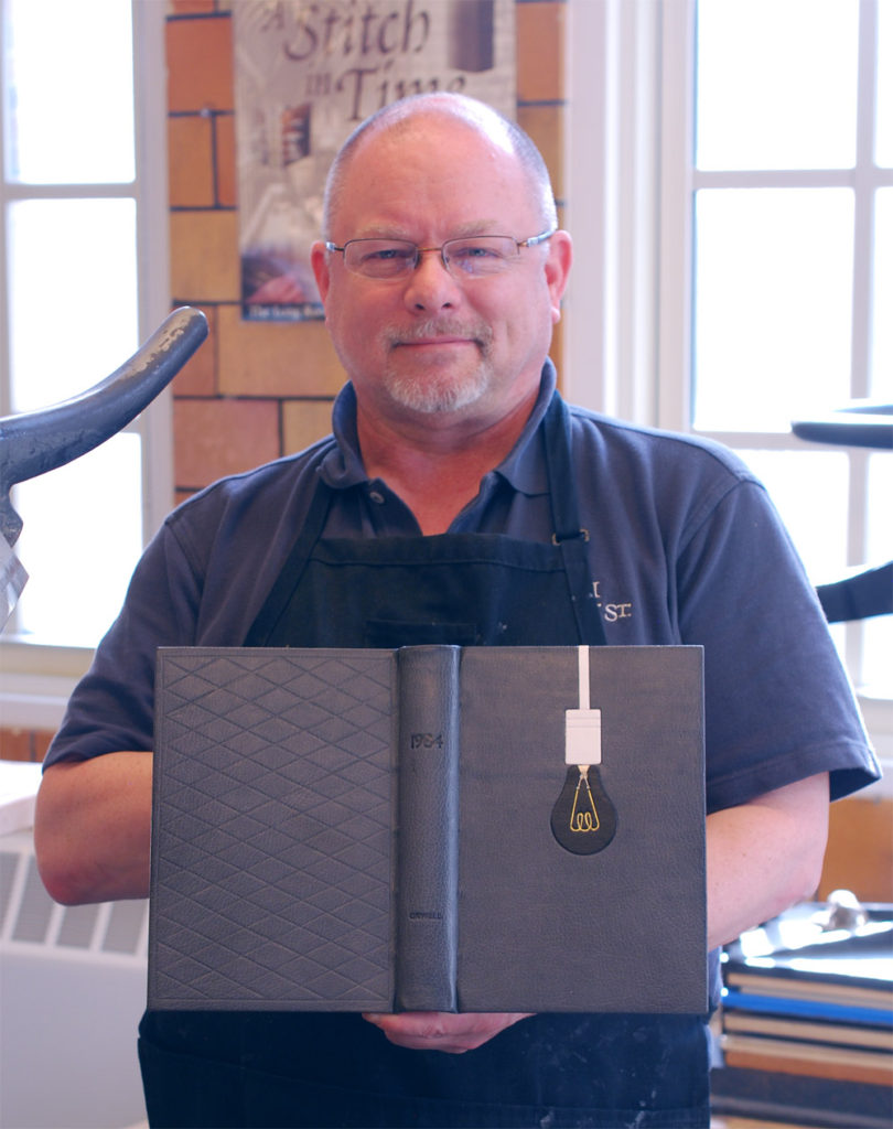
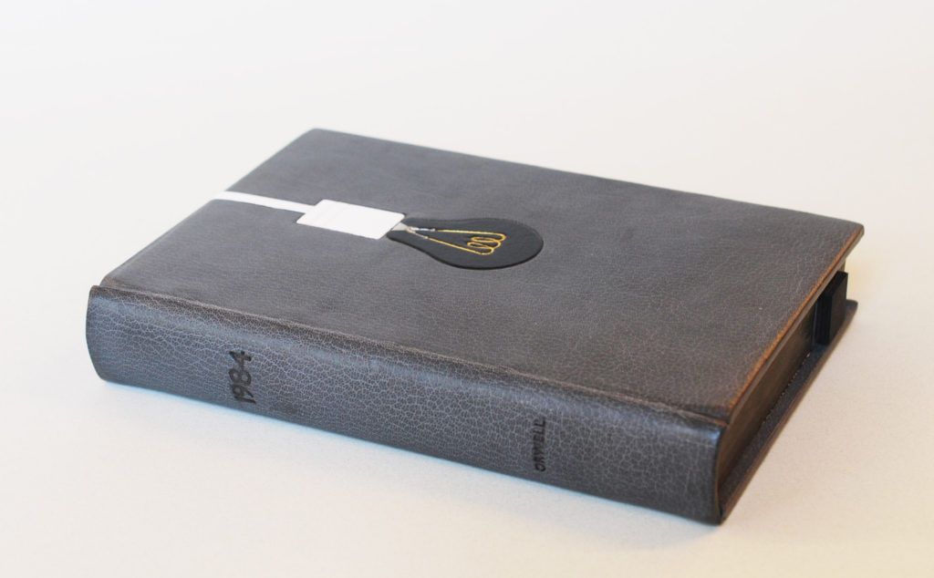
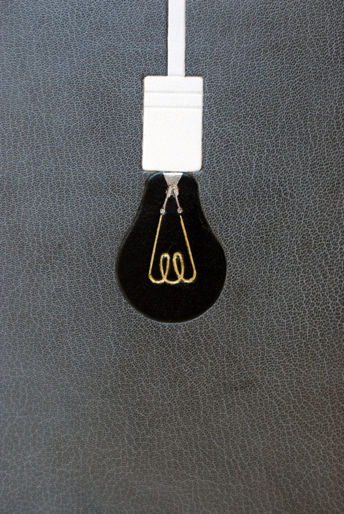
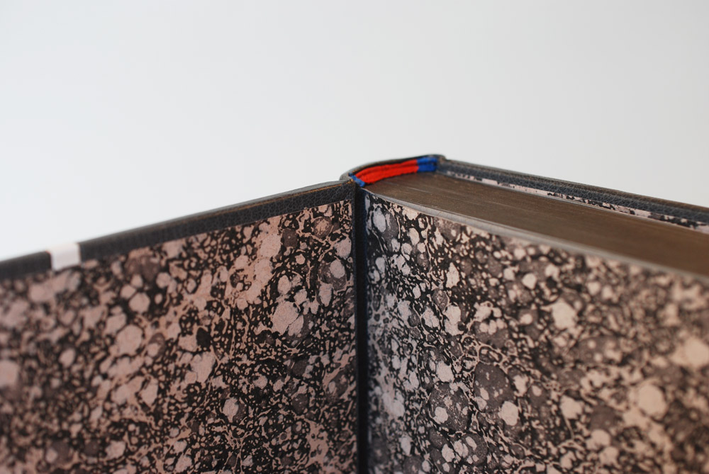
Todd Davis bound 1984 in a medium grey Harmatan goatskin with blind tooled onlays in white and black goatskin. Elements within the lightbulb are both tooled in gold and palladium with a small amount of surface gilding in palladium. The title and author are smoke tooled across the spine. The back cover is adorned in a blind tooled lozenge design. The French double core headbands are sewn in blue and red silk. All three edges of the text block are colored with graphite. The paste down and fly leaves are a black, grey and white stone marbled paper from Compton Marbling.
We shall meet in the place where there is no darkness. As a reader, we are introduced to this significant quotation only a few pages into the book. Todd found this line to be the inspiration for his design. Using a palette that is absent of color, Todd placed a black lightbulb on the front cover. The black bulb provides light with no illumination.
The entire design from afar has the subtle appearance of a noose, signifying the inevitable end that the protagonist will face. The lightbulb is a black goatskin tooled onlay. The interior elements of the lightbulb display three different design techniques: the filament is gold tooled, the leads are tooled in palladium and the stem press is surface gilt in palladium.
The headbands are the only instance of color on the entire binding. The colors that Todd chose represent the garment worn by Julia as described by Winston, her denim blue dress and red Junior Anti-Sex League sash. The endpapers are so extraordinary, they match the aesthetic of the binding to a T.
After graduation, Todd will be staying in Boston. Having recently purchased a bindery from a retired bookbinder, he is currently on the hunt for studio space in the Greater Boston area. The ideal space would be open for other binders to rent space and have access to the larger bindery equipment. Todd is constantly posting his handiwork on Instagram. You can follow him here.
Emily Patchin
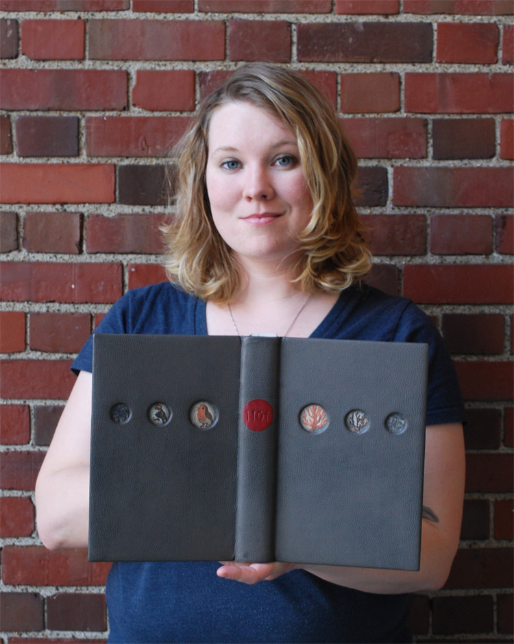
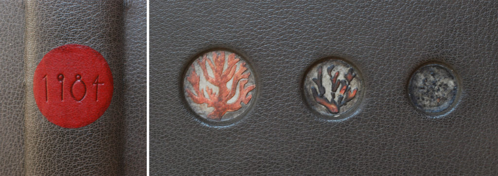
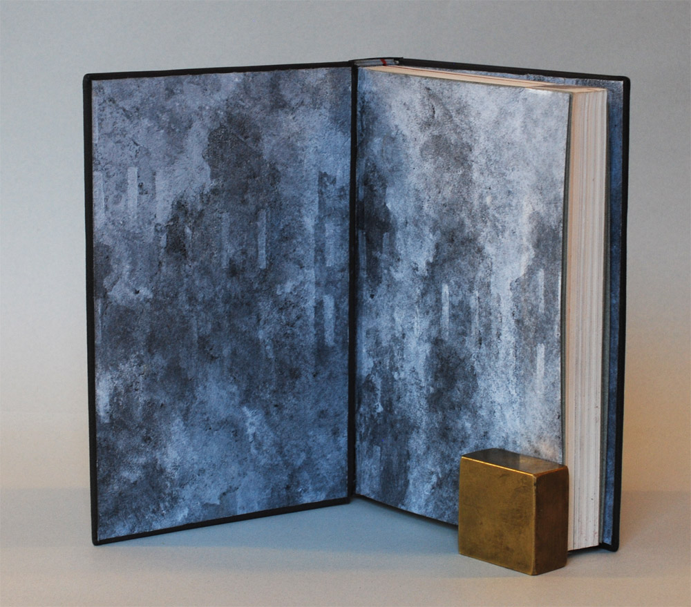
Emily Patchin bound her copy of 1984 in a medium grey French Chagreen goatskin. Six recessed circles on the covers contain a collaged watercolor drawing. The title is blind tooled on a leather circular label of red goatskin. The French double-core headbands are hand sewn in silk in grayish blue with a small stripe of red. The red stripe continues on to the head and tail edge as decoration. Emily created a unique paste paper for the binding, which she used as the paste down and fly leaves.
Emily was intrigued by the notion of false memories which constantly plagued the protagonist, Winston. She chose to stray from her initial idea of representing the characters directly and instead focused on three objects that continually surfaced throughout the story: the diary, the paperweight and the thrush.
Mounted into the recessed circles on the front and back cover are a series of images representing the bird and coral (which was encased inside the glass paperweight). These images quickly degrade as your eye moves closer to the book’s fore edge. Emily cut out her watercolor drawings and laminated them to elephant hide paper. The two smaller images were slightly charred to amplify the falseness of their existence. The red label refers back to Winston’s description of the diary, his first “illegal” purchase from the antique shop.
The endpapers were created by layering white paint through stencils over a ground of graphite. The stencils were silhouettes of degrading buildings. Harking back to a once beautiful architecture that is now crumbling under effects of government.
After graduation, Emily will be moving back to California. Beginning in July, Emily will be taking Dominic Riley’s Design Binding Intensive at the San Francisco Center for the Book. You can see more of Emily’s work at her website Out West Bindery.
Jonathan Romain
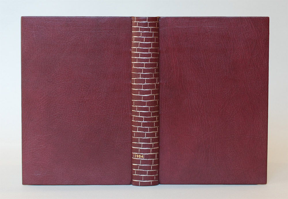
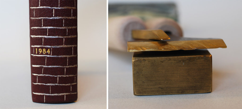
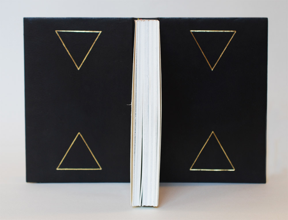
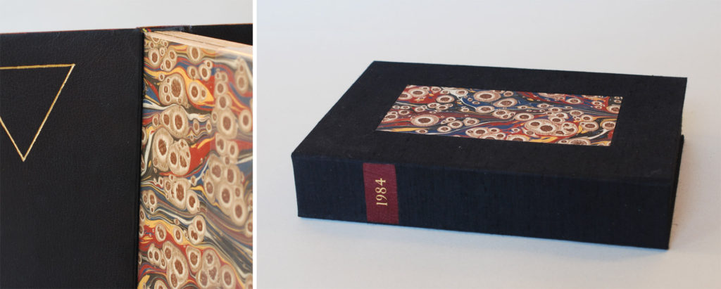
Jonathan Romain chose to isolate his design to the spine of the book. This design choice embraced the natural grain of the leather, which is so organic and rich. Jonathan chose a crimson colored Russell Oasis goatskin and tooled the spine in palladium with the title tooled in gold. French double-core headbands in mostly black with a fat stripe of red and yellow adorn the head and tail. The head edge of the text block is rough edge gilt. The Harmatan black goatskin edge to edge doublures are tooled in gold. Marbled paper from Payhembury was used as the flyleaves and to decorative the clamshell box.
Jonathan played upon the concept of structure and foundation; starting from the urban landscape of 1984. Building upon the themes of crumbling architecture and walls as barriers he began to make a connection between the structure of a binding to the foundational integrity of a brick wall. In order to achieve his vision of asymmetry and the fluid-like grout lines between bricks, Jonathan handmade two finishing tools.
The tooling is purposefully rough, offering an evener richer likeness to a brick wall. The doublures are adorned with four gilt triangles arranged like an hourglass sand timer. Each triangle represents one of the government buildings from the story: the Ministry of Truth, the Ministry of Peace, the Ministry of Love and the Ministry of Plenty.
Jonathan and I spoke for some time about the aesthetics of a box. I prefer to create a highly decorated box to match my elaborately bound book. There are some issues to this desire of mine. An elaborate box can increase the price significantly and might also need it’s own protective layer (which I usually remedy with a simple 4-flap enclosure). Yet Jonathan leans in the direction of creating a simply designed box that stresses functionality. Whatever your opinion, I wanted to include Jonathan’s box as it so nicely ties in with his binding. The black Canapetta cloth is adorned with a red title piece and the same tiger’s eye marbled paper as the book.
Jonathan is currently interning at the Rare Book Room at the Boston Public Library. Beginning in late summer he will move over to the Boston Athenaeum’s Conservation Lab as the Von Clemm Fellow. You can find more of his work at Romain Bookbinding.
Mary Grace Whalen
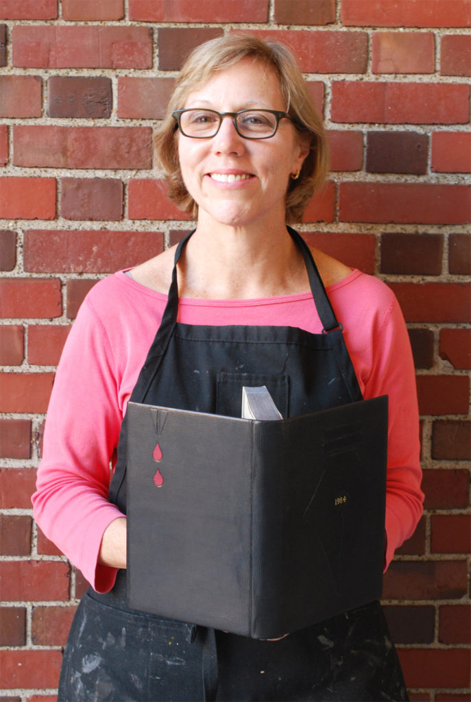
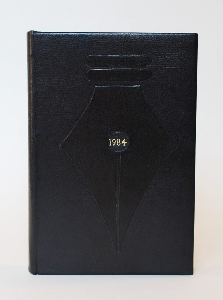
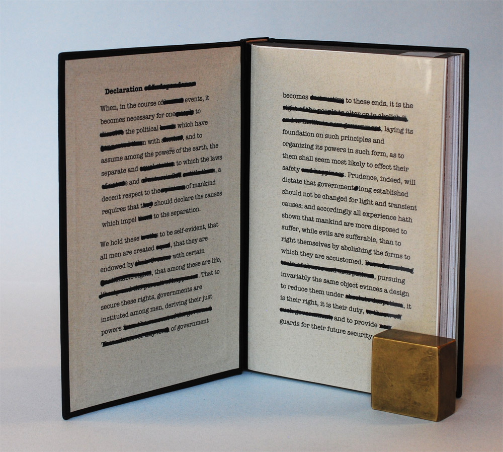
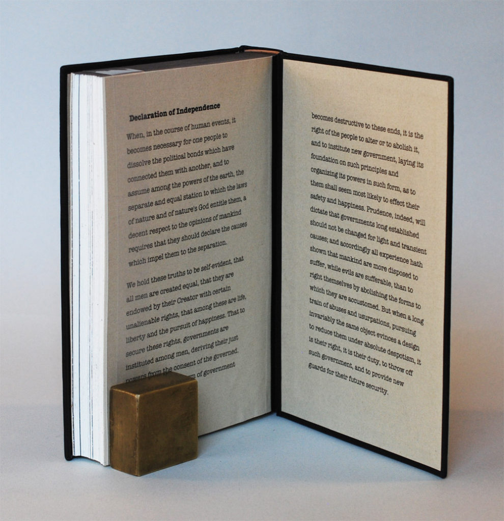
For Mary Grace Whalen’s binding of 1984, she opted for a somber look. Bound in black goatskin with blind tooled onlays of black and red goatskin. The title is tooled in gold on the front cover. The leather wrapped headbands at the head are a bisque color, while the headband at the tail is scarlet red. The head edge of the text block is colored with graphite. The paste down and flyleaves are printed on Nideggen and extends her concept from the cover to the interior of the binding.
Winston’s fate begins to unravel the moment he puts words to paper in his diary with an antique nib pen. The nib icon perfectly captures Mary Grace’s design concept, which is centered around the power (or subsequently the consequence) of the word. In 1984, thoughtcrimes can be curbed by notions such as crimestop, blackwhite, and doublethink. All of these words are product of Newspeak, a suppressive language where ideas of beauty, individuality and emotion are continually redacted and soon forgotten. Winston fights so hard to recapture old memories, trying to validate this thoughts by writing them down on paper.
Technical issues arose with Mary Grace’s initial design, which featured a black nib dipped into a pool of red ink all on a base of bisque colored leather. Overcoming a devastating hurdle, she revised her design to black on black. The tone on tone is a design choice that I admire. This revised design captures the spirit and dread of the story more closely. The back cover features the tip a of nib with two red droplets signifying the two gin-scented tears that trickle down from Winston’s eyes in the moment of death as he concedes his love for Big Brother.
When you open the book you are faced with a redacted excerpt of the Declaration of Independence. In 1949, Orwell wrote about a future dystopia that has since passed. Yet the current political affairs surrounding battles over autonomy and the right to express one’s individuality begins to shift closer to a universe seen in Orwell’s fictional novel. However, Mary Grace leaves the reader with an uncompromised version of the Declaration at the end of the book. Hope is not lost.
Mary Grace will be staying in the Boston area and will continue to hone her skills in bookbinding.
I want to thank Jeff Altepeter for once again allowing me to interrupt his classroom to converse with the graduating students about their set books. As always, it was such a treat to get to know each of them a bit more through their craft. Congratulations and good luck, Class of 2016!


Great bindings! Thanks for sharing, it is too far to travel…. from the Netherlands…
Good job everybody! I love the yearly set book post.
Nice to see and read about their work
Erin,
Thank you so much for this wonderful post. I graduated from NBSS in 2008 and am always excited and eager to see what each class is accomplishing each year. It’s not easy to do that living in Utah, so I really appreciate getting to know these binders and their stunning, beautifully designed and crafted work. Thank you!
Christina
Thank you so much for sharing these, Erin… Fantastic photos/writeup, and of course the work is spectacular too. Very enlightening!