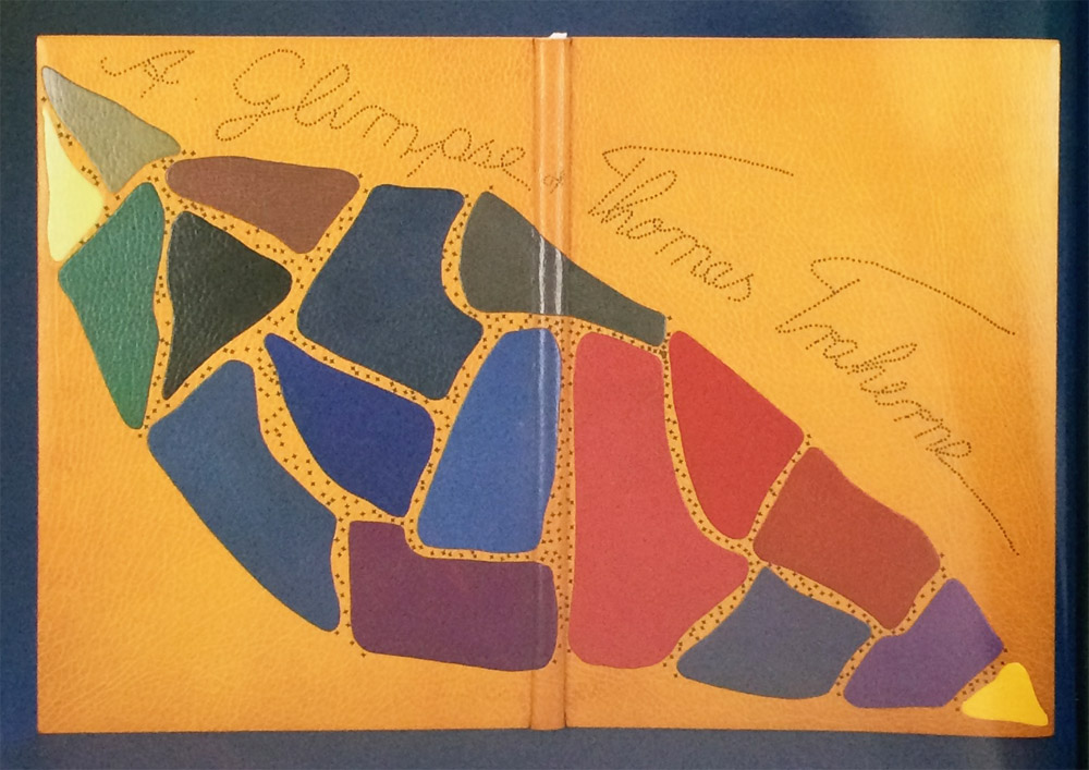
Another one of my favorite bindings from Tini Miura. This edition of A Glimpse of Thomas Traherne includes illustrations by Ann Brunskill and was published in 1978 by The Worlds End Press in London. The design on this binding is like an abstract puzzle compiled of “pieces” that represent parts of Traherne’s poetry to offer a picture of his creativity.
Bound in 1990 in yellow morocco where each onlay is a single, unique color. The title is stretched across the binding and each letter is created through repetitive tooled dots through brown foil. Tini creatively ties together the title and puzzle by tooling a diamond motif through brown foil strewn in the negative spaces between the onlays.
This is one of the few examples where the title is transformed into a design element. Can you talk about why for this particular binding, you chose to display the title this way as opposed to using type?
The colored onlay pieces are freely moving over the surface, like a line of a poem is following the former to make a verse. The overall image represents the several verses that make up the poem.

