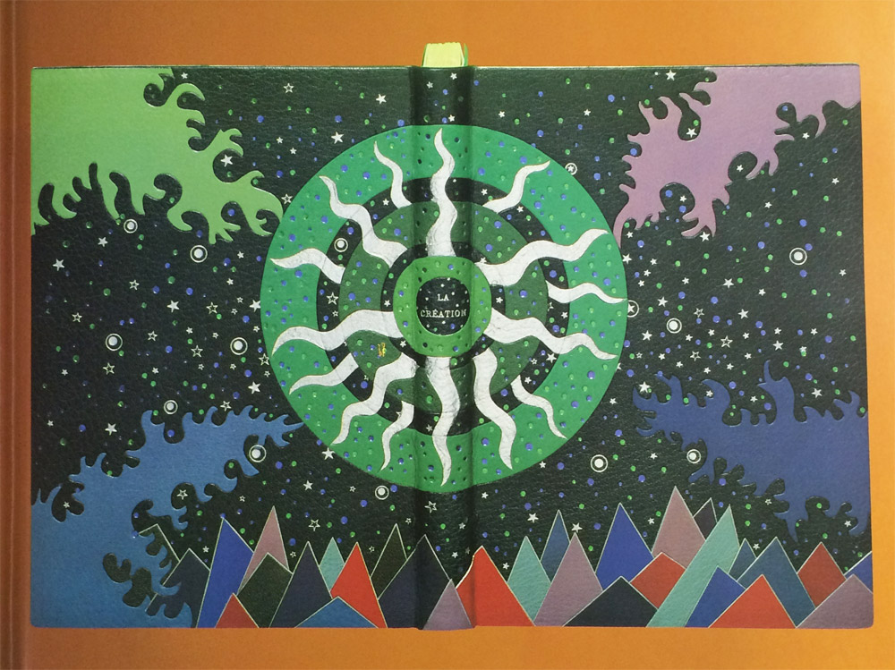
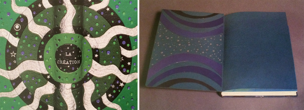
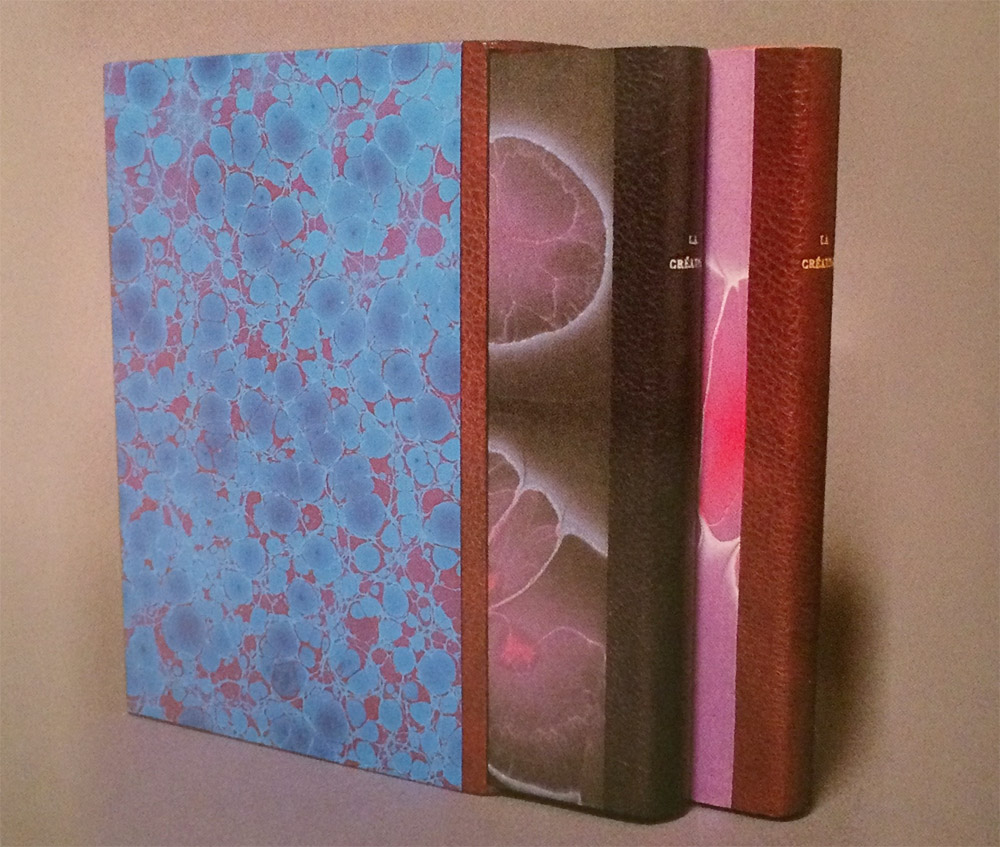
La Création (from the Old Testament) is a two volume set and was bound two ways by Tini Miura in 1983. The book itself was published in Paris in 1928 and includes illustrations by François-Louis Schmied. The first book is bound in dark blue morocco. The explosive design was created by using a large collection of colored onlays and platinum tooling. The central design of concentric circles symbolizes the calmness amongst darkness and chaos. Click on the image below to see a detailed image of the design.
The doublures are a pale blue morocco with cool-colored onlays and platinum tooling. The fly leaf is one of her recognizable oleaugraphs (more on that in the interview below).
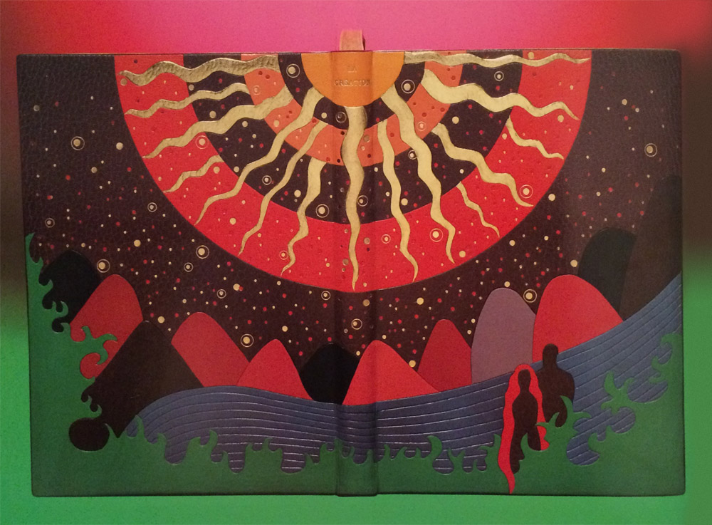
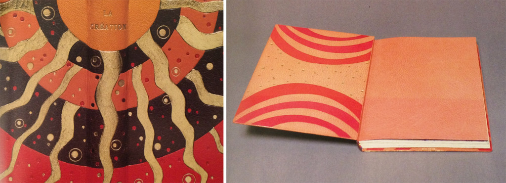
The second binding in La Création is equally expressive, but designed in a warmer palette eluding to the birth of life. This binding contains the suite of illustrations by F.L. Schmied in black and white and is bound in a wine colored morocco. An impressive collection of onlays create the pictorial design along with another explosive central design similar to the first binding. Small tooled shapes are speckled across the background and emphasized with gold and red foils.
The doublures are created in a similar fashion to the other binding using pink morocco and onlays in rose. The tooling is completed with gold foil.
I think it can be tricky to create a cohesive and attractive design when adding multiple layers of color and tooled elements. Your interpretations of La Création are an example of when this design strategy is successful. When you are building designs this complex, where do you begin? Can you walk through your process for laying out your designs in leather?
I saw the image in my mind and understood this was from the old testament: In the beginning………The word created the vibrations which are spreading throughout our universe.
1. I begin with the idea sketch, indicate colors, shapes etc.
2. make a scale to scale drawing, indicate numbers of lines and curves from the set of the gilding tools
3. transfer this design onto a long fiber Japanese paper
4. attach this Japanese paper
5. begin the tracing using my warm tools through the paper
6. remove the paper, begin deepen the impressions
7. moisten parts of the leather, using a warm gilding tool “ crushing” the deep leather grain to a solid line by gradually increasing the temperature and pressure. ( to have an uninterrupted gold line all grain has to be “ crushed “ to a level where no hight differences exist.)
8. onlay: thinly pared leather is wetted, placed over the shape it is meant for, tapped down by using a soft brush as not to tear or stretch the shape, using a warm gilding tool follow the lines, remove the leather, let dry between board, when dry, cut desired shape holding a penknife at an 45 degree angle. Roughen the form on the original leather on the book with dull side of binders knife for a better hold. Paste out the onlay, wet the roughened shape, paste onlay. down. Press under a thin Japanese paper with fingers or flat hand, pick up excess paste, trace outlines, let dry under weight.
– – – – – – – – – – –
Tini Miura became a household name during my time at the North Bennet Street School. Our instructor, Jeff Altepeter, was taught by her while at the American Academy of Bookbinding and so her techniques would emerge into demonstrations every once in a while. For the interview this month, I’m going to be mainly focusing on bindings from her book A Master’s Bibliophile Bindings: Tini Miura 1980 – 1990. This book was my first exposure to her work and when I first fell for her expressive and colorful designs. Tini has had a long and prolific career as a binder and teacher, so I hope you enjoy her responses on those experiences.
Check out the interview after the jump and make sure you come back during the month of October for even more enlightening responses regarding a selection of Tini’s work. You can get email reminders by subscribing to the blog, just click here.
Your artistic interests came at an early age, being expressed through painting for the theater during high school. After graduation, you decided to combine your love of painting and reading by becoming a book illustrator. How were you introduced to a career related to book design?
I grew up in a home where art was alive, my father was a professor for history of art and painting. After seeing my first opera I was so impressed by the scenery that I wanted to design stage settings in my future.(Also singing in a choir I realized the stress before an opening was not for me.)
Your father encouraged you to understand book construction before entering a job in design. Can you talk about your first apprenticeship?
I wanted to become a book illustrator. I love to read and working with colors makes me feel alive. As my father taught at an art school, he gave me his advice. Like a fashion designer needs to know how to sew, I should learn the functionality of a physical book. I was an apprentice in Jens Blutau’s Bookbindery in Kiel for 3 years and graduated as number one in my town, then state and finally, my country.
You later spent 14 months studying with Hugo Peller at the Royal Bookbindery in Sweden. How did this training differ from your German training? Did you prefer one style over another?
After graduation, I studied for 14 months under master binder Hugo Peller of Solothurn, Switzerland. Hugo Peller had refined his techniques in Paris, France under monsieur Altermatt and taught in the French-style binding. In France many steps are different. There are often 7 craftsmen working on one book. Tools and techniques have therefore evolved differently. For example, if one does nothing but edge gilding, the result differers from a binder who might just do it twice a year. I work in the French method except for 2 steps.
In your interview in The Thread That Binds, you said that it takes 8 years of apprenticeship before one can be considered a master binding and to have enough experience to teach. This model of training has been accelerated today or perhaps can be viewed as not as comprehensive. How do you perceive training for newer generations of bookbinders?
When I was learning, you needed 3 years of apprenticeship. If you want a master degree, you needed 5 more years. Either at an institute or a combination of practical work and school. To be a leader you have the responsibility to know.
If one wants to open one’s own bindery and have apprentices, one needed a master certificate to keep the needed quality over the centuries (since the beginning of the guilds.) I don’t know if the rules are the same now in various European countries.
It is more difficult now to find a bindery that offers these qualities. Technology has changed as well the number of private collectors world wide. I also taught design and history of art from Romantic to Art Deco.
All my training had an influence on the way I work. Being able to compare systems, speaking several languages, not feeling bound by national pride, do what I consider is best for a specific task, made it easier to study in various countries. I choose the technique best for a particular task. (Lots of techniques for various problems—also taking into account in which century a book was published.)
Your training came from several binders and finishers spread throughout Europe. How did this diverse training help you develop your skill? Do you find influences from your instructor’s work in your own design work?
I pick from a variety of techniques to do the best for a particular book, working with 98% French methods. I don’t think I was ever influenced by designs from someone else. It sounds crazy, but when I see or touch a book, I have been asked to design and bind I “see” it ready, colors and design. Binding is a physically challenging work and the design is like a “present”, no work involved, only in the execution. That is why I never change what I have seen in my mind’s eye.
In addition to a diverse training, you’ve also had ateliers in Stockholm, Tokyo and New York (to name a few). What unique qualities did each of these communities offer to your career as a binder?
I have lived in 7 different countries, visited many more. The location had nothing to do with the work, the customers followed me to these places.
Tini’s list of ateliers:
Stockholm, 1963- 1974
Tokyo, 1976 – until now
New York 1986- 1996
Santa Fe, N.M., 1999 – 2002
Long Beach, Ca. 2005 – 2015
Having worked as a binder since the 1960s, how has the perception of fine binding changed?
I don’t think my perception has changed, the marked for designer bindings – I think is less numerous, but the love for our profession has not lessened. There are a lot of activities all over the States and I believe that many want to feel satisfaction to see something grow, using your brain (reading the book) your body (binding) and emotions (soul) in the choice of colors and design. In this age of technology where friends sitting next to each other, are texting not talking, we need to live in the physical, not only virtual world to stay connected.
Not only are you a talented bookbinder, but through collaborative efforts between yourself and your husband Einen, you’ve developed a marbling technique referred to as oleaugraphs. Can you talk about this process and how you got interested in marbling?
For me, color and music are emotions. From the very start I made decorative paper for a particular book. How could I use a 17th century marble pattern on a 20th century text, print, lay-out, illustrations? It felt wrong to me and I began to experiment in various methods, marbling among them.
I had marbled in Stockholm and when Einen and I moved to Tokyo, we began to experiment. I wanted modern decorated paper for my 20th century “live d’artistes”. The word Oleaugraph is a combination- oil-English, l’eau- water,French and graph from drawing, Greek.
Above are three examples of Tini’s oleaugraphs used on the slipcase and chemise for the two volume set of La Création.

What an interesting interview. I love to hear how people find their craft. Always impressed by this series, Erin!