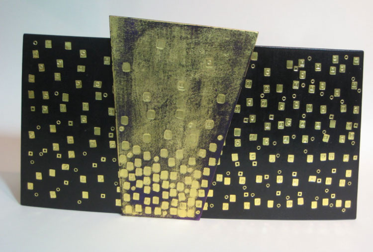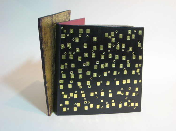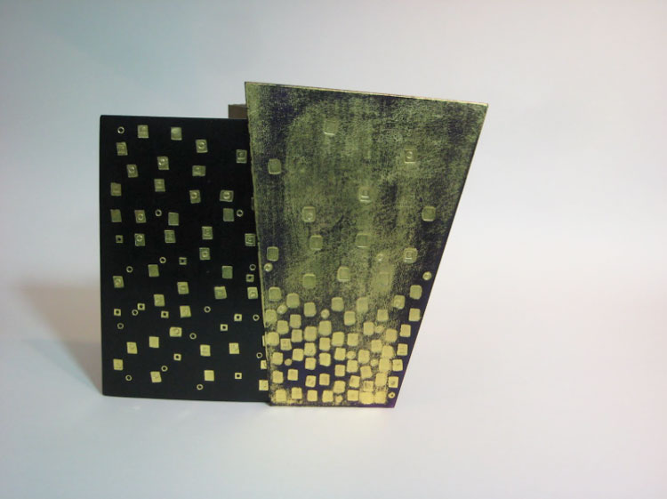
Die Nibelungen arrived in Mark Cockram‘s studio bound together with staples. After removing the pesky binding material, Mark transformed this book into an intriguing sculptural object.
What’s the inspiration behind this sculpted binding? The additional panel almost appears to swing between each cover, although I believe it is attached to the lower cover.
This is a charming book with fantastic illustrations. One aspect of the illustrations are the backgrounds, often of buildings. The outlines of the buildings create a framework for the rest of the illustration. I wanted to explore this with the binding. You are correct to say that the panel is attached to the back board. The concept is simple, but like a lot of simple things it works well. The edge of the binding is extended beyond the normal square. When the book is partially open the panel gives us an angular perspective, again a reflection of the illustrative style.
The leather is hand dyed with traditional gold tooling, I tend to make my own simple tools and adapt them as I work. I set out to produce a simple, controlled, rather elegant book with angles and forms. As with all my work, I had fun making Die Nibelungen.


Excellent creativity and book art. This is really a inspiringly beautiful book. Thank you so much.
A beautifully original book design, Mark has a good artistic eye! Thanks for the post Erin, keep up the good work! ~ Paul