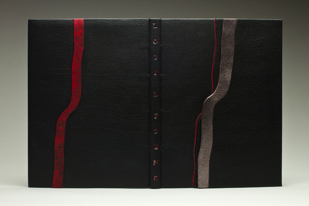
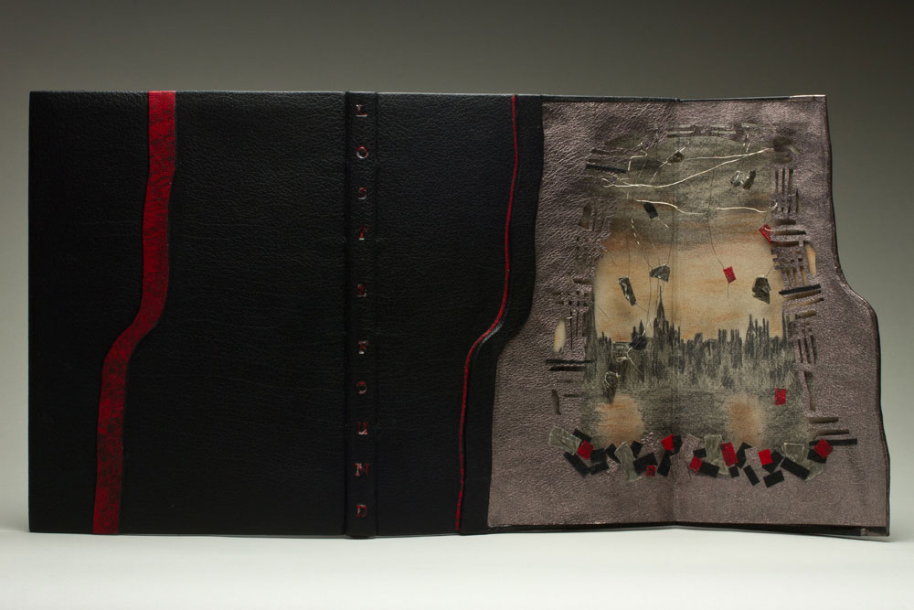
This beautiful fine binding has a secret. It’s a secret (technique) that only Monique Lallier and a few of her students know about. The front cover has a panel that swings open along the fore-edge to reveal an elaborate, hidden design. This technique is unique to Monique’s portfolio.
Lost and Found is a work about illustrator Rachel Rackett and was recently bound by Monique for InsideOUT, an international exhibition organized by the Designer Bookbinders that celebrates the craftsmanship of contemporary binders and private press printers. I can not wait until this exhibit arrives at the Houghton Library in September, you can bet on a future post about the show.
Another signature design element seen throughout your portfolio is the front panel, which opens to reveal a hidden design. What is the history of this design technique, where did you learn about it?
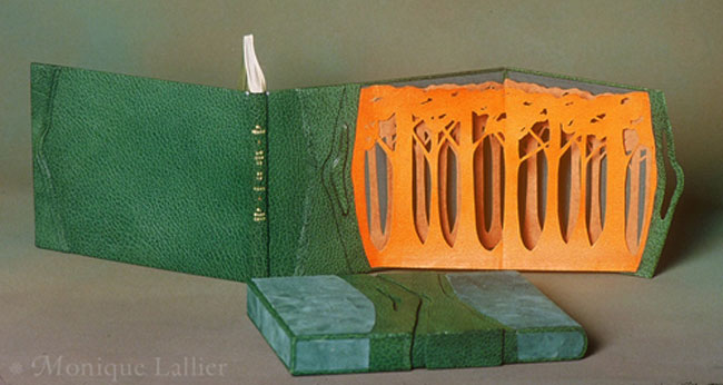
In 1985 I designed L’Ecorce et le Vent with a front panel opening on a “forest” of layers of trees, the first layer being goat skin and the two other layers being Japanese paper. This was my first attempt and it was a great success at the 1986 exhibition L’Association des Relieurs du Quebec. This book is now in the collection of the Morgan Library in New York. I really don’t know where I had this idea of the hidden design. In my first attempt it was to show a forest and I wanted the three dimensional aspect of looking at a forest, so it had to be free and moving, not static like an onlay.
For The Knell of Cock Robin I wanted to express the feeling of a bird (on the agate) flying into the forest.
For Lost and Found, the story is about Rachel Rackett, an illustrator of books. When she died they found a box filled with drawings that had never been used, so they produced the book to show her work and many illustrations were about the blitz of London during the war, so I thought that the hidden design of destruction was perfect for the story.
I don’t know anybody else, other than my students, that used this technique in the same way. I have seen front panels that cover the entire surface of the front or back covers, it creates a very different design.
– – – – – – – – – – –
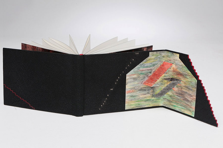
Just one more panel binding to end the post. The following binding was completed in 2012, for the ARA-Canada exhibit Les escaliers de Québec. The portfolio binding is covered in black morocco goat with highlights of red morocco. The text block is an accordion attached to the lower board only and has a graphite colored head edge. The hidden décor panel opens to a colorful scene created by Masahiro Chatami with a photograph of Québec City tipped behind the staircases. The marbled paper endleaves are by Claude Delpierre.


I love her work so much!And more importantly,I respect Monique Lallier.She has never stopped creating and making new books,experimenting new ideas.Her work is unique and elegant,poetic.If I will travel to the United States in the futrue,I will attend her workshop class(Is she still teaching now?)But,currently,I could only admire her works online.I have just bought the book’the thread that binds’,and her DVD instruction:)))
I’m so glad you are enjoying the posts on Monique’s work. She is still teaching, you can find her workshops regularly at the American Academy of Bookbinding.
These are AMAZING!!