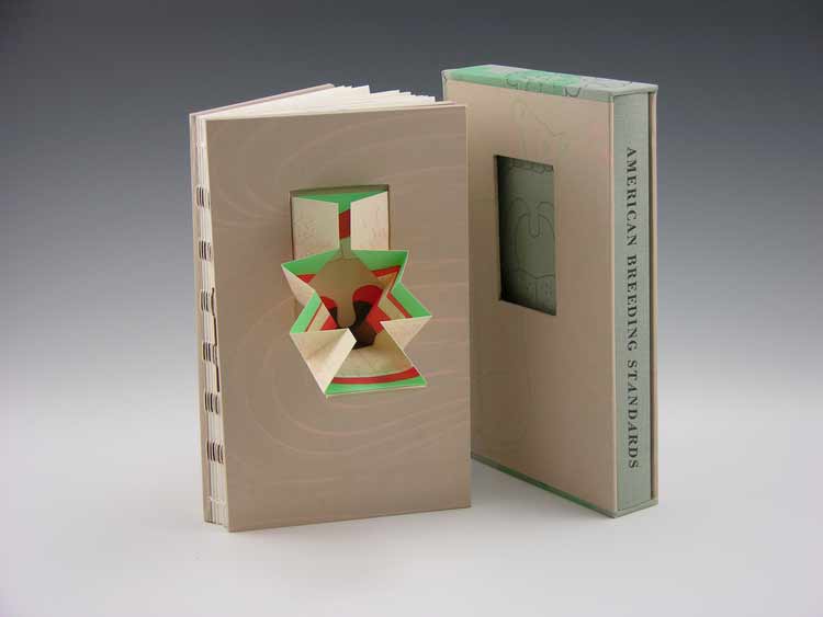
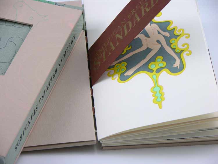
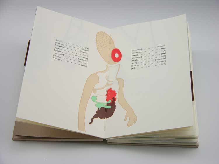
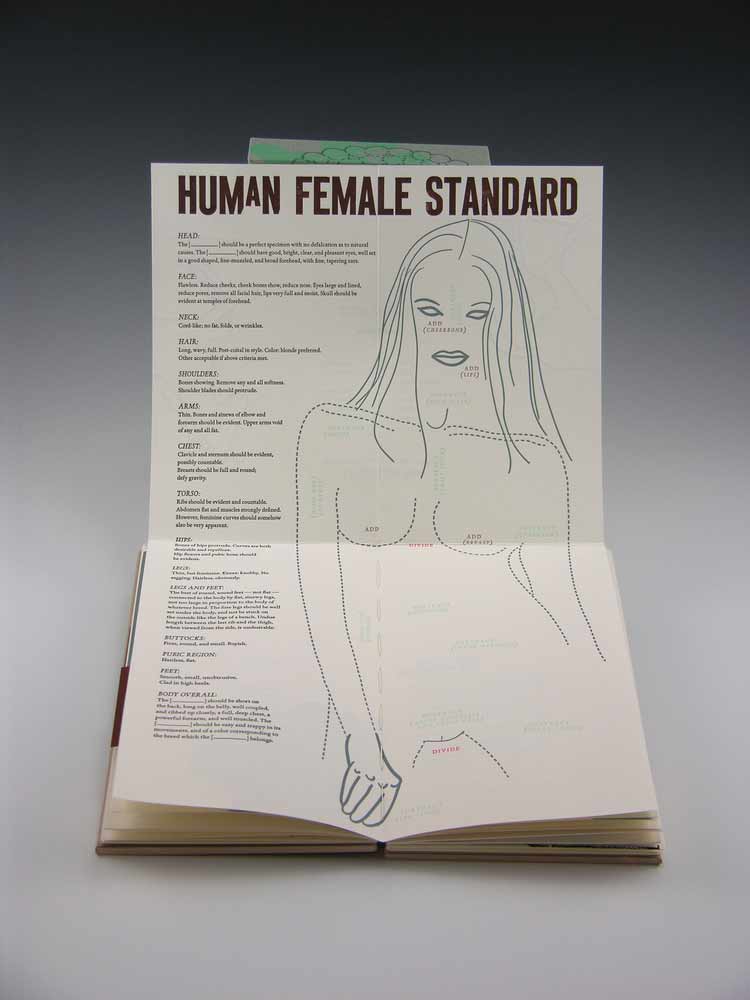
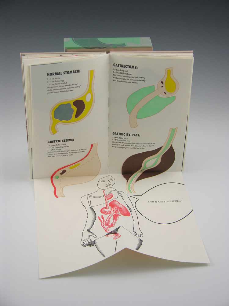
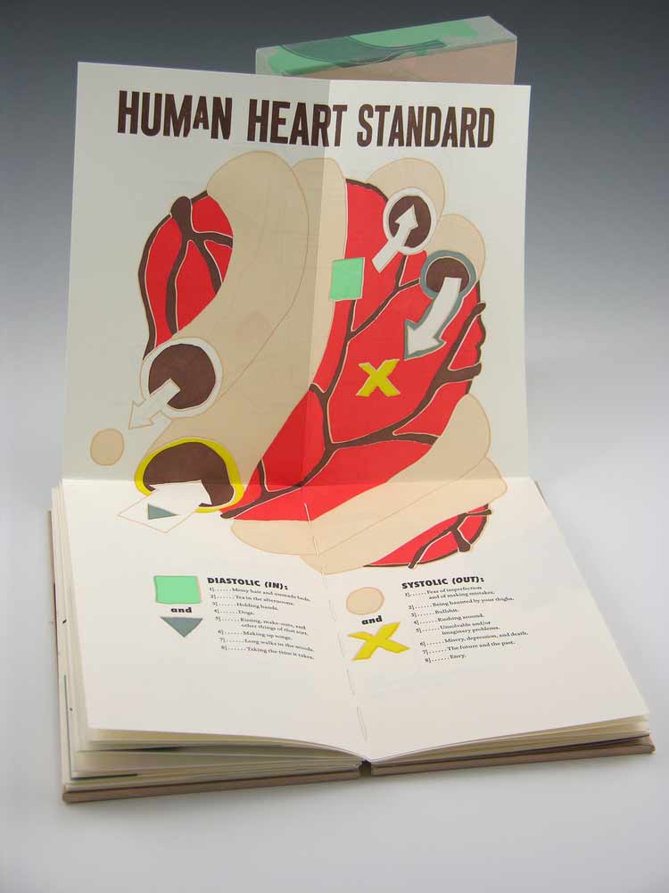
American Breeding Standards is the most recent work from Crooked Letter Press run by book artist and graphic designer Ellen Knudson and was produced in an edition of 60 in 2012-2013 in Gainesville, Florida. This artist book explores the systemized rules about what comprises a good or bad horse, a good or bad woman — and the steps one might take to achieve the breed standard.
American Breeding Standards was designed and letterpress printed on Zerkall Book paper. The illustrations and text are printed from photo-polymer plates and handset metal types. Some text excerpted from American Horses and Horse Breeding (John Dimon, 1895) and Canine Breeding Standards of the German Shepherd (American Kennel Club, 2012), while the rest of the text and illustration are by Ellen.
The binding structure is an exposed spine sewn on Cave Paper tapes and attached to paste paper covered boards. The cover of the book has a hinged pop-up that folds out. There are also 3 additional foldout pages throughout the book.
While setting up the Marking Time exhibition for the Guild of Book Workers at Dartmouth College, I came across Ellen’s piece Self-Dual (How to Walk a 30,000 Mile Tightrope). By the way, I’ll be featuring this book in a post later this month. The prints featured in this artist book are beautifully illustrated and printed in rich and muted earth tones. The book was favorably executed as the dos-a-dos style binding.
I’m excited to present this interview with Ellen and to post a portion of her work throughout the month of July. Ellen has such a versatile design sense, offering a range of artist books so throughly executed. Read the interview after the jump and come back each Monday in the month of July for more posts on Ellen Knudson.
After graduating from North Carolina State University in Graphic Design you later pursued a Master in Fine Arts from the University of Alabama where you studied Book Arts. Can you talk about your interest in these fields and what your training was like, particularly in the book arts?
I’ve always loved language, writing, and letters. In high school, my friends and I wrote notes to each other and drew the typography, almost illuminating them! (Thank goodness there was no texting — where would I be today!?!?) We were graphic designers without knowing it! One friend even made a letter E out of steel wool (she’s a nurse now). The margins of my notebooks were packed full of illustrations of letters and all kinds of creatures. It’s just what I liked doing.
I pursued graphic design because of my attraction to typography. I saw a letterpress printed piece when I was a junior at N.C. State. I loved the tactile nature of the type and paper. That was when I fell in love with the materiality of letterpress. After college I worked as a graphic designer for 12 years, always keeping letterpress in the back of my mind. During that time, I made my own one-of-a-kind books using stamps, stencils, transfer type, and colored pencils, never realizing that Book Arts existed as a discipline. In the late 1990s, I was lucky enough to live in Chicago and worked at the museum The Art Institute of Chicago as a designer (still to this day, my favorite job ever). I discovered Columbia College Chicago Center for Book and Paper, and it was there that I had my first experience with Book Arts. I was so excited about letterpress and book arts that I bought a Vandercook Universal I from Dave Churchman in Indianapolis.
In 2002 my husband, 3 year old son, and I moved to Mississippi and a year later I decided to attend the Book Arts graduate program at The University of Alabama. It was the perfect program for me because I needed and wanted to learn the fine crafts of letterpress printing, hand bookbinding, and papermaking. I had previous exposure to the processes, but the Alabama program provides a modern, fine press approach that is meticulous and very centered on craft. I had also taken a couple of fantastic workshops at Penland School of Crafts, but it was really the UA Book Arts Program (Steve Miller and Anna Embree) that helped me pull all of my experiences into something concrete.
Can you discuss your process for transforming an idea into a physical book and how you play with the book structure?
Every book I make begins with many, many mock-ups. Most of my books contain some, if not all, of my own writing, which is where the idea begins. I typically start with an illustration of a few page spreads of the book, then I draw a three-dimensional illustration of the book so that I can “see” the idea. This is my favorite part — I usually do that drawing multiple times, on napkins, receipts, or whatever, because it is the picture in my head that I’m dying to make real! Imagery doesn’t have to be finalized — I use shapes and lines to indicate image and text. Doing this stems from my undergraduate education, where “thumb-nailing” was how we started all of our projects. It’s something I’ve always done (remember: margins of the notebooks…) and I don’t know a better way of working out ideas. From the drawing stage I move to folded pieces of paper, usually just plain old copier paper — I try not to get too precious about the early mock-ups because I want to explore and not worry about using costly papers.
When designing the book, my goal is to enhance the content of the work through the structure. I typically don’t stray too far from the codex form because it’s the sequential nature of books that drives me to be a book artist in the first place. The one book I’ve done that doesn’t use the codex form is Subject/Verb/Object — and that, too, was a conscious decision because the “book” is about the confusion/frustration of things not being clear or straightforward.
After the initial sketching and thumb-nailing, I usually design the book on the computer, even if I will be hand-setting the type. From the computer I print out laser copies and make more mock ups. I make blank mock-ups with the real materials I will use, sometimes laser or inkjet printing on those materials for mock-up purposes. During the design process, I would say that I make anywhere from six to ten mock ups before I even begin printing the book. Believe me, things definitely change when I get on the press, but that is both challenging and exciting.
Paste papers have been used frequently in your artist books. Can you talk about using this medium in your work?
Paste papers are my way of painting and bringing interior color out onto the exterior container of the book. Making paste paper is very different from letterpress printing and bookbinding — it’s messy and much less meticulous (at least the way I do it). I also like the way that paste paper varies the finished edition. No two books are exactly alike. That appeals to me.
You’ve taught a range of letterpress and bookmaking workshops at various venues such as Penland, Paper and Book Intensive, the University of Alabama. What aspects of teaching do you enjoy most?
My favorite thing about teaching is that it helps me learn my craft. Teaching makes me think about how I actually do things and how to improve and/or simplify the process so that others can learn. I’ve been teaching Book Arts at The University of Florida for the past few years, and it has helped me immensely with my own work. The best way to learn something is to do it! Repeatedly! I also love to see what students do with the techniques I’ve taught them. I love it when a student simply takes a process and makes something beautiful. It’s inspiring.
You’ve been working with the book as an art form for over 11 years, how do you see your work evolving within this medium?
My approach to much of my book work has been very methodical and planned out. I design the book, then I produce it. I am very interested in relying less on the computer and doing more with manually created images and the contents of my print shop. I am experimenting with putting things in the press, inking it up, pulling a proof and printing that page, then seeing what happens next by reacting to what’s on the page. Conceptually, when I have a text or idea, I will still apply it to the experiment. I am also excited to interact with the new Artists’ Book Ideation Deck that Julie Chen and Barbara Tetenbaum have created. My future work is definitely being motivated by improvisation.
