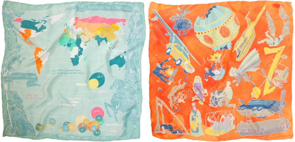
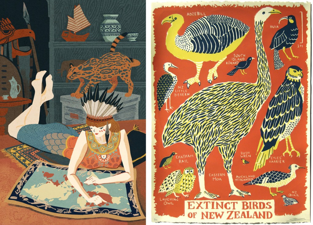
Infographics are popping up everywhere on the internet, so why not use them as patterns on garments. Talented illustrator Caleb Luke Lin has turned his delectable designs into stylish kerchiefs. Caleb is also the creator of many delightful paintings, prints and illustrations.
2012
-
Artist: Caleb Luke Lin
December 5, 2012 by Erin Fletcher
-
Photographer: Ina Jang
December 5, 2012 by Erin Fletcher
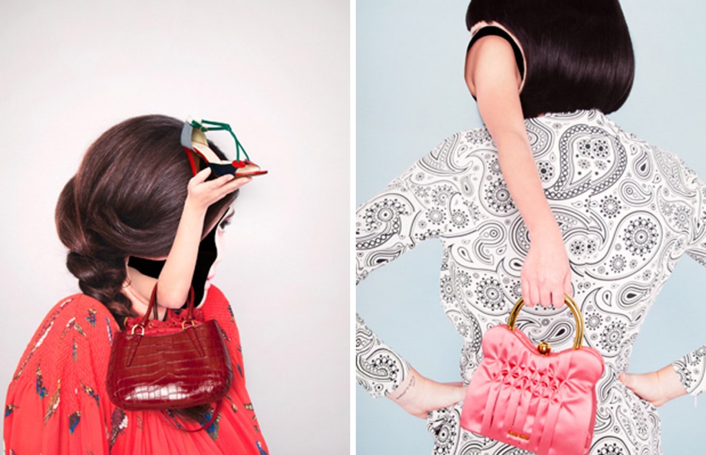
Fashion photographer Ina Jang captures some wild and awkward shots for Jalouse magazine. Her portfolio seems playful with it’s candy-coated palette, yet Jang consistently removes her subjects identities through overlapping imagery.
-
Artists: APAK
December 5, 2012 by Erin Fletcher
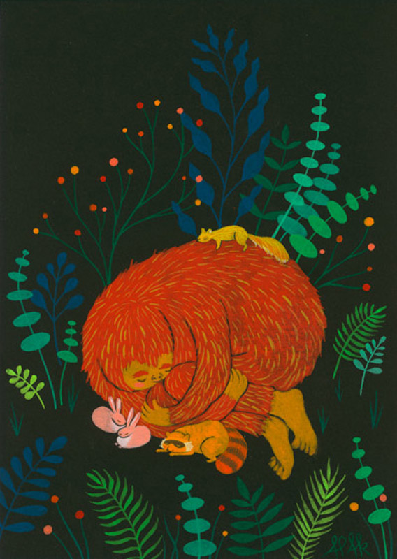
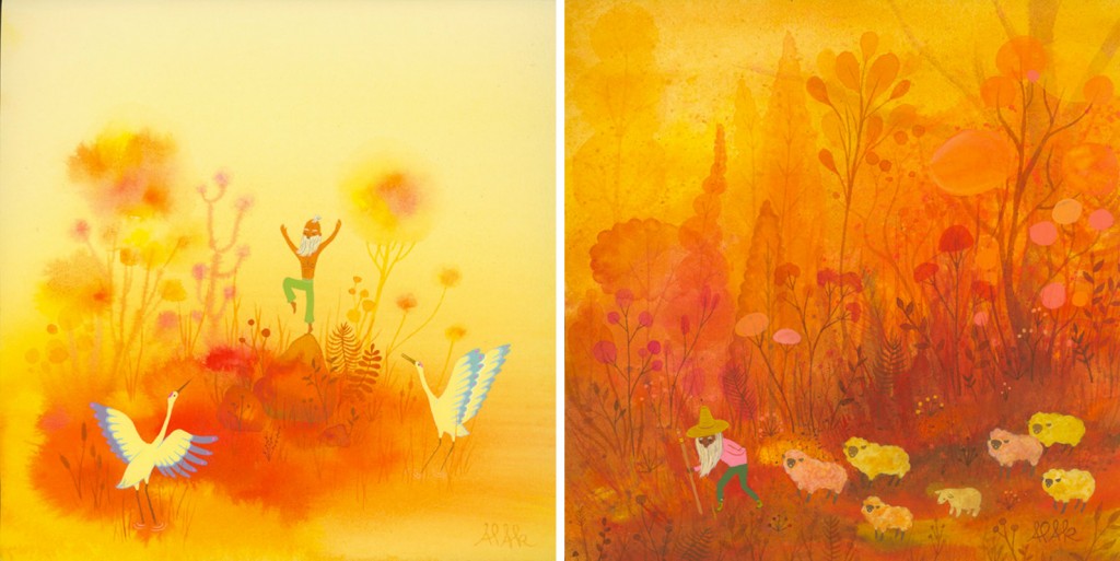
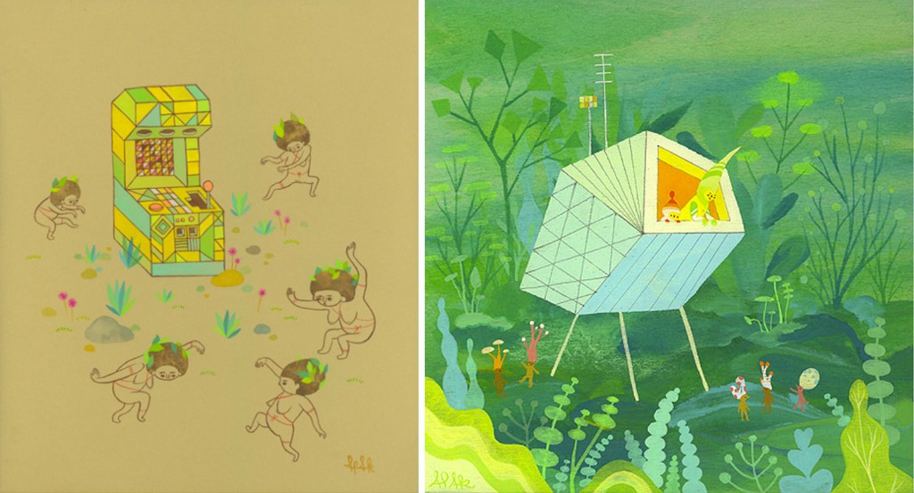
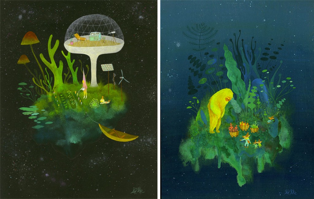
Welcome to the wonderful world of APAK Studio, a creative collaboration between husband and wife, Aaron and Ayumi Piland. Using gouache and acrylic, this duo paints a lush utopia filled with curious little creatures exploring the magic and mystery of life and love.
-
Daily Glimpse with Laura
December 4, 2012 by Erin Fletcher
DAY TWENTY-SIX
At 10:30 in the evening I just got home from working, eating black bean quinoa tacos for dinner, while Laura was…
-
If Only…
December 4, 2012 by Erin Fletcher

Too bad these Bookbinder Heels from Anthropologie are sold out, as a bookbinder I feel an obligation to own a pair.
-
If Only…
December 4, 2012 by Erin Fletcher
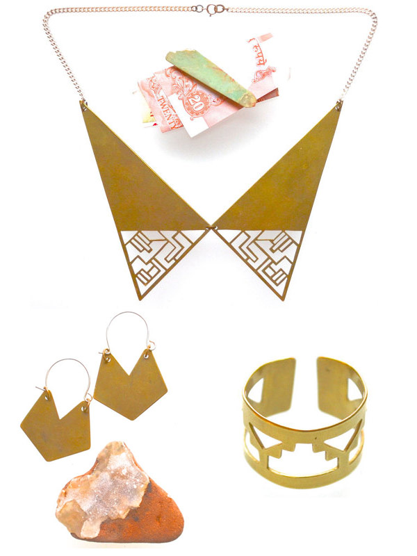
I think I might be adding all of Telle + Rex’s jewelry to my wish list this year. Check out their beautifully handcrafted pieces under their shop on Etsy: ISWAS + WILLBE.

-
Mother of Pearl :: Resort 2013
December 4, 2012 by Erin Fletcher
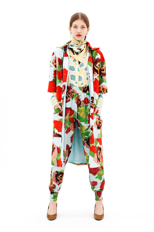
Mother of Pearl paired with British artist Gary Hume for their debut Resort 2013 collection. Hume’s paintings are distinguished by their vibrant color palette and simple imagery depicting flora and fauna, as well as portraits. Mother of Pearl transforms Hume’s work into sensationally stylized floral garments, adding flair to a basic pair of jogging pants and sweaters. Oh yeah, did you see the collar tassels!
-
Daily Glimpse with Laura
December 3, 2012 by Erin Fletcher
DAY TWENTY-FIVE
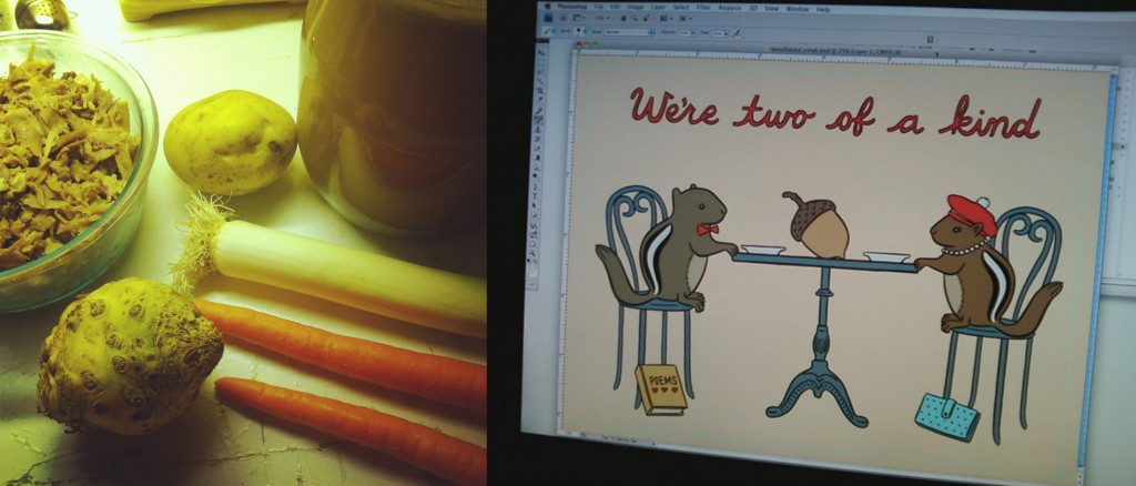
At 6:45 in the evening I was making turkey and rice soup from Thanksgiving leftovers (made turkey stock this morning), while Laura was finishing up another greeting card for The Found.
-
My Hand…Charlie and the Chocolate Factory
December 3, 2012 by Erin Fletcher
This is the last week to view my work on Buy Some Damn Art!!
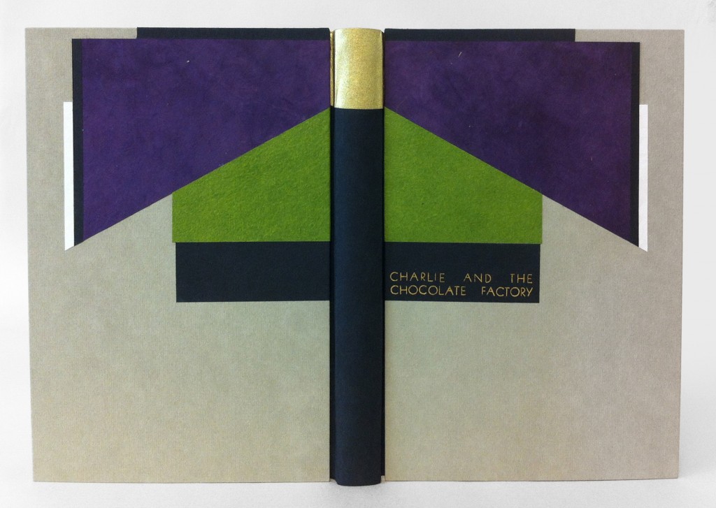
The sixth and final book in my Roald Dahl series is Charlie and the Chocolate Factory, which may be his most well-loved story inspiring several adaptations such as the 1971 film with Gene Wilder (that we all love), the 2005 Tim Burton version (that we all might not love), various live theatrical performances plus one theme park ride. As I read through this book again, I found myself scribbling note after note from the abundance of imagination and imagery sprouting from the text. I needed to settle on an idea and I knew that I wanted to incorporate Art Deco elements into the design. And so the inspiring words are those that make up the detailed description of Willy Wonka’s appearance: black top hat, tail coat of plum-colored velvet, pants were bottle green, gloves were pearly gray, and a gold topped walking cane.
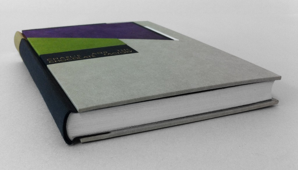
Working within the limitations of my chosen color palette I created a stacked design of shapes according to their position on the body. The cane became the center point of the design and the binding and so I chose to use Peter Verheyen’s variation on the German case binding, which is the same structure used for Fantastic Mr. Fox, so that I could cover the spine separately from the boards. The spine is covered in black Hahnemuhle Ingres with Ferro gold as the tip. The headbands are wrapped with paper corresponding to the black Ingres or Ferro gold. The boards were initially covered in smoke Hahnemuhle Ingres before adding the paper onlays one at a time. Carefully measuring to make sure the design would remain square and that both boards would successfully mirror each other. I used various papers for the design because my main goal was to match the distinctive color palette. All of the black elements are Hahnemuhle Ingres; I choose purple Lokta, lime Cave Paper and Echizen ribbon Japanese paper for the other elements.
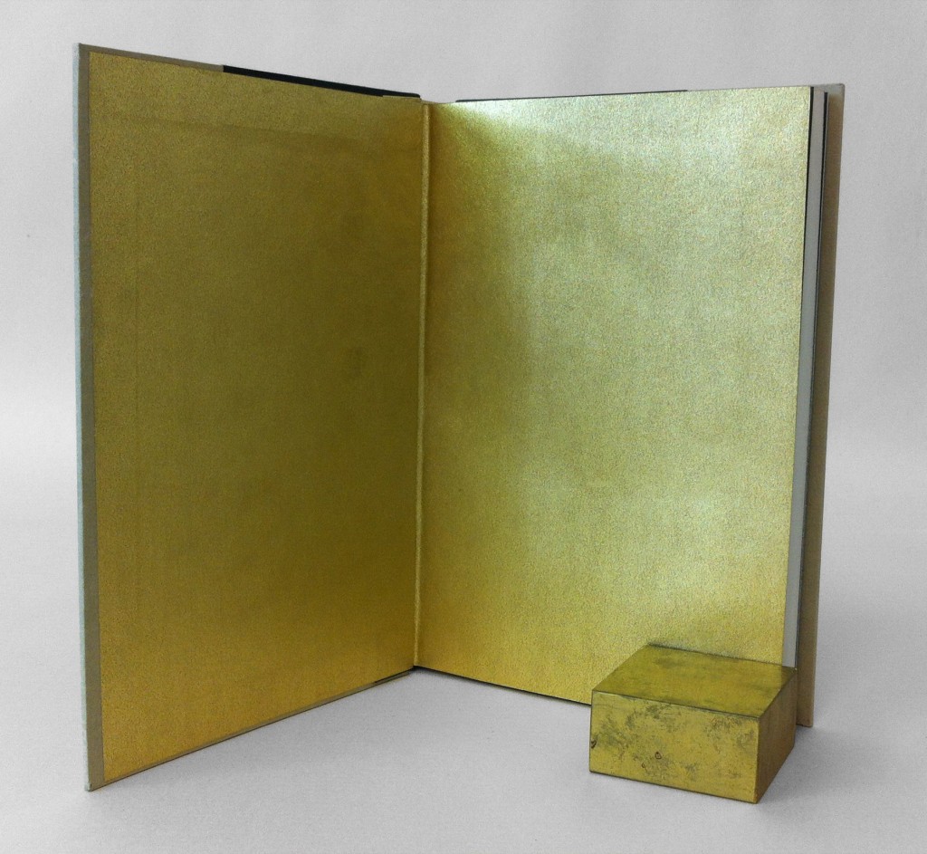
The edges were painted with a mixture of light gray acrylic paint, water, wheat starch paste and airbrush medium. This mixture creates a fluid pigment that can be applied as an even, thin coat, which prevents the paint from flaking. The made endpapers could only be gold as a homage to the golden ticket.
The book is housed in a clamshell box, the trays are covered with smoke Hahnemuhle Ingres and lined with light gray Ingres. The case is covered in full black Iris bookcloth.
-
Daily Glimpse with Laura
December 2, 2012 by Erin Fletcher
DAY TWENTY-FOUR
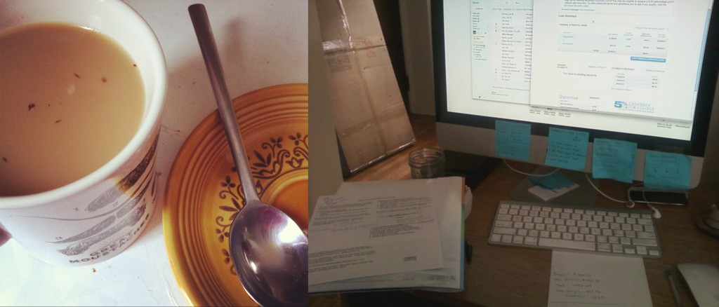
At 10:00 o’clock in the morning I was enjoying a cup of cardamom black tea, while Laura was looking over finances.

