RSS Feed

February, 2014

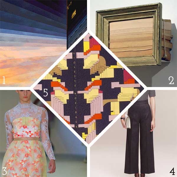
  1. Swell Things No. 12

    February 28, 2014 by Erin Fletcher

    stno12b

    1. Click the link to check out these animated GIFs from artist Fong Qi Wei. He combines my love of collage, animation and ombre patterning to create stunning and mesmerizing visuals. 
    2. Framed book edges from Canadian sculptor Maskull Lasserre. This artist focuses on a much overlooked area of any paperback and highlights the years of use and dirt. 
    3. This dress is apart of a Spring 2013 collection from designer Erdem. I just can’t resist the bright colors, lace and florals. Spring is coming. 
    4. The fall collection from Lyn Devon embodies fashion of the 60s. Lines cut dramatically across the female form creating a graceful and powerful feminine silhouette. 
    5. An absolute stunning binding by Micheline de Bellefroid. I’m absolutely in love with this binding. It harmonizes color with design and seems greatly inspired by the talented Sybil Pye. 

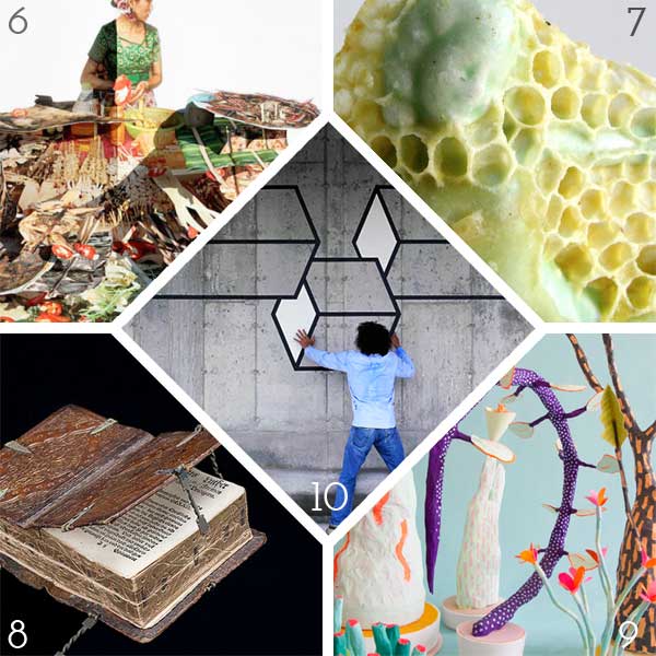
    stno12a

    6. These complex and detailed series of pop-ups come from artist Colette Fu. We Are Tiger Dragon People is the result of a trip to China’s Yunnan Province, where Colette collected images of the rich life and colorful culture in which her mother grew up. 
    7. Artist Aganetha Dyck drops small ceramic sculptures into beehives and gives the bees opportunity to artistically modify the pieces. I had a somewhat visceral reaction to these pieces, the process is quite unique yet the outcome is a bit unnerving. 
    8. A 16th century binding that can be read 6 different ways. Click on the link to watch the book in action. Once I recovered the the awesomeness of the this binding, I decided that I must investigate further and make one of my own. 
    9. These wacky Paper Plants from Adam Frezza and Terri Chiao are just fantastic. I would love to step foot on the planet where plants like this could thrive. 
    10. Aakash Nihalani uses tape and sometimes cardboard to construct 2-dimensional illusions. His pieces are mostly installed outside and have a flair for humor. He often is posed interacting with these forms, creating a unlikely narrative against a bleak landscape.
  2. Book Artist of the Month: Diane Jacobs

    February 24, 2014 by Erin Fletcher

    Cloudland1-DianeJacobs

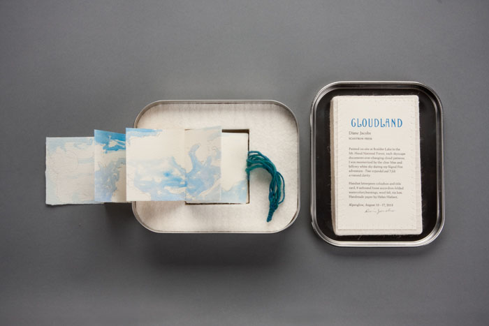
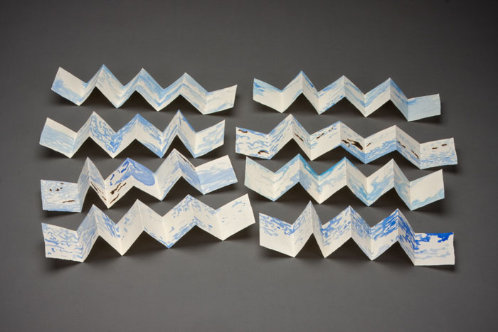
    Housed inside this tin box is the miniature artist book Cloudland. Painted on site in the Mt. Hood National Forest, Diane Jacobs captures the altering cloud patterns viewed across the sky with the use of watercolor and slight burning of the paper. The eight accordions inside the tin fold out to 18″ long by 2.5″ tall.

    Cloudland2-DianeJacobs Cloudland3-DianeJacobs

    I was particularly drawn to this artist book due to my fondness for clouds and the gorgeous typeface you used for the title page. The cloud formations were painted on site at Boulder Lake in the Mt. Hood National Park, was this outing planned or were you unexpectedly struck by inspiration?
    I painted all the accordion folios on site. I had an idea to do a book about clouds before going on the Alpenglow backpacking trip with Signal Fire. The first part of the trip was backpacking then we could retrieve art supplies for the remaing 3 days where we were stationed at Boulder Lake. While planning for the trip I folded up some paper trimmings to take with me. For CLOUDLAND I used handmade cotton paper scraps from Helen Hiebert.


  3. Bookbinder of the Month: Haein Song

    February 23, 2014 by Erin Fletcher

    RomeoAndJuliet1-HaeinSong

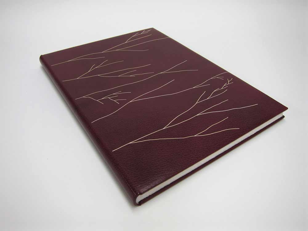
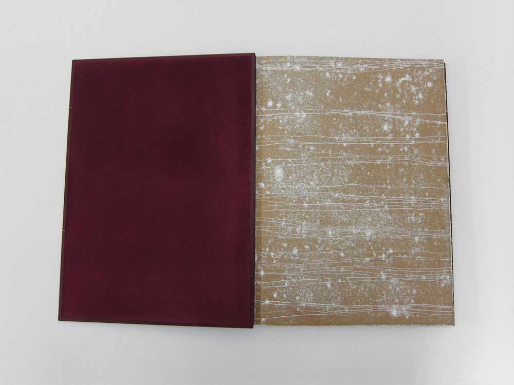
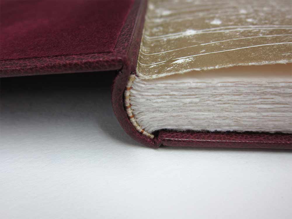
    In 2012, Haein Song bound this copy of Shakespeare’s Romeo and Juliet in full leather maroon goatskin. The delicate linear design was created by applying a series of natural goatskin onlays. The endpapers are monprinted in gold with suede doublures. 

    RomeoAndJuliet3-HaeinSong RomeoAndJuliet2-HaeinSong

    At first glance, the decorative elements appear to be hand tooled, but those thin lines are actually several onlays. Did you find it difficult to manipulate such delicate and thin pieces of leather?
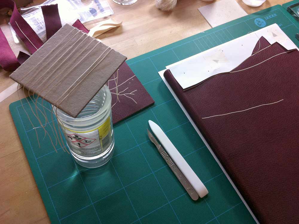
    Leather pieces are paired down very thin (0.2.mm) and I cut them into long lines of a width of 1mm. It isn’t easy to glue the pieces so I put pva and paste mix on the glass surface then lay the piece on top so it can catch the adhesives. Then with a help of scalpel and tweezers I lay them on the the cover of the book based on my design. I think the idea of doing it seems more challenging than actually executing it. Once you are used to the thinness and longness of the piece it become a little bit like a drawing tool. And when I was laying down the pieces I had a feeling that I was drawing with a leather.

    RomeoAndJulietOnlays-HaeinSong


  4. Book Artist of the Month: Diane Jacobs

    February 17, 2014 by Erin Fletcher

    Nourish1-DianeJacobs

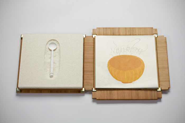
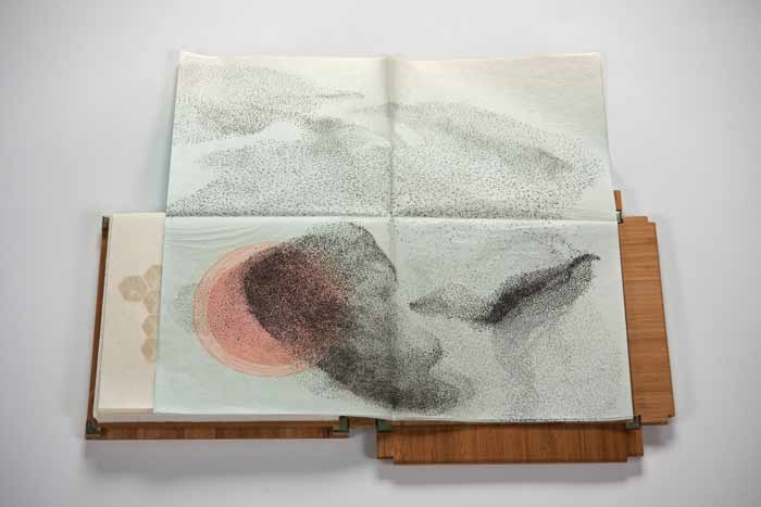
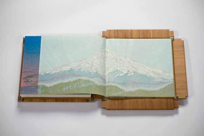
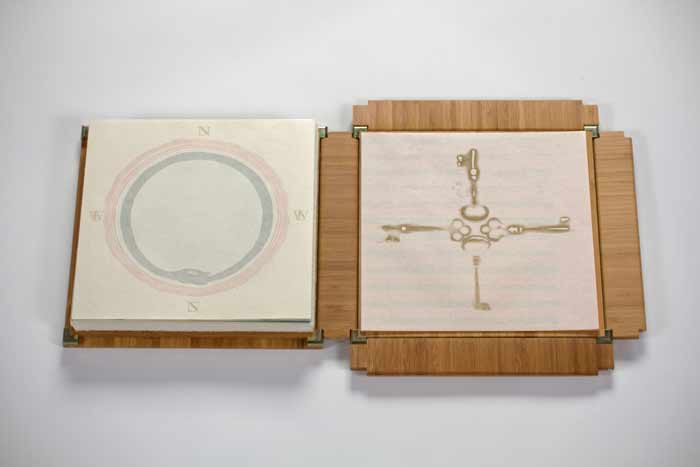
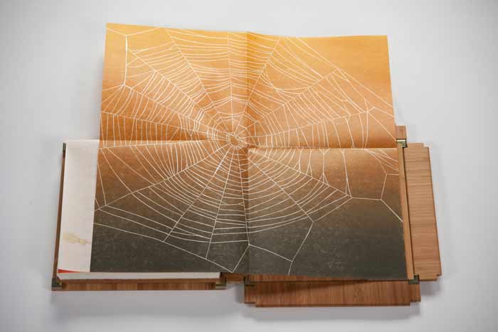
    Housed in an elegantly crafted bamboo box are a series of prints under the title Nourish. This unique artist book was created by book artist Diane Jacobs in 2012. The book explores both the natural and man-made systems in which we as humans depend on in our daily lives. As you advance through the book, these complex systems are displayed within a delicate balance of beauty and harshness. 

    Nourish5-DianeJacobs Nourish2-DianeJacobs Nourish3-DianeJacobs Nourish4-DianeJacobs

    This is such a beautiful artist book and is quite complex with the range of materials. The illustrations are so delicately printed; I especially love the ghost image on the reverse. The structure is so flawless, can you talk about the choices you made for how the prints would be housed and read?
    My goals were to investigate color, play with the transparency of gorgeous Gampi paper, wow the viewer with complex reduction prints, and engage with the viewer to ask questions and think more deeply about the interconnectedness of all living things and the state of the environment. At first I thought the book would be bound but soon realized it needed to be free and every folio needed to be opened twice (or four times in the case of the starling murmuration). I wanted the box to collapse and this took a lot of ingenuity by Mark Burdon. The clincher was relinquishing the idea of purchasing a prefab hinge. Once we realized we had to design it, it came more quickly.

    Watch the video below to see how the book unfolds.


  5. Bookbinder of the Month: Haein Song

    February 16, 2014 by Erin Fletcher

    TheTrial1-HaeinSong

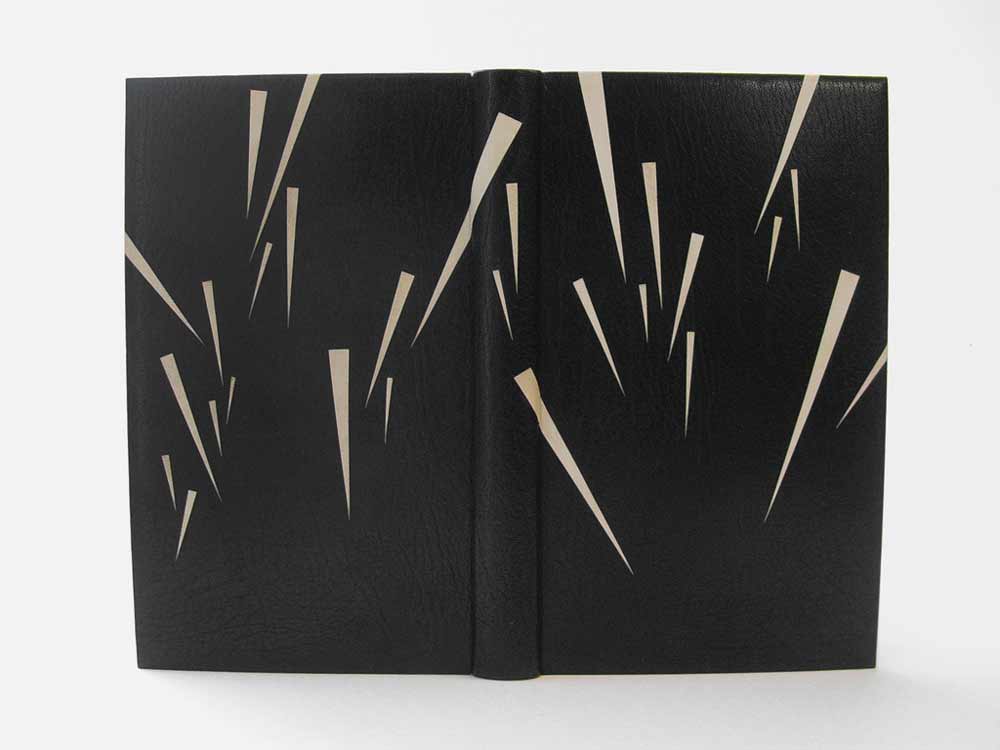
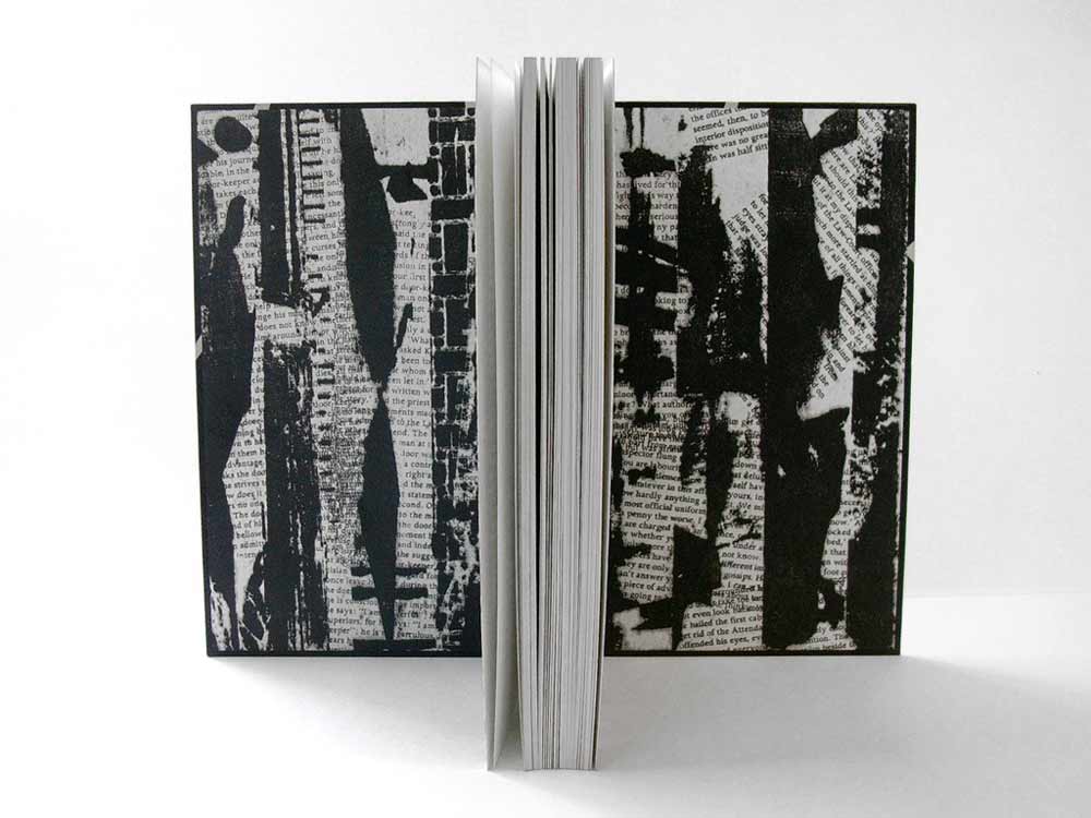
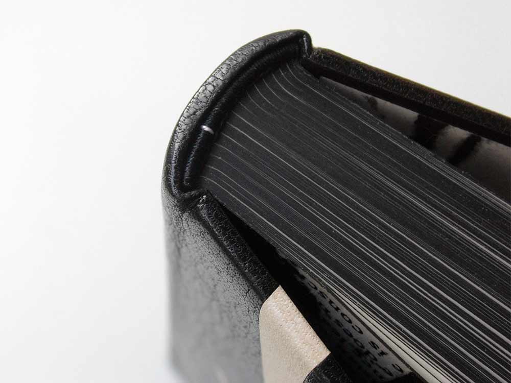
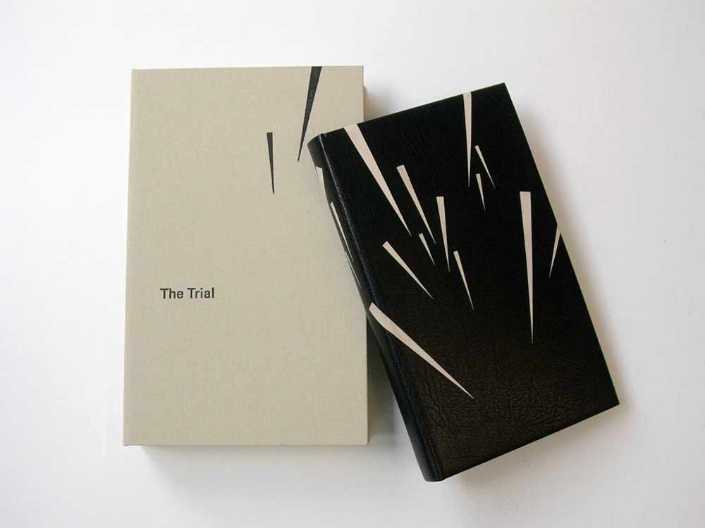
    The striking design on this fine binding of The Trial by Franz Kafka was created by the talented Haein Song in 2011. This Folio Society edition is covered in full black goatskin with reverse pared natural goatskin onlays. Keeping in fashion with her other bindings, the endpapers are hand printed and sit opposite a leather joint. 

    TheTrial2-HaeinSong

    The head edge and tail edge of the text block are decorated with black acrylic, leaving the whiteness of the paper on the fore edge exposed. Breaking up the edge decoration like this can be very interesting for the overall concept of the design and I think Haein is really playful in this area of the book. 

    TheTrial4-HaeinSong TheTrial3-HaeinSong

    You’ve created design bindings for some prominent authors such as Camus, Kafka and Kipling. Do you have an affinity for these authors? Do you plan to bind more of their works?
    I’m an admirer of few authors, which include Beckett, Camus, Kafka, Borges, Pessoa, Calvino, Kundera, Perec, Hesse and Carroll. I’m also very fond of playwriters associated with The Theatre of the Absurd. Whenever I have an urge and space I look for some of those authors’ books and I have few waiting to be bound. How I came to bookbinding is from the love of reading and interest in language. I don’t think it was easy for me to acquire a second language after being a grown-up so my love is mixed with the frustration I had to go through. And some of the authors I mentioned above express what I want to say through their books eloquently, articulately and poetically.


  6. Artist: Kennedy James

    February 12, 2014 by Erin Fletcher

    SerialBondage24-KennedyJames

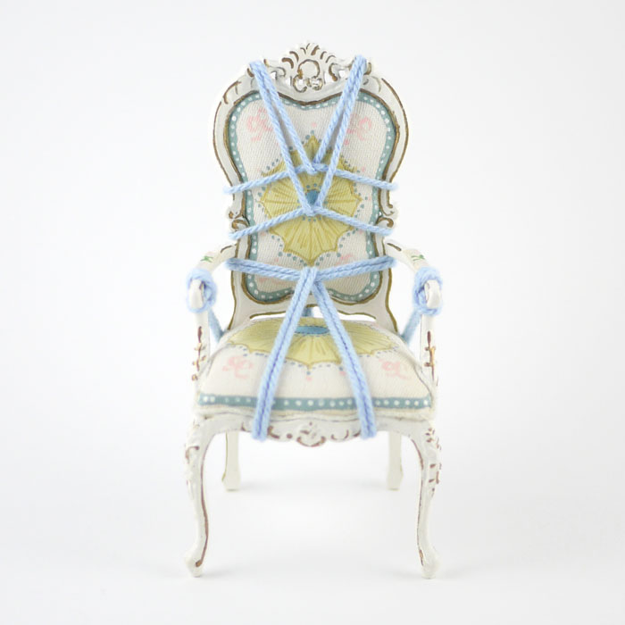
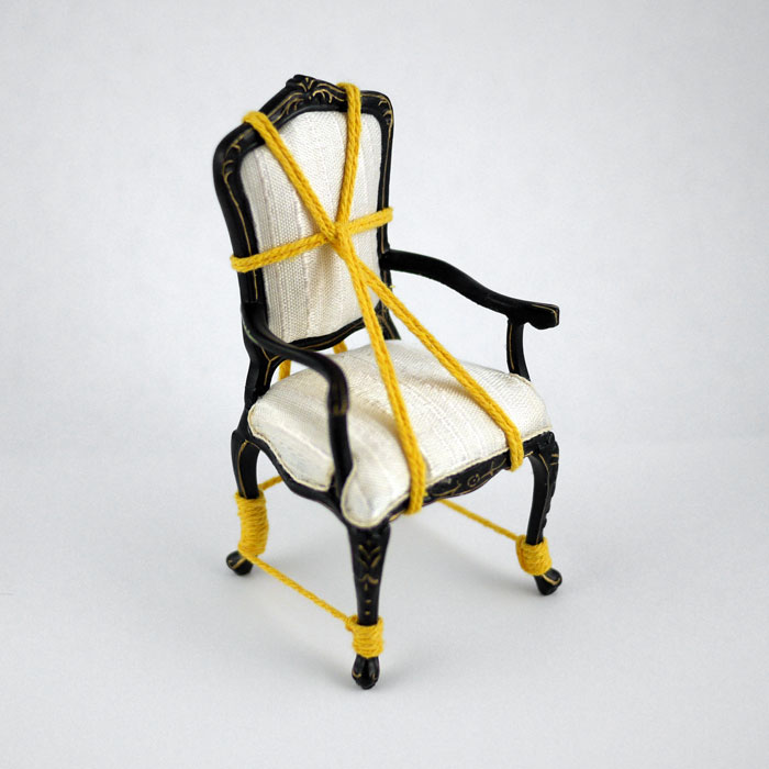
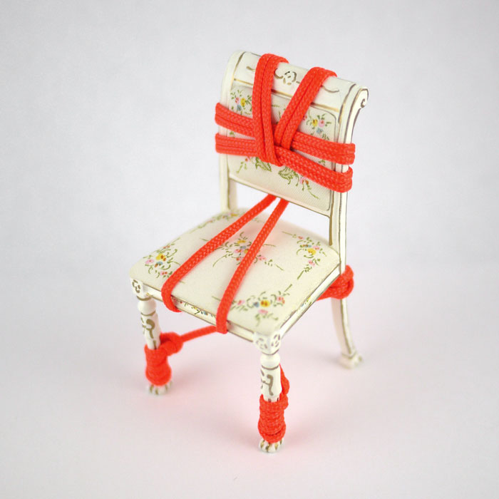
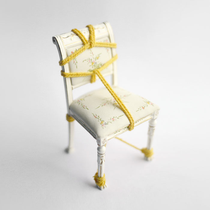
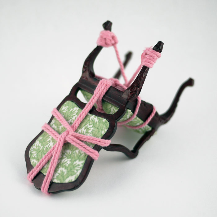
    Here are a few pieces from a collection by Kennedy James called Serial Bondage. Each chair is tied-up with yarn in the ancient art of Japanese Shibari (rope bondage). There is something delightful and playful about these delicate miniature chairs harnessed with brightly colored ropes. 

    SerialBondage7-KennedyJames SerialBondage8-KennedyJames SerialBondage18-KennedyJames SerialBondage13-KennedyJames


  7. Artist: Justyn Hegreberg

    February 12, 2014 by Erin Fletcher

    TwoDots-JustynHegreberg

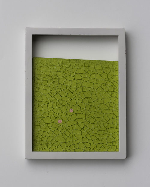
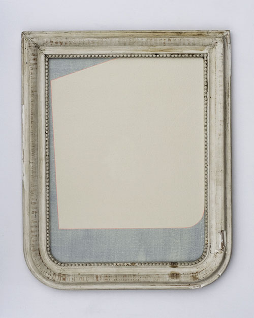
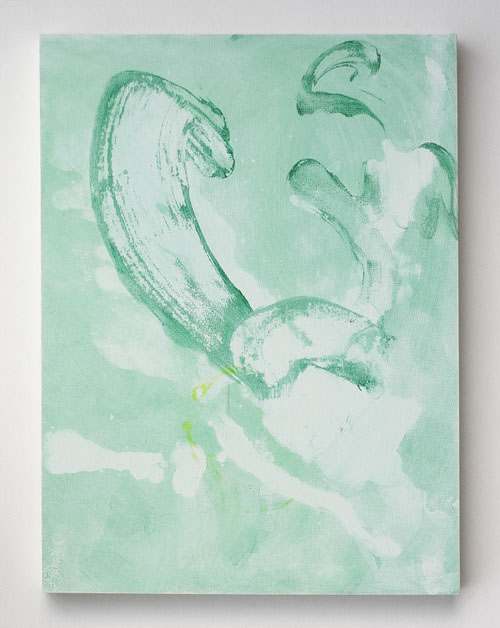
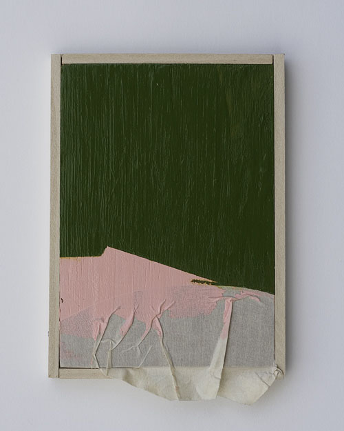
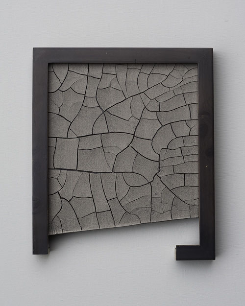
    I love art that can exist as just a beautiful object, no need to crowd the frame with tons of conceptual nonsense. The attractiveness of Justyn Hegreberg’s artwork grabs me through the varied textures, bold colors and asymmetric formats. He both thinks and works outside the frame (even though sometime the piece doesn’t quite stretch to all four sides). 

    Emblem-JustynHegreberg Graft-JustynHegreberg PinkAndGreen-JustynHegreberg GreyCracked-JustynHegreberg


  8. Book Artist of the Month: Diane Jacobs

    February 10, 2014 by Erin Fletcher

    WovenUndergarments-DianeJacobs

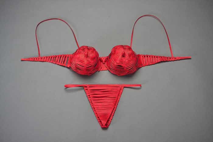
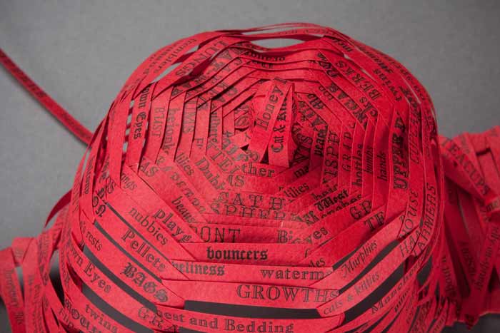
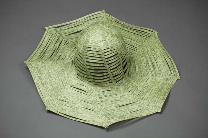
    Over a three year period, Diane Jacobs, compiled a list of slang and derogatory words used to exploit women. Sources for this list came from friends, family, strangers and several slang dictionaries. The words were set individually out of type and letterpress printed. These printed strips were then used to weave women’s undergarments and hats offering references to women’s craft, the body and our misogynist culture. 

    WovenUndergarments2-DianeJacobs

    This work has been exhibited at the Gallery Paule Anglim in San Francisco and the Hoffman Gallery at Oregon College of Art & Craft.

    WovenUndergarments3-DianeJacobs WovenUndergarments4-DianeJacobs

    I think it’s important to distinguish that a word can be ingested as either derogatory or empowering based on the context of the situation. I think your Woven Paper Undergarment series is teetering towards empowerment; allowing the woman to be in control and wear these words with confidence and pride. Can you talk about your overall concept behind this work?
    I am really glad you feel that way. I started this body of work after an experience I had in a Bart station in San Francisco right after being at a Gorilla Girls event. A man asked me for a quarter and I gave it to him. He said “thanks honey” and I said “ don’t call me honey” and he flew out of control calling me every name in the book. After that I picked up a dictionary on slang and derogatory words. I painstakingly hand-set many many words for this body of work. The words lost their negative power and I reclaimed them.


  9. Bookbinder of the Month: Haein Song

    February 9, 2014 by Erin Fletcher

    JustSoStories-HaeinSong

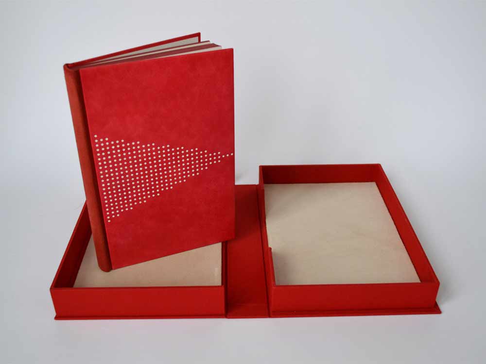
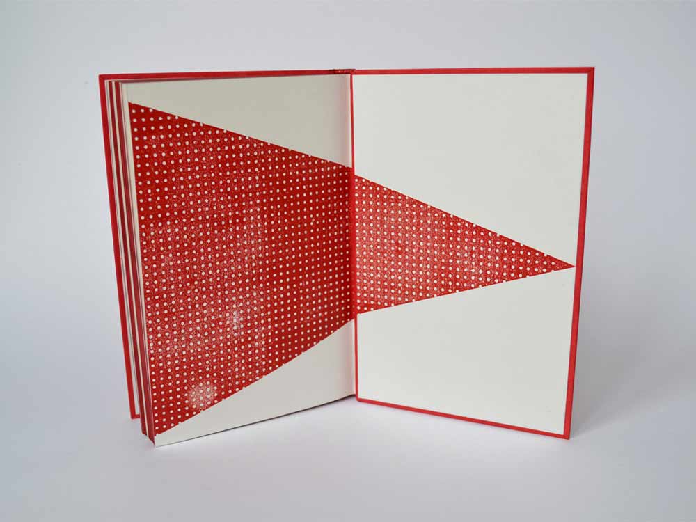
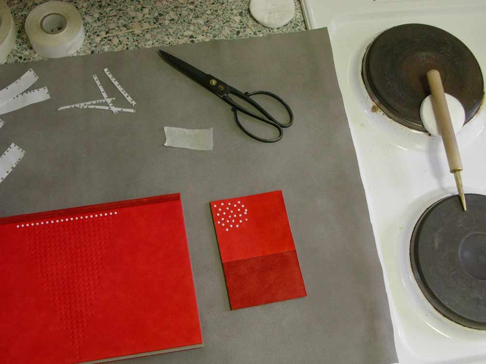
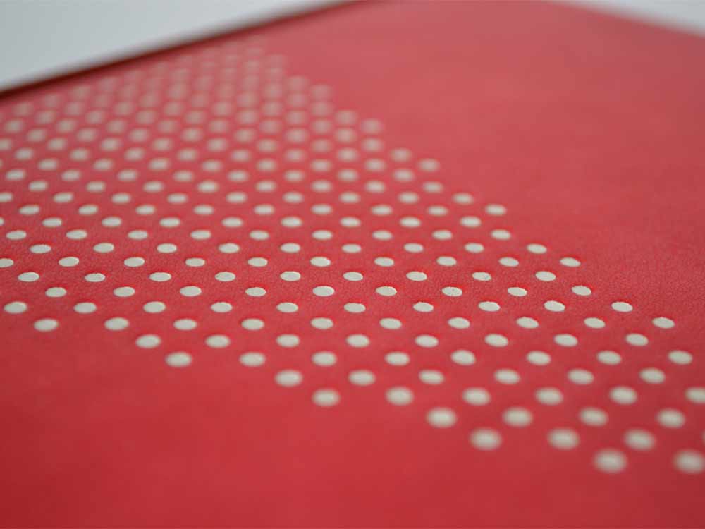
    This Folio Society edition of Just So Stories by Rudyard Kipling was bound by Haein Song in 2010. Bound in the Bradel binding structure, the spine is covered in reverse goatskin. The front and back boards are covered in hand dyed goatskin. The geometric pattern is tooled in white. The monoprinted endpapers sit opposite a leather joint. 

    JustSoStories3-HaeinSong JustSoStories-Tooling-HaeinSong

    Haein shared this image showing the the tooling in-progress. I love how clean and organized her space looks, a perfect calm environment for tooling.

    JustSoStories4-HaeinSong

    I choose to feature this binding because I’m such a proponent of using a single color to create sublty in design. Sometimes the simplest ideas can create the most extraordinary pieces of art. Using reverse goatskin for the spine creates not only a deeper red, but introduces a change in texture. For this binding, you utilize the Bradel binding, which allows you to create the exterior in three parts. Is there a fondess to this structure that you find supports your design sense more than a full leather binding?
    I like what Bill Evans, an American pianist and composer, said about that – “The simple things, the essences, are the great things, but our way of expressing them can be incredibly complex.” I’m attracted to the very essential and elemental quality of seemingly simple forms like dots, lines, squares and circles.

    When it comes to the structure I don’t think I prefer a bradel binding to a full leather binding – both have different qualities and attractions. But as you’ve mentioned a bradel bindings can provide simple design solution by changing materials or colours and there is a something architectural about that. I used a bradel binding for this book precisely because of that reason.


  10. Conservation Conversations // Lab Coat Daydreams, Part II

    February 6, 2014 by Anna Shepard

    Something I have been thinking about a lot lately, as I while away hours at the bench, is the question of accessibility, specifically within the context of conservation. Recently there was a big hullaballoo at the H when a young woman, who fashioned herself as a “performing artist,” kissed a statue, smearing her dark lipstick across its pristine marble face. For this grand act of vandalism, she was fined a great sum and was required to spend an hour or so touring our conservation lab to get a feel for how complex and careful the work that goes into preserving books and flat paper objects actually is. Clearly the act is not socially acceptable and I think this young woman knew better than to leave such a noticeable mark on a statue, but it made me question the ways in which we are encouraged to engage with beauty and the ways in which we are not. Is there a right and a wrong way to experience beauty? Without proposing anything all that anarchical, I would like to address the parts of my work that break my heart and those that give a greater feeling of purposefulness.

    anna-part2a

    I was discussing the statue-kissing incident with a good friend and she pointed out that there is an element of embarrassment in the situation that I had not thought of before. As she understood it, the fact that the young woman performed a passionate act, a very active response to the beauty she was encountering, was the root of the evil. She was selfish in her act because it was an uninhibited response that many of us might have liked to perform ourselves if we only felt so free as to do so. It is this recognition of an unharnessed human response to beauty that makes the act inappropriate. In some ways I completely agree with this logic and it makes me consider the role of any museum or gallery space in exposing us to historically important and beautiful cultural relics and new forms of expression. On the other hand, if we all went around touching oil paintings and leafing through the most delicate books, they wouldn’t be around for long for us to enjoy. 

    Much of the work I have been doing lately deals directly with this same issue. I have been working with a book conservator to iron out the wrinkles in a “permanent” library exhibit–the main issue being that most of the books currently on exhibit have been sitting in their display cradles for five plus years. The continual stress on the bindings, in addition to the damage from light exposure to the displayed pages, is now something needing immediate attention. I wonder if it will make any difference to the visiting public that many of the books and original documents will be scans and facsimiles of the originals? Will they perceive this stand-in for what it is and be disappointed or will they be oblivious of the switch? One of the unique perks of working in a conservation lab is that we handle some very interesting and valuable pieces with our bare hands (well-washed, of course) and, though it is possible to gain access to virtually all of our collection by applying to be a scholar, I still wish that everyone could hold these rare books close enough to smell their paper and feel the smooth leather and frayed cloth with their own hands and it’s that part of my work that troubles me the most.

    anna-part2b

    The privilege of having such intimate experiences with these books and paper objects is the great joy of those working in the field and much of what we do in the lab is done solely for the purpose of making items more available and ready for use. The questions of functionality and usefulness and the longevity of an item are things that must be taken into consideration when dealing with each individually. It is that question: whether to change the structure of something to allow for greater access or to preserve it for undisturbed, safe keeping, that calls us to employ the keenest discernment. Being able to share these pieces of history and culture are what make it all worth while.


  • My name is Erin Fletcher, owner and bookbinder of Herringbone Bindery in Boston. Flash of the Hand is a space where I share my process and inspirations.
    The StudioNewsletterInstagramEmail me
  • Archives